index.md 14KB
title: Computers as I used to love them
url: https://tonsky.me/blog/syncthing/
hash_url: 154a7a62b2
I’ve been struggling with file sync solutions for years. In the beginning, Dropbox was great, but in the last few years, they started to bloat up. I moved to iCloud, but it was even worse. Finally, a few days ago, after iCloud cryptically broke again, I decided it’s time to try something different.
I tried Syncthing, a free and open-source alternative. And you know what? It’s been liberating. The sanity, the simplicity, the reliability, the features. It brings the joy of use and makes you believe the collapse of civilization can be slowed down a bit.
Syncthing is everything I used to love about computers.
It’s amazing how great computer products can be when they don’t need to deal with corporate bullshit, don’t have to promote a brand or to sell its users. Frankly, I almost ceased to believe it’s still possible. But it is.
Installation
You download a single binary executable. You run it. There’s no step three.
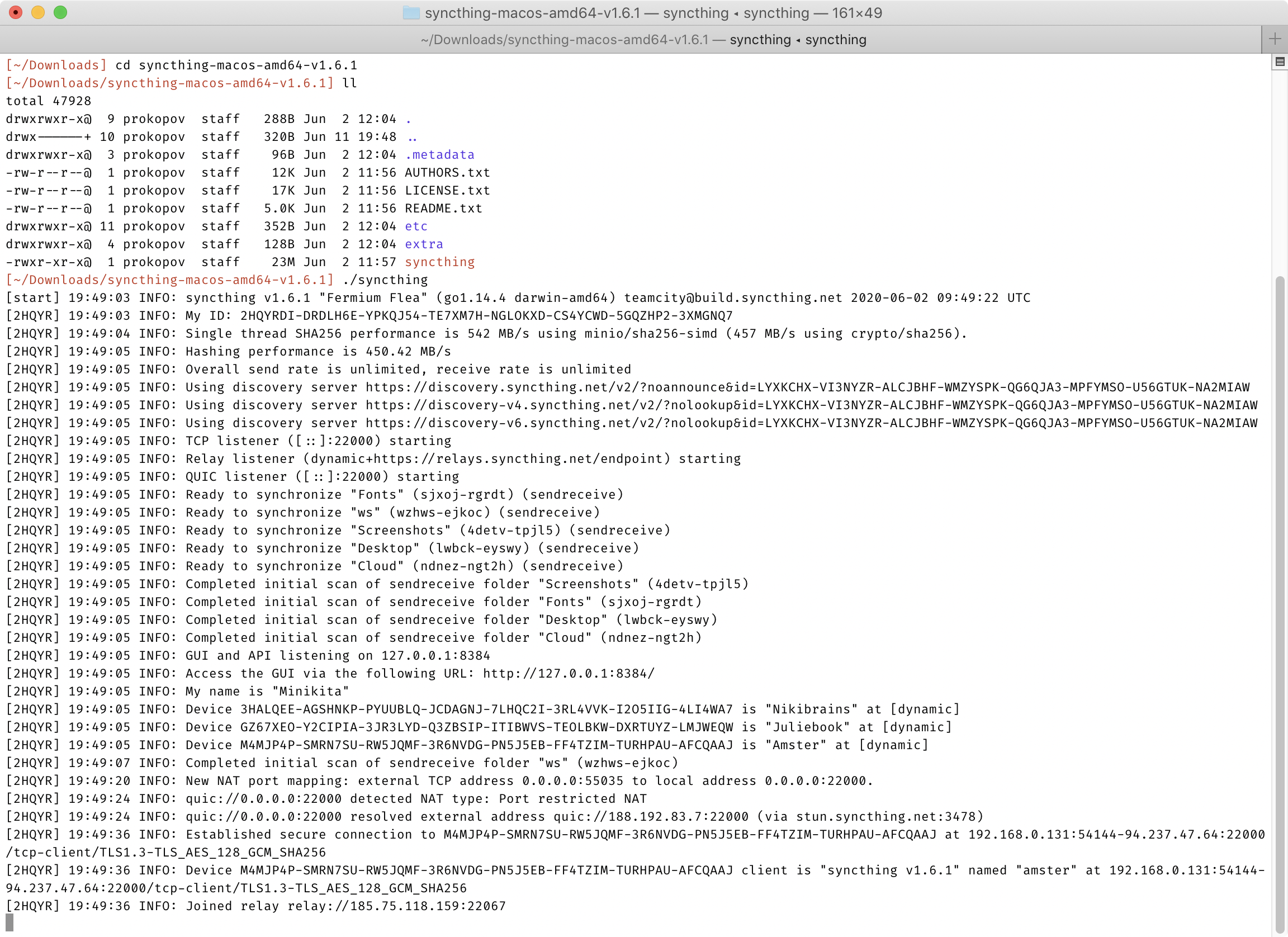
No, seriously. It’s so simple I thought I missed something. But no. After you run that binary, you have a fully operational node of Syncthing. It’s ready to sync with any other Syncthing node, no other setup necessary. There’s no installers, no package management (but there are packages if you want to), no registration, no email, no logins, no password creation, no 2FA, no consents, no user agreements. Just download and run. Heck, setting up autostart on Linux server was more complex than just running the app itself!
Homebrew makes it even simpler:

Just to give you the perspective, these are all the steps that Dropbox puts you through when you install it on a new computer:
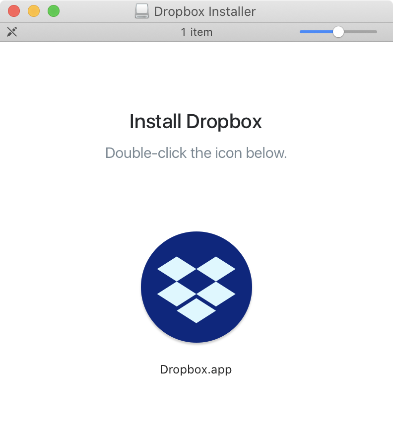
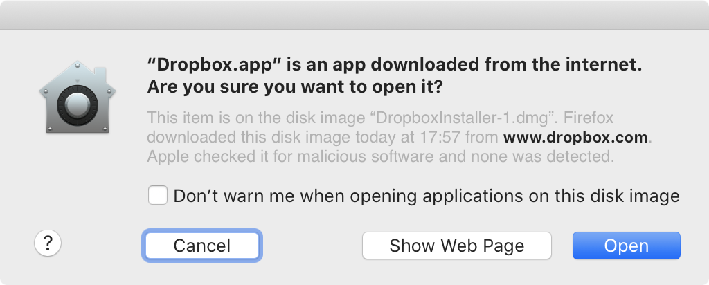

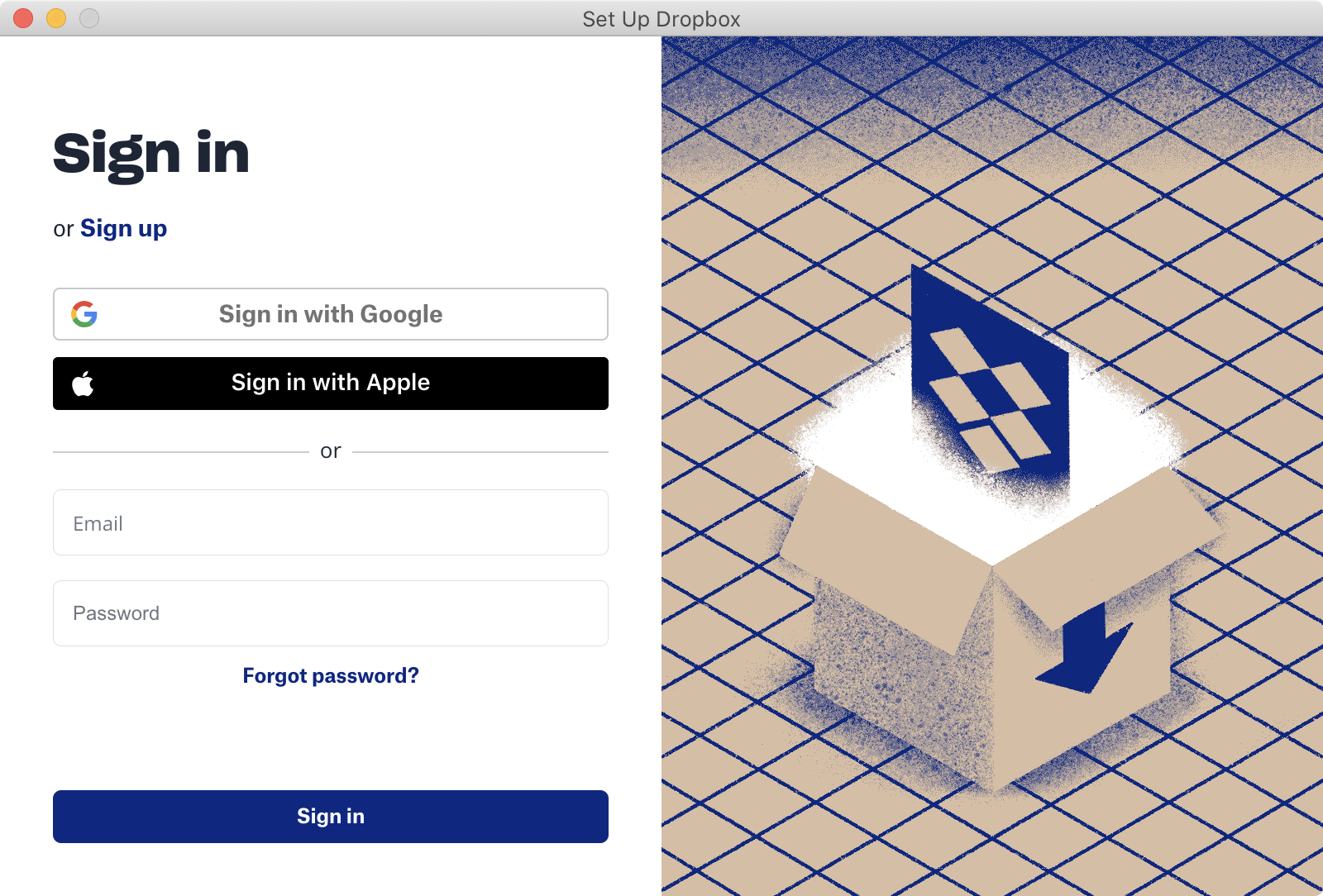
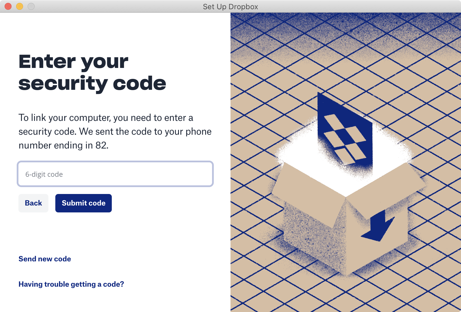


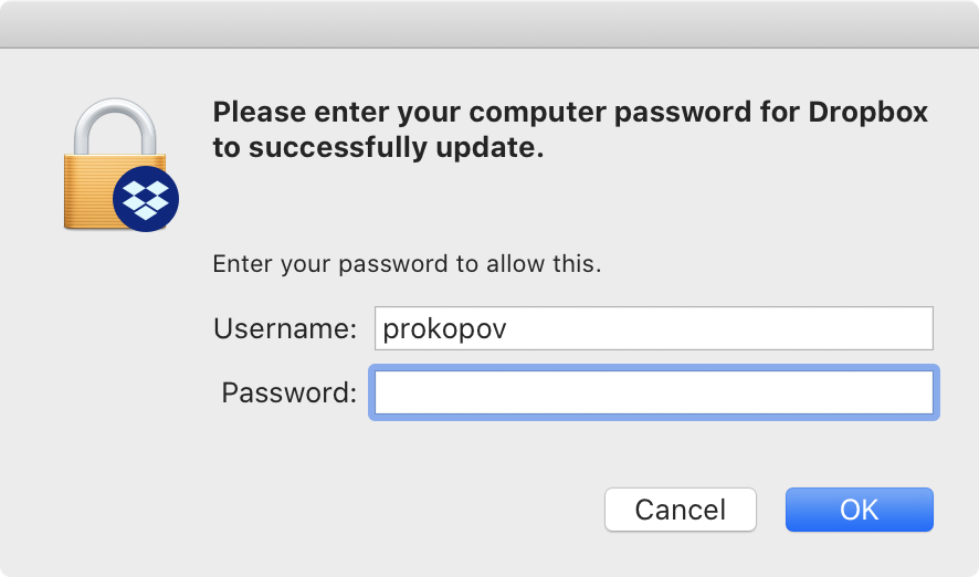
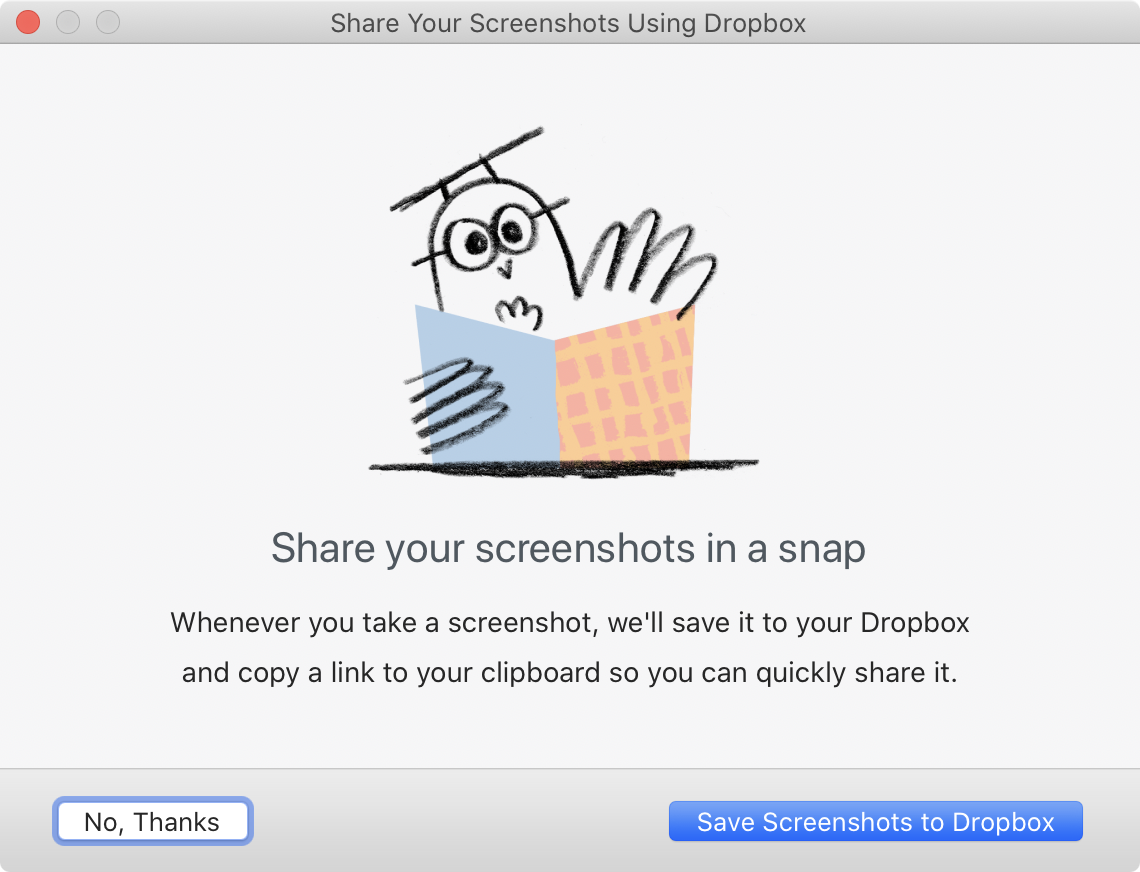
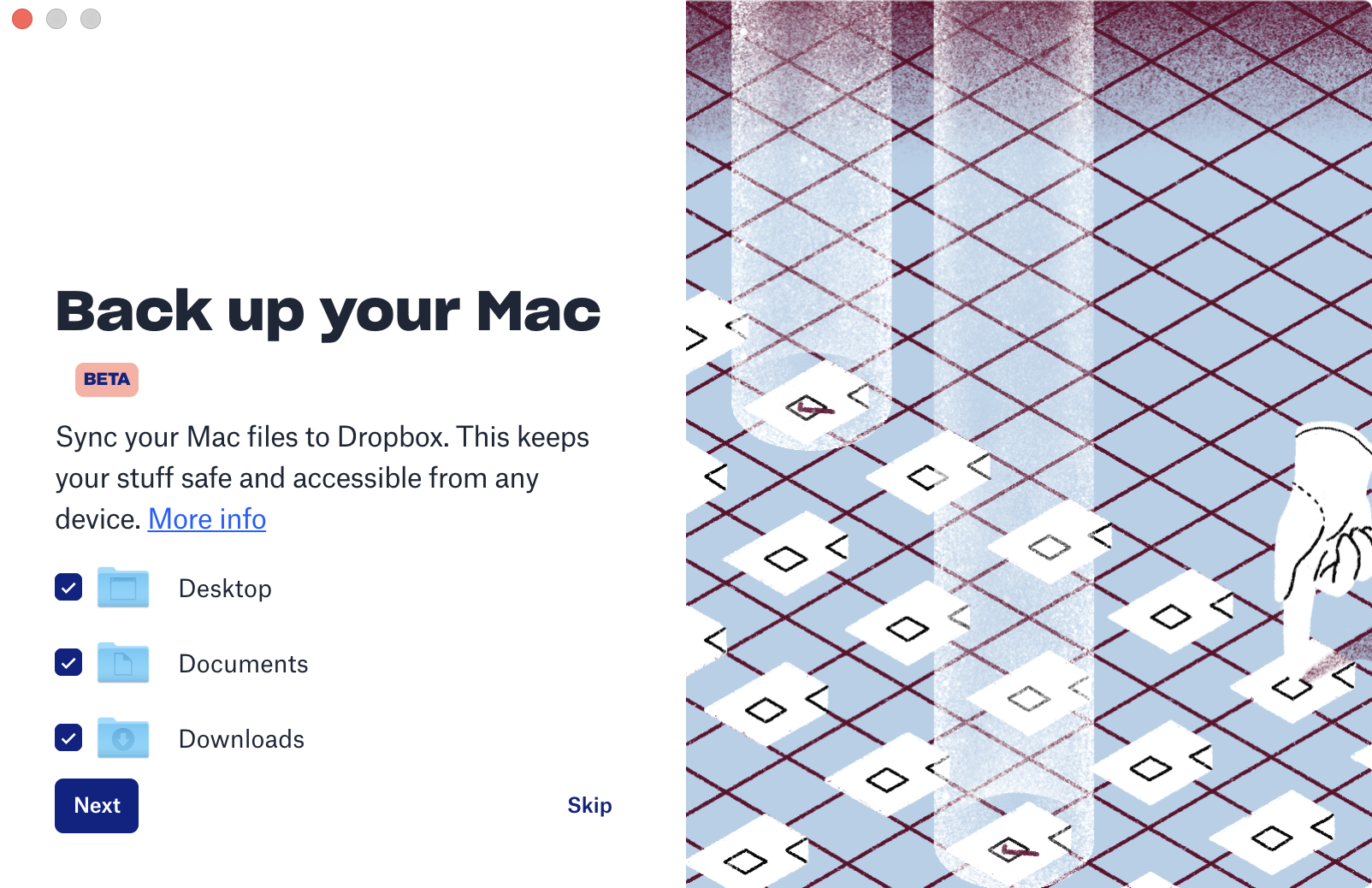
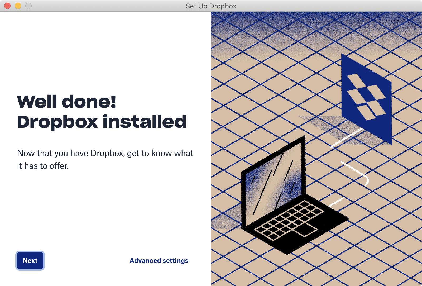
Aaaaand… that’s not all! You also get this annoying notificaiton to deal with:
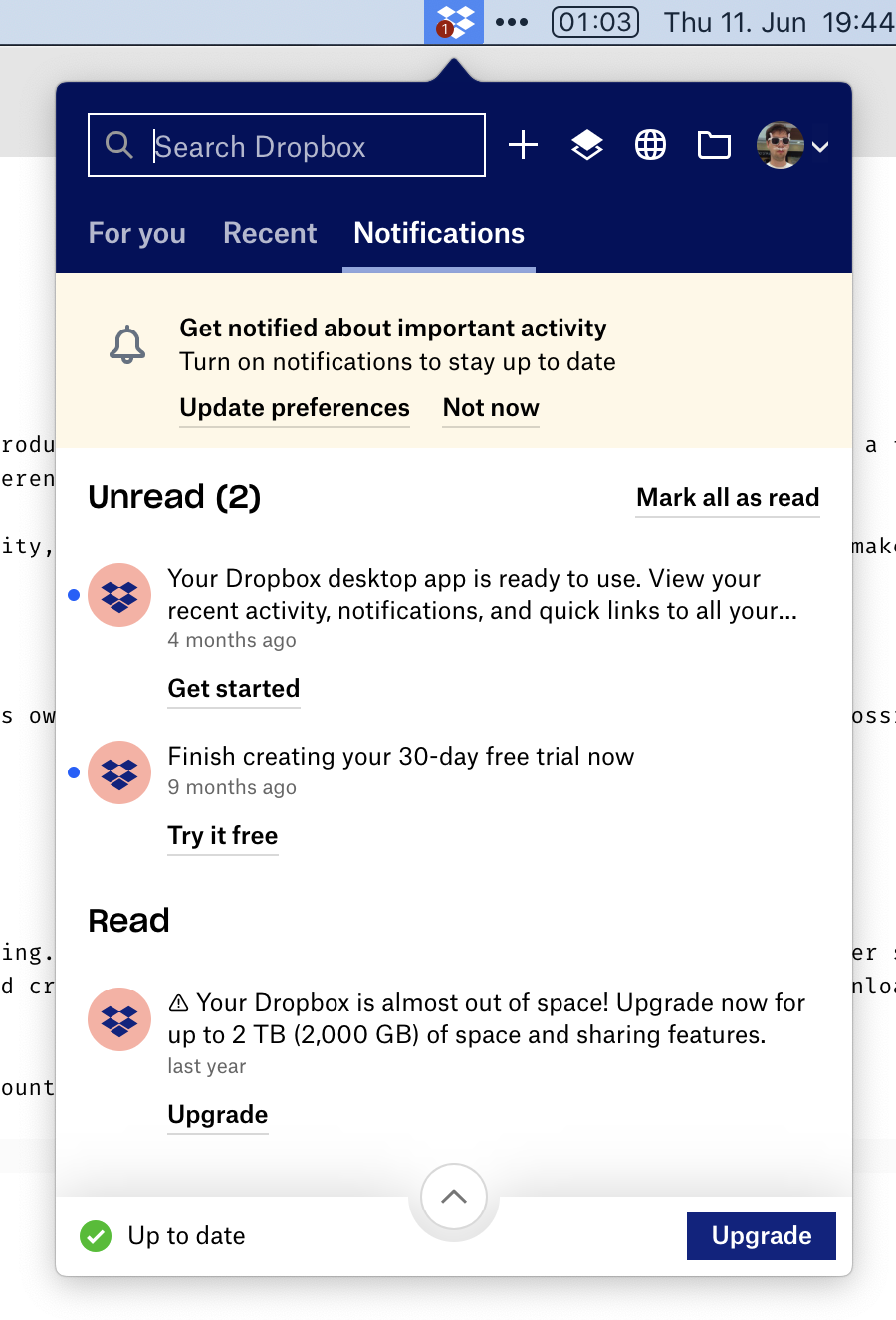
Only at this point can you start using Dropbox. Luckily, I already had an account, otherwise, it would be 5 more steps. Ridiculous!
(It goes without saying, that all of these are different windows. It does not happen in a single predictable area, mind you. You have to chase every one of them. And the “Set Up Dropbox” window is always-on-top, so it hides other required steps, which also adds to the fun.)
No artificial limits
Because Synthing is free and doesn’t depend on server-side storage, they don’t need to put weird or unnatural restrictions on you. You can use as much space as you have on disk. You can sync as many folders as you want. You can sync any folder, no matter where it’s located. You can sync with anyone in the world. In fact, you can sync any folder with any number of people. At no point have you to wonder “but will it work with my plan”? If your hardware allows it, it will work. As simple as that.
Folders are the most vivid example of how other cloud storages constantly fuck up the simplest things. Syncthing can sync any folder on your drive, located anywhere. You can sync existing folders. You can sync multiple different folders. Folders are just folders, nothing special about them. Here I’m syncing “system” folders: ~/Desktop and ~/Library/Fonts, and three custom ones. No sweat:
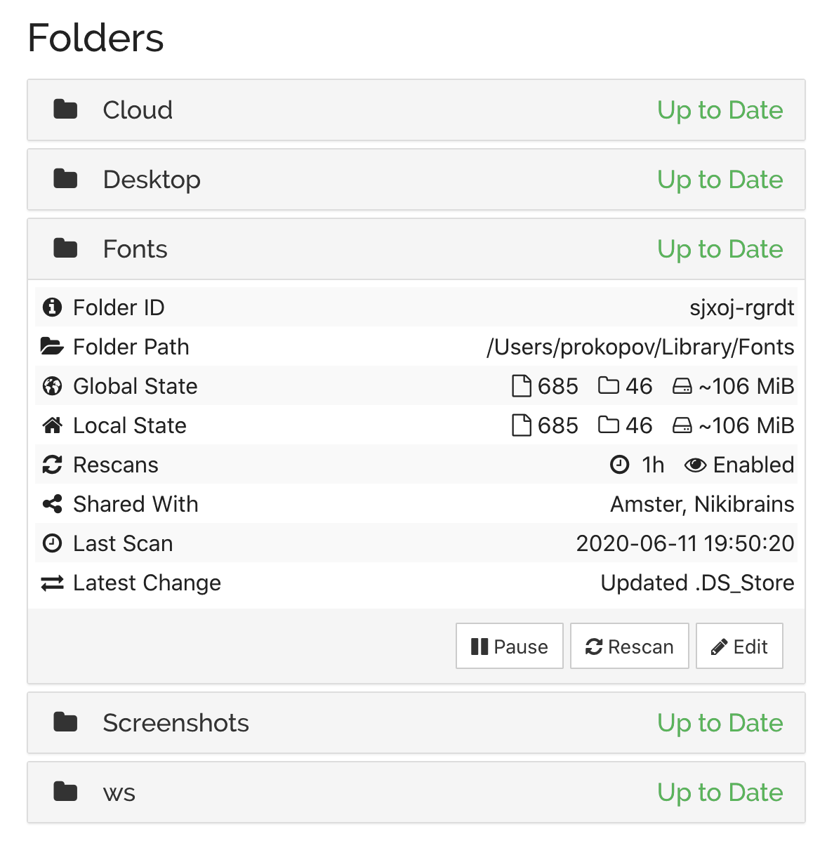
This simplicity lets you use it as a tool you can apply, sometimes creatively, to your task, not as a service you have to put up with. For example, by syncing ~/Library/Fonts, if I install a font on one machine, it automatically installs everywhere.
Contrast this with Dropbox, which requires you to put everything inside ~/Dropbox folder. If you keep your projects under ~/work and want to sync it, well, tough luck. You can’t sync multiple folders either. Well, technically Dropbox can sync anything, of course. Files are files. But branding dictates there MUST be a Dropbox folder somewhere, even if it’s inconvenient for the user.
 Sweet, sweet branding...
But the worst offender is the iCloud. Same as Dropbox, it also requires you to put all your stuff into a folder. But that folder is called ~/Library/Mobile Documents/com~apple~CloudDocs!!!
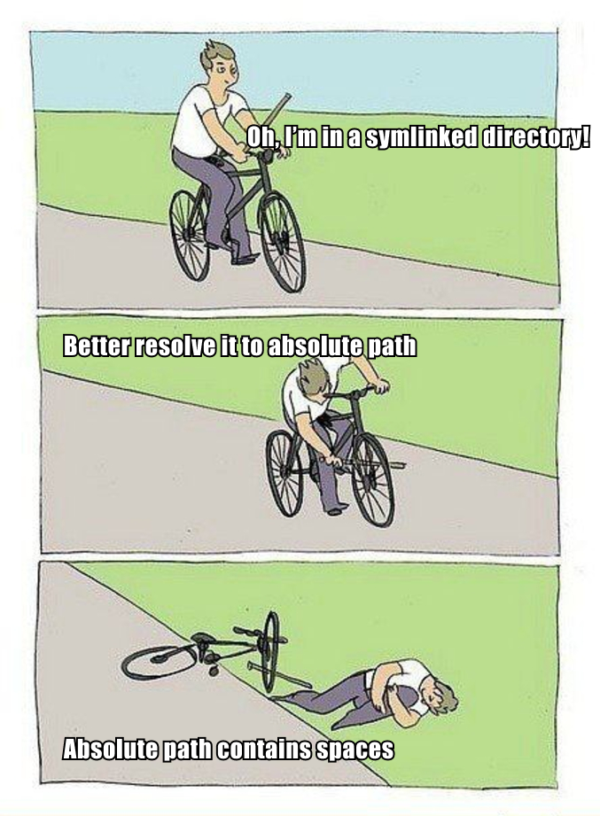
If you are a programmer, it’s unusable. First, you can’t in your right mind type THAT every time you need to cd. Second, it contains spaces! Which breaks all sorts of things, believe me or not, even in 2020. I can’t keep Fira Code in iCloud because of python scripts, I can’t keep Jekyll blog like this one there because of Ruby, I can’t run bazel, etc. Useless.
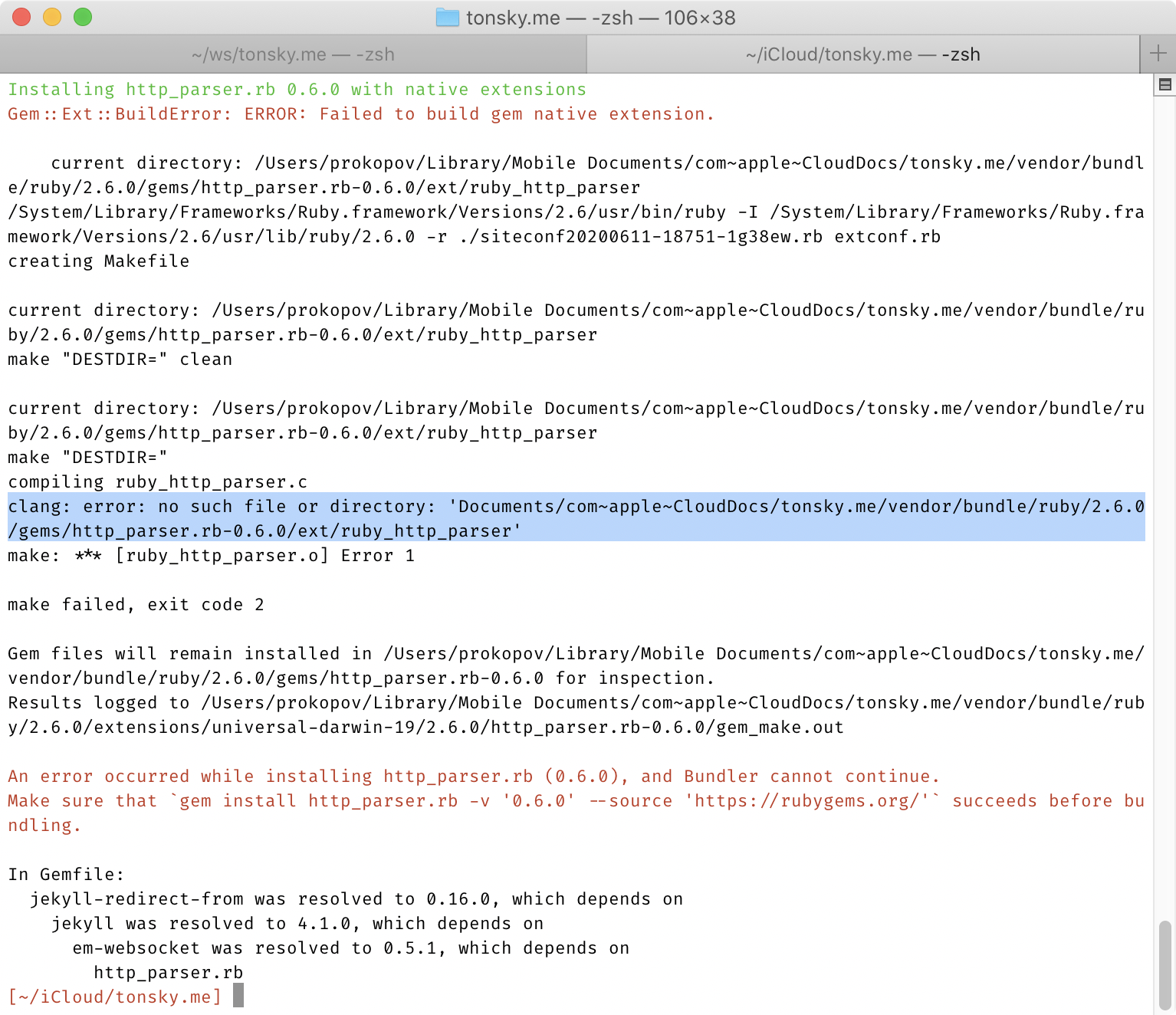
And if you think symlinking it to ~/icloud helps, believe me, it does not.
No registration
How do you connect two devices, if there’s no registration, accounts, email, etc? Simple! Each device has a unique id, generated automatically when you first run the program. Share this id with another device, let them share their, and you are good to go.
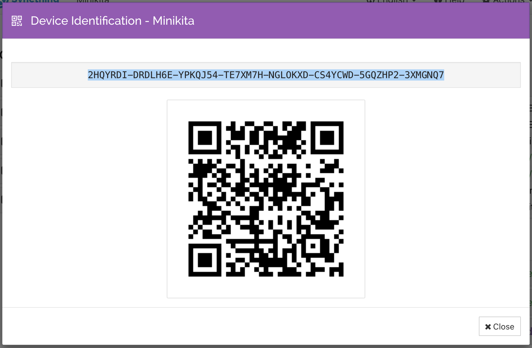
Best news? Those ids are not even secret. They are more like public keys, so you can exchange them freely. But the scheme only works if both devices know ids of each other.
What I like about this scheme is how beautifully simple and down-to-absolute-essentials it is. This is pure mathematics. But it’s also very convenient to use. There’re no emails, no forms, no unresponsive web pages, no invites, no expiring tokens, no failing/outdated/overloaded APIs, no password management, nothing to hold onto or “manage”.
Power mode
There’s power user mode! If you don’t care, there’s always a UI, and most of the things you can configure there. But if you’re a programmer and need more, you can:
- Install Synthing on a headless Linux server,
- Control it by editing XML config,
- Control it via REST API,
- Configure folder ignores via regular expressions.
All APIs and configs are well-documented:
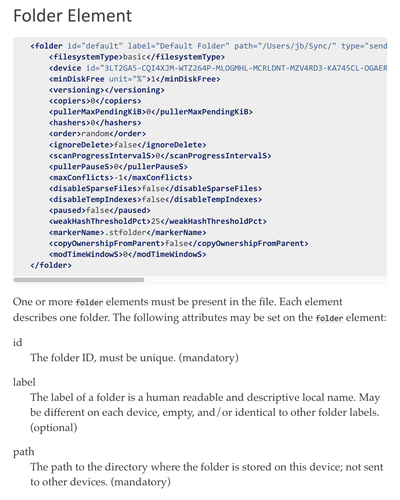
For example, this is my .stignore for workspace folder:
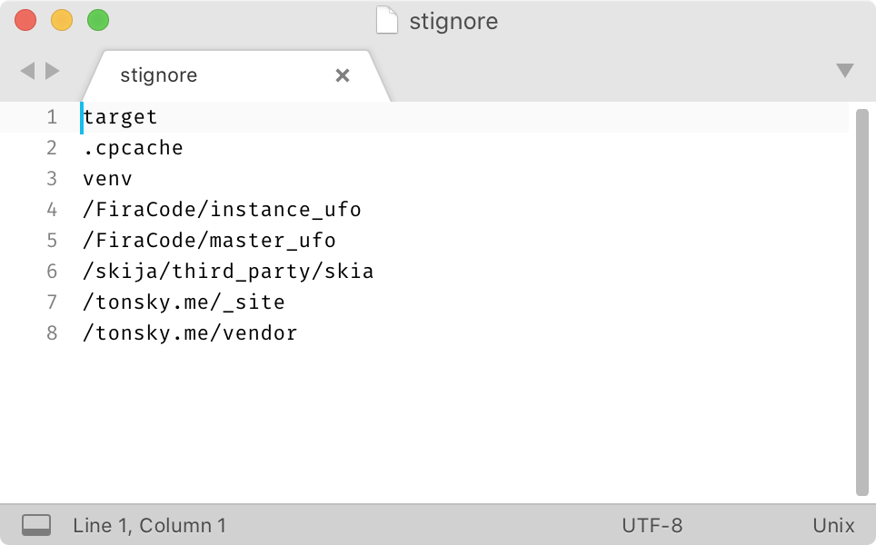
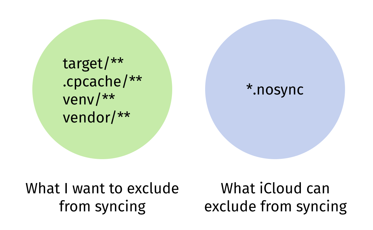
Configure it once and forget about generated classes, vendored dependencies and other caches syncing unnecessary forever.
In contrast, iCloud has a feature to exclude *.nosync files from syncing, but you know what? I usually don’t have files called *.nosync, that’s the problem:
And Dropbox? Well… I still have nightmares about this Dropbox UI:
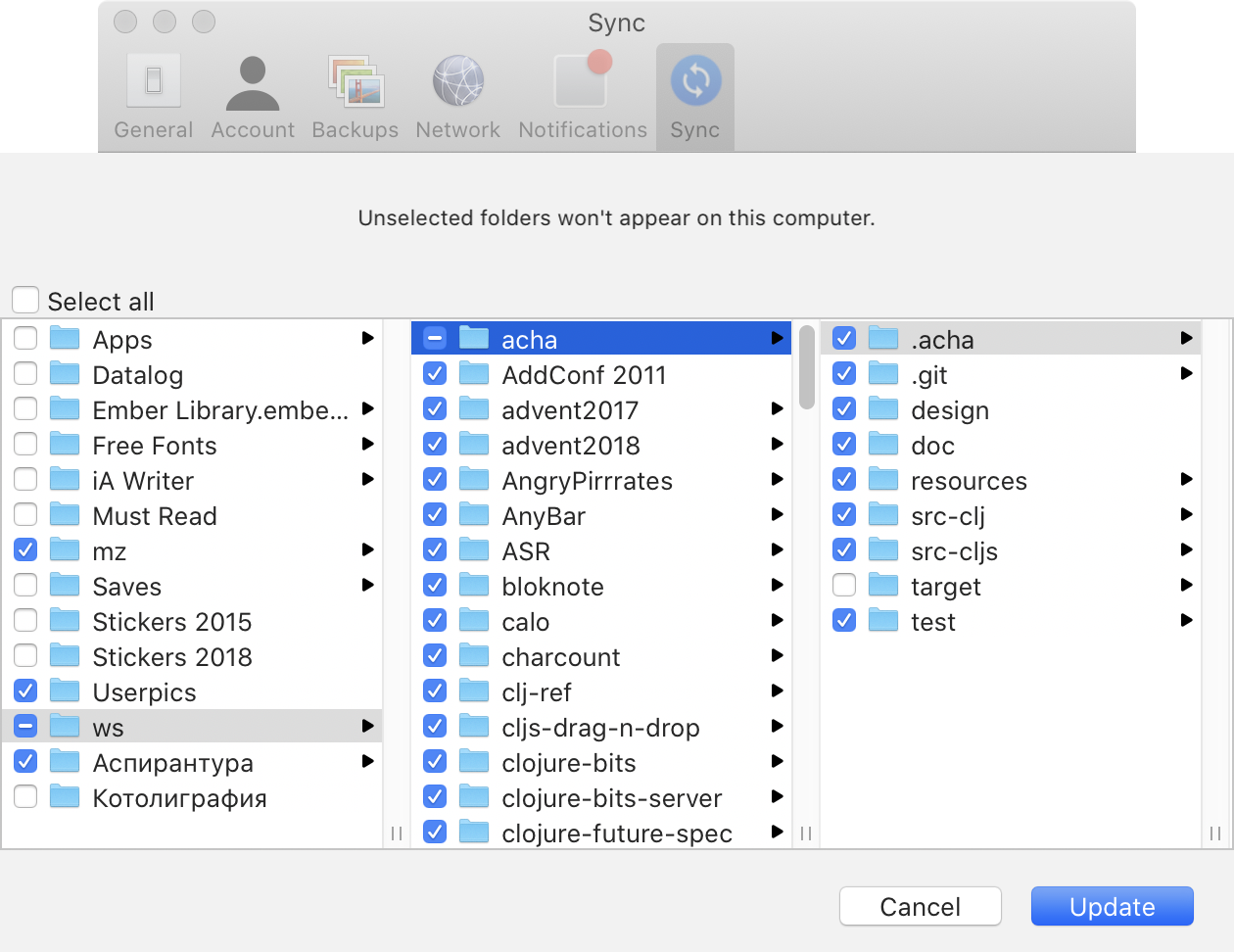
It’s kind of funny, how commercial apps have feature bloat but don’t have power mode. You can do more different things, but can’t configure them to your liking.
No upsell
Commercial solutions are interested in keeping users locked in and constantly upselling more features to them. As a result of that, you get notifications, features, popups. For example, on this screenshot, after I just installed Dropbox on a fresh machine:

Top to bottom:
- I already have an annoying red dot in the menubar,
- Link to another product (Paper), even though it has nothing to do with file synchronization,
- A firm suggestion I should enable notifications,
- A notification that says my Desktop app is ready for use?! I mean, I’m looking at it from the desktop app!
- Dropbox advertising some sort of trial,
- Dropbox selling me more space (even though it was 2 years ago and I have >50% free),
- Large “Upgrade” button,
In the mystic “For you” tab:

we see:
- Starred items? What is it, a high-school notepad? If I really wanted, I could tag files in the OS, but thank you.
- Calendar sync? Why on Earth would FILE SYNCHRONIZATION application wants to access my calendar?
Wait, there’s more:
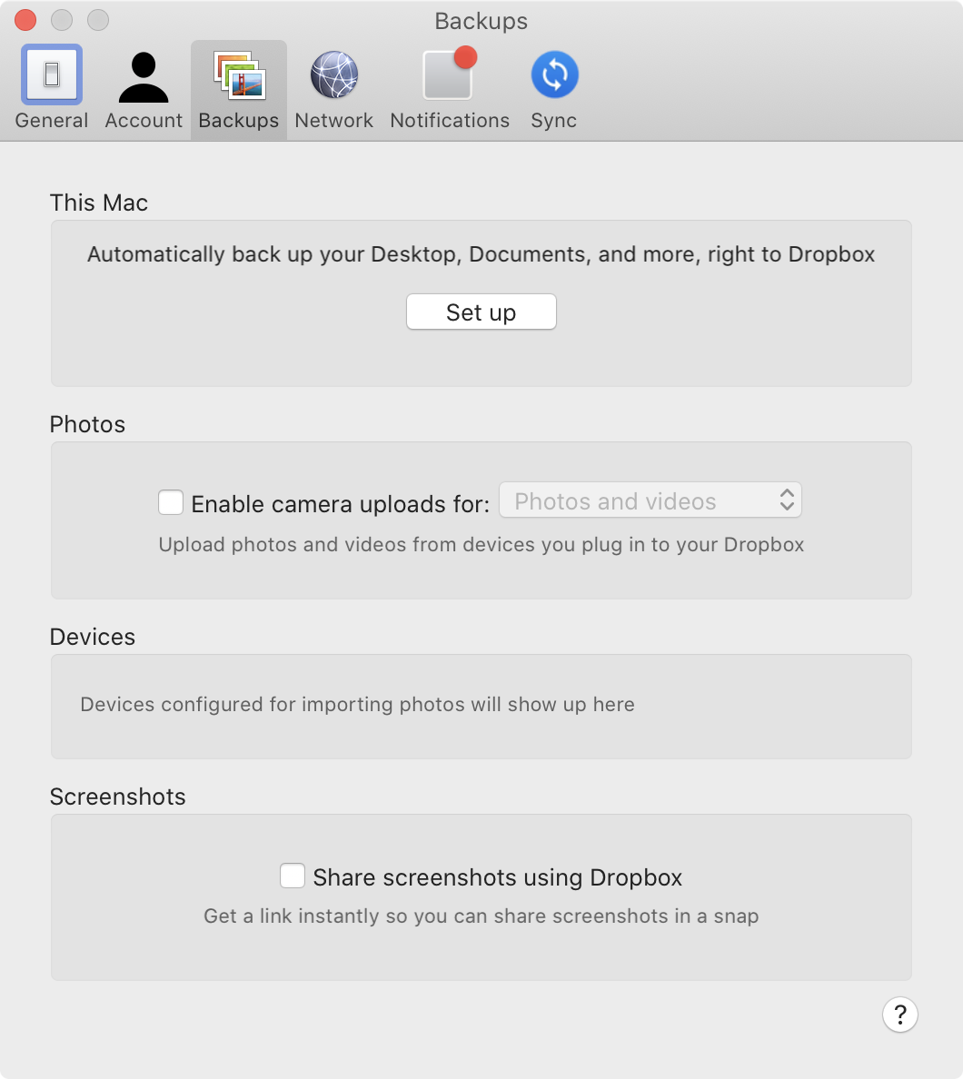
More “features”:
- Desktop sync,
- Photos sync,
- Screenshots sync.
These are at least file-like? I don’t understand why they have to be “special features”, though, if you already have an app whose primary task is to sync files. It already does that. Why are some files more special than others?
The answer is simple: the only way Dropbox can survive is by building and selling more features. You’ll never have peace of mind with them.
iCloud is much younger and doesn’t have feature bloat yet, but they are still interested in selling more Macs and iPhones. So they will always try to isolate you from the rest of the world. Expect weird restrictions and great inconveniences, like iCloud folder location or moving Desktop folder when you enable/disable sync for it.
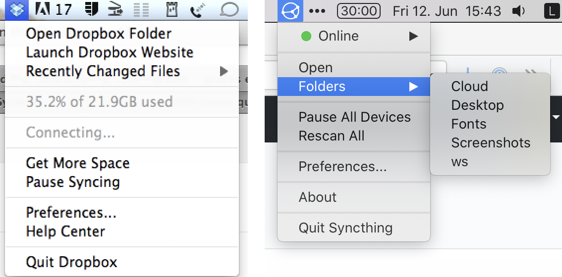
Syncthing survival, on the other hand, does not depend on making more features. They do one thing, but they do it well. Look, their menu1 looks exactly how Dropbox used to look when it still was good in 2012:
No lock-in
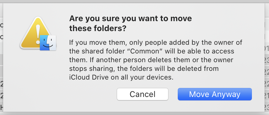
Another ugly thing both iCloud and Dropbox routinely do is trying to scare you from walking away. Those appear every time you move more than one file outside of iCloud folder:

And those are Dropbox versions:

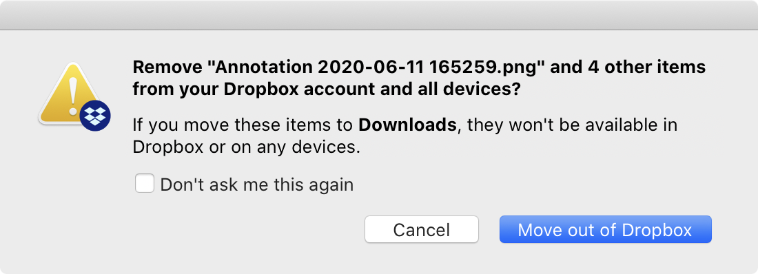
It might seem like they try to explain something, but they do not. They are scared you might be leaving and try to scare you back. The tactic is simple: question your every action, even trivial operations like moving or deleting files, display huge warning signs even for safe operations, long puzzling wording (“documents stored in iCloud will be removed from Mac”) so that you never sure what will happen. That’s some shady shit.
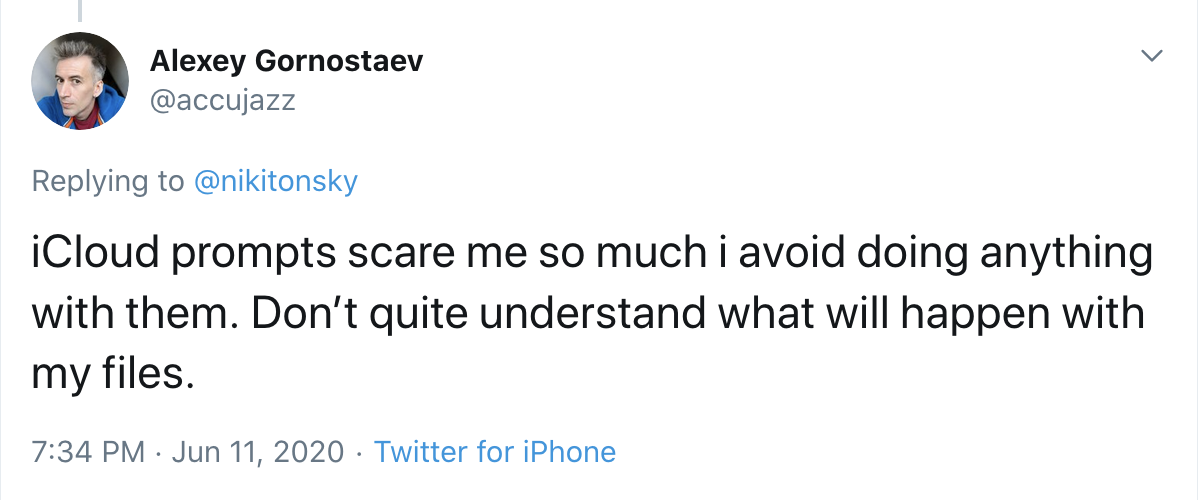
Syncthing, on the other hand, simply doesn’t care. They don’t get any money from you, so they are not interested in creating a need or constantly reminding about themselves. If you are looking for peace of mind, you can’t have it with commercial offerings.
Conclusion
Syncthing has reminded me how great computers can be if they are not made by corporations. It’s simple, predictable, sane, acts no-nonsense. You can configure it however you like and it always keeps you in control. It’s a pure function and it’s good at that. It’s free and open-source, but I’m much more happy to donate them €10/month than e.g. Dropbox. I would be a much happier person if at least half of the programs on my Mac/iPhone were like that.
