index.md 25KB
title: “God is in the details.”
url: https://medium.com/@buzzusborne/god-is-in-the-details-bc3a9a9a5d88
hash_url: 46670cc5f4
It applied to Ludwig Mies van der Rohe when he was designing buildings in the mid 1900’s, and it remains true in product design today. Though I don’t profess to know much about architecture, another likely commonality with product design is that it’s those same details that are the easiest to forget. But it’s those little things, the tiny minutia of detail, that ultimately make beautiful products, and beautiful houses.
Unfortunately, when I refer to the “details” in product design, I’m not talking about obvious design things; like colours, drop-shadows or placement. Instead I’m referring to something harder to define; experience and subconscious patterns that help the user feel more at-ease with an interaction. That detail might come in the form of a change in cursor, a “down” style for a button, or a helpful animation.
Whatever form that detail takes, I’ll bet that it wasn’t designed in Photoshop, or included in even the most detailed spec document. It’s the details that fall outside of titles like UX, or UI. It’s interaction detail that can only be found after using a product for real, then dedicating solid design and engineering time to building.
The details are difficult to include when you’re building a product; they’re expensive both in terms of time and technical overhead — which is why they’re rare. I spend my time in pursuit of these details, and as the designer and developer of Prevue, I have two luxuries which thankfully afford me the ability to obsess over them:
The first is that I have the capacity to use, improve and repeat. I’m not just talking about about the technical ability to implement the details — I’m also talking about having the time to do so. Sometimes an interaction will take me 50% longer to build, simply because I’ve spent hours obsessing about the animated states that occur over a 0.65 second duration. That’s not a luxury that many products can afford, or are willing to build into scope. Understandably so.
The second is that I use my product, for real, every single day. If there’s an annoying interaction, unnecessarily lengthy animation or a dumb user-flow — the chances are pretty high that I’m going to spot it. That’s the difference between functional testing:
“Does X do Y when you press Z?”
Versus true-to-life user-testing:
“Does the product intuitively help me achieve a task,
quickly, when I’m up against a deadline?”
But let’s be honest; using a product over-and-over, re-building functionality, and obsessing about the little things takes a lot of time — perhaps a luxury afforded to side-projects like Prevue, or products with too much money. They’re usually too hard to justify, and they’re definitely the first thing to be sacrificed when push comes to shove. That’s probably why Ludwig Mies van der Rohe only designed a handful of buildings that weren’t ugly skyscrapers — or why Prevue doesn’t ship features very often.
Having spent the last 7 years polishing my own side-project, I’ve learned where to look for “quick wins” when it comes to building detail-oriented design into larger, fast-moving commercial products. So instead of professing to knowing the perfect solution for forcing “detail-mining” into your release schedule, I thought I’d share a few places where you can start looking for improvement in your own projects, and why those details can make all the difference.
Visually Confirm Interactions
I’m going to start with something that applies to most products, yet is so commonly overlooked — button states. Even on a fast internet connection, there’s likely going to be a delay after pressing a button before the next action takes place; like a new page load, image upload, or some kind of event. Yet so few products give any visual confirmation that something is happening in the background.
Leaving the user hanging there, with no confirmation that their click actually did anything, is likely causing an unnecessary break in their journey. Whilst your servers are processing the action, your user is wondering whether their click actually registered. They’re thinking about your UI. That’s the very opposite of what you want.
The solution is to consider adding a button style for when the user has clicked, then another style or animation for when the submission has been made. At the very least, this shows that the user did, indeed, click.

Better still, if the action is likely going to take a little while — consider actually telling the user what’s happening. If you can’t explain something adequately through design, then there’s no shame in literally spelling it out.

Of course, attention to detail can run deeper than basic styling. A good example is when it comes to uploading images (an action that takes considerable time). In the event where user interaction is predicted to last into the 2+ second range, you might be better off faking success than making your user wait.
Use Subtle Animation
I could talk for days about the importance of animation, and the role it plays in helping users understand an interface — fortunately there are already plenty of better resources out there. Instead, I’ll just touch on the importance of subtle, almost invisible animation.
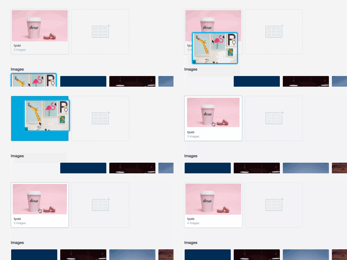
Take the following as an example; dragging an image to a folder doesn’t require feedback — it just works… but the user doesn’t know that. So a small animation that infers success is all it takes to alleviate uncertainty.

Animation can also help to indicate context, and transition between views. Instead of abruptly moving between states, risking losing the focus of your user, animation can help indicate where things came from.

Remember, Things Load
I recall reviewing the notes from a user testing session whilst working at Skype — where we had given people a drag-and-drop UI that saved ‘on drop’. It was so well-built, that the action of saving was almost instantaneous, and didn’t even require a loading state.
It was so fast, in fact, that users had a total disbelief that their action was successful — ultimately causing more confusion and anxiety than necessary. The solution? Pretending that the product was “thinking”, by adding a loading spinner on event of a drop. Even though it wasn’t.
That was a good use-case for a loading spinner. But most of the time, I see designers adding spinners, simply because they can. Most of the time, the user doesn’t need to be told that something is loading at all, and adding a spinning graphic is likely to command more attention than necessary.
Take the following example — the image, which is dynamically generated (slow) then loaded via AJAX, isn’t the point of the page… the text is. In this case, animation replaces the need for spinners or delays.

Optimise for Context
With any product that contains data, images or reporting — it’s likely that no screen is ever going to look the same. Yet when designing, we optimise for the best-case scenario, and often forget about when there’s no data, lots of data, or somewhere in-between. A good start is to ditch lorem ipsum, stock-quality images or perfectly rounded numbers in designs — and optimise for context instead. What does real data look like?
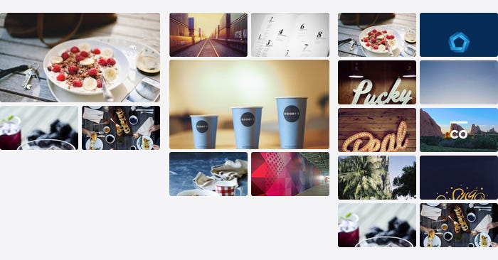
By considering the various states of a UI, you can begin to get creative about how to design accordingly. For example, a group of images in Prevue will change configuration depending on how many there are — to make sure that no matter what, the users images always looks nice.

Being context-aware isn’t just about looking good, either. Situational context is about identifying when and where extra attention should be paid to seemingly straight-forward, commonplace UI.

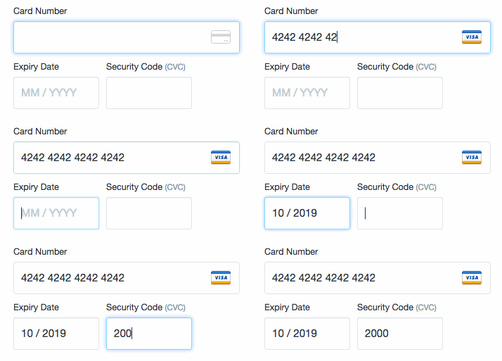
Take credit card forms for example — an area where extra care and attention can help users subconsciously understand what’s required of them, and prevent potential errors.
They’re also a perfect example of the value of real-life testing — there’s so much anxiety involved in entering secure, financial details that you simply can’t appreciate it until you try for yourself. When building the credit card form for Prevue (above), I tested several live versions in an attempt to perfect the experience. Every time, my card was actually charged $10 — which was a great incentive to get it right.
Context is key in a situation like this, and even the tiniest details can help users understand what they’re doing. For example:
- Format the numbers in the same way as on the physical card
- Preventing non-numerical characters, or more numbers than necessary
- Assuming MM/YYYY if MM/YY is entered
By considering what content might be displayed, the circumstances in which a task might be undertaken, or the feeling of the user at the time — you’ll be able to balance what looks best with what works best.
Respect Native Functionality
Your product should respect the functionality of the platform in which it lives — which means it definitely shouldn’t alter native functionality, like ‘hijacking’ your scrollbar, and should ideally complement existing user experience patterns.
For example, some people are used to using keyboard commands to perform common actions. So if your product allows the user to perform a potentially disruptive action (like moving content around, or deleting lots of text) — then you should strongly consider allowing Ctrl+Z functionality to ‘Undo’. The same applies for saving (Ctrl+S), pressing ESC to dismiss a modal window, or “clicking away” to close a dropdown or open menu.
By preventing your user from performing an interaction they’re familiar with — you’re creating an unnecessary pause; a moment of uncertainty for them.
There should also be no wrong way for a user to perform an action. For example, in both Prevue and Email Builder, users can upload an image by pressing the “upload” button — but if dragging a handful of images directly into the browser is what someone is used to; both products are built to allow for that too.
Building two or three different ways to perform the exact same action seems like unnecessary complexity, especially if you don’t even tell users that functionality exists. But when users are able to use your product how they want; you end up creating a seamless and fluid experience that people feel comfortable using. It’s why iPad’s were designed to emulate the familiar actions of leafing through a magazine’s pages.
Set the Tone
The final, and arguably easiest detail to implement, is tone of voice. In the midsts of designing tough UI and writing functional documentation — it’s easy to forget that you’re building a product for real people. Forgetting to add a human touch to your copywriting can result in error messages reading as though they’re composed by robots — reminding users that they’re dealing with a faceless machine, right at the moment they need the most guidance. Dave Greiner gave me some good advice about copywriting:
Read your copy aloud, and imagine you’re talking to your user face-to-face
It’s great advice for two reasons; firstly because you quickly spot when your message becomes unnecessarily lengthy, impersonal, or even rude. And secondly, because reading your message aloud will inform you when being overtly personal isn’t appropriate for the context either.
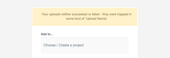
Take the following as an example of the latter — where I got the tone and context completely wrong for an error message:

In an attempt to be disarming and human, I wrote the above message to be displayed on the rare occasion when uploads failed due to server error. What I didn’t consider was context. At a point when the user had waited patiently for their upload to process, the app responded with an unhelpful and unapologetic response. If I was a user on my way to a client presentation, or up against a deadline, this would be less than ideal. This has fortunately been fixed, but not before I received a justifiably angry email from a customer.
Of course there are also occasions when you can have fun, and where a bit of personality can add value to an otherwise boring user experience. Like on the Prevue signup, where submitting the form without entering any details will return this message:

The details are the last 1% of a product. They’re hard to define, they’re impossible to scope, and they’re absolutely no substitute to thorough research, great design and clever engineering. They can, however, be the difference between an average experience and a great one.
The details will help your product feel natural, fun, intuitive, and even make your users feel smart. It’s in the small things, that easy-to-forget 1%, where you’ll find the key to making people fall in love your product.
In the details — that’s where you’ll find God.
