index.md 42KB
title: Copying is the way design works
url: https://matthewstrom.com/writing/copying/
hash_url: 4072b1e628
This is a very short book about copying. Its contents, unless otherwise noted, are licensed under
CC-BY SA 4.0(more on that in a bit). You can download, copy, remix, excerpt, change, and repost it however you see fit.
I
Charles Eames said it best: “We don’t do ‘art’ — we solve problems.”
To buy furniture in 1950, you had to choose between affordable and enduring, between rugged and fashionable. Charles and Ray designed a chair that was all the above and sold it for $20.95. They called it the LCW.
The LCW embodies the Eames’ obsession with simplicity in material and method. “We want to make the best for the most for the least,” they said. The design was revolutionary: in 1999, Time magazine called the LCW “the best design of the century.” Today, you can buy a brand new LCW from Herman Miller (the officially licensed manufacturer of Eames products) for $1,195.
Or, you can buy a chair called the “Fathom” from a company called Modway for $145.
Functionally and aesthetically, the chairs are identical.

© Herman Miller

© Modway
There’s an LCW from 1946 in MOMA’s collection. It’s one of the very first ever made. Most people would call it the original LCW.
Charles and Ray Eames sold the manufacturing rights for their furniture to Herman Miller in 1947. Collectors call the LCWs made in the ’40s and ’50s “originals.” But in some sense, these — and the more recently manufactured Herman Miller versions — are copies of that LCW in the MOMA collection.
And then there’s the Modway Fathom. It’s clearly a copy, an unlicensed one at that. But at $145 (the equivalent of $12.78 in 1947) it’s more affordable than the LCW was when it was first manufactured and sold. In spirit, it’s more of an original than any LCW: the best, for the most, for the least.
I’m sharing this story because it demonstrates a surprising fact: what makes something “original” (the first, the best, the most famous, the most true) or a “copy” (an identical copy, an unauthorized replica, an interpretation or a remix) isn’t always obvious — or important.
I’m a designer. As a designer, I feel the need to be original. If you’re a designer, or even if you’re just interested in design, you probably feel the need to be original, too. We tend to worship inventors and originators, designers who were trailblazing and innovative. And we copy them.
This oxymoron of a craft can drive a person crazy. There’s lots of space between originality and industry, authorship and acknowledgement, riffing and ripping. I wrote this very short book to explore that space.
Some people have been frustrated by copying, refused to accept it, and struggled with every ounce of their strength against it. Other people have used copying to their advantage, whether to improve themselves, build a community, or subvert authority.
I’ve only been able to have a career in design because I copied.
I hope that by the time you’ve finished reading, you’ll see how important copying is. Right or wrong, virtue or vice, copying is the way design works.
II
Steve Jobs copied. “Great artists steal,” he said, quoting Pablo Picasso (or was it Stravinsky? T. S. Eliot?). Jobs and Apple copied many designs in their early days, most notably from a Xerox research laboratory in Palo Alto. The story goes like this:
In the early 20th century, Xerox was a pioneer of office technology. By the middle of the century, computers were getting smaller and more affordable, and Xerox knew they’d have to work hard to keep their market dominance. In 1970, The Xerox Palo Alto Research Center — Xerox PARC — was founded to explore the future of the “paperless office.”
Within two years, Xerox PARC had designed a groundbreaking computer called the Alto. One of its innovations was a graphical user interface: programs and files were displayed in virtual windows which users navigated using a mouse. It was an eerily accurate picture of what personal computers would look like 30 years later.
Jef Raskin, leader of the Macintosh project at Apple, had seen Xerox’s work. He wanted Steve Jobs to see it for himself, and set up a meeting.
“I thought it was the best thing I’d ever seen in my life,” Jobs said of the Alto’s user interface. “Within ten minutes it was obvious to me that all computers would work like this some day.”
When the Macintosh was released in 1984, it featured a graphical user interface. Programs and files were displayed in virtual windows which users navigated using a mouse.
It was just like the Alto.
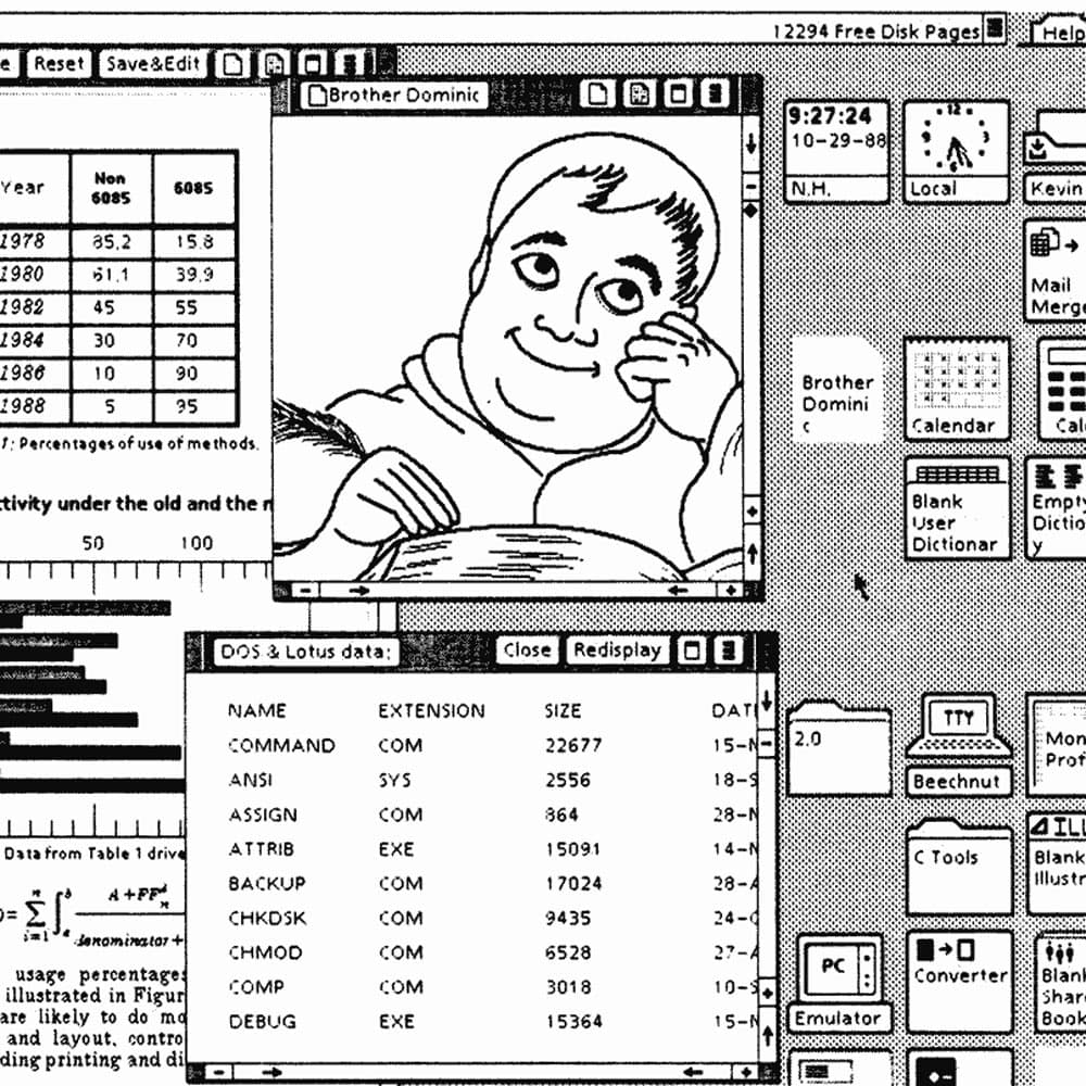
© Xerox
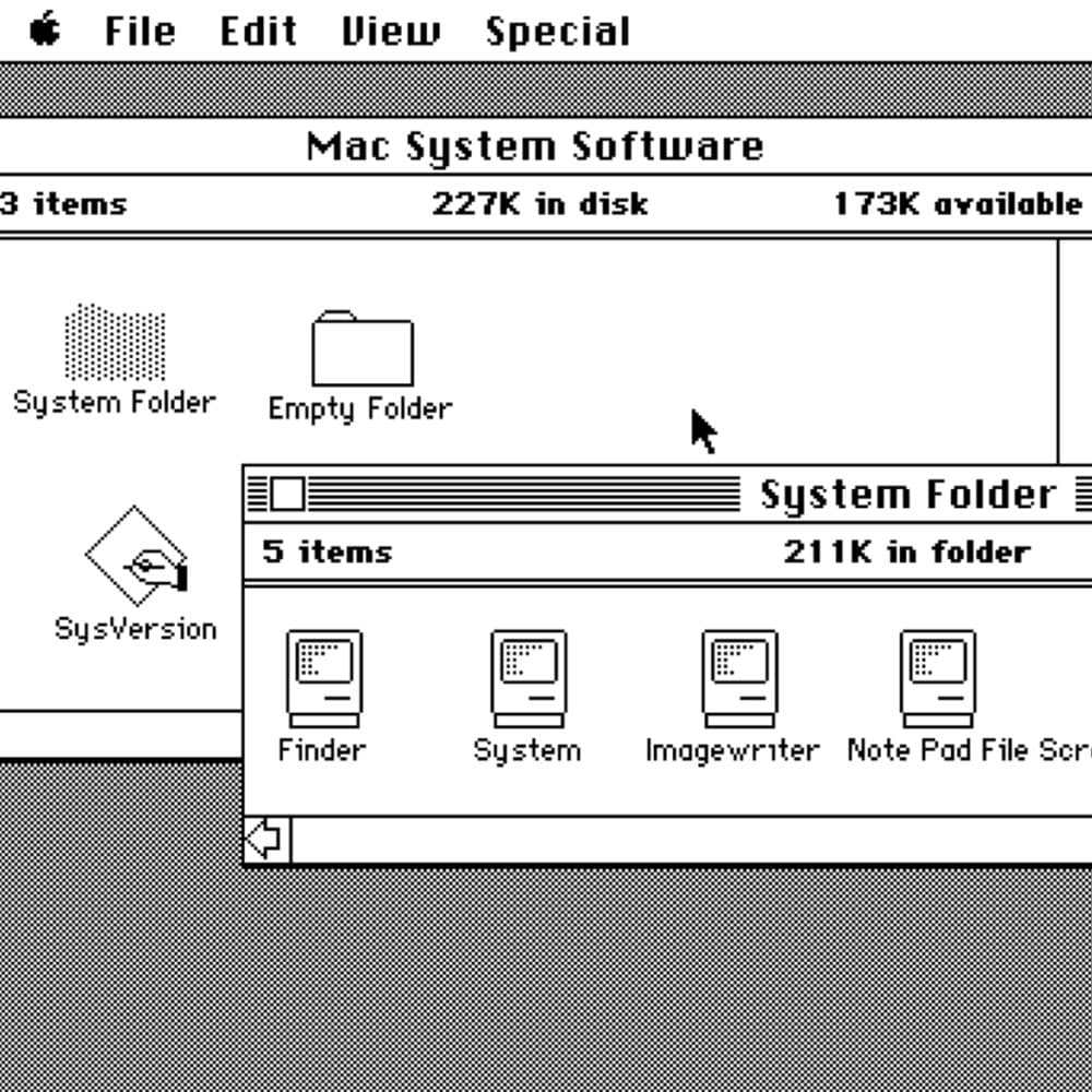
© Apple
Steve Jobs didn’t like to be copied.
In 1985, a year after the Macintosh was launched, Apple sued a company called Digital Research Interactive for copying the Macintosh’s user interface. Digital Research settled out of court, and changed the appearance of its icons, windows, and mouse pointers.
In 1990, Apple sued both Microsoft and Hewlett-Packard. The case was a repeat: Microsoft’s Windows and HP’s NewWave featured designs that Apple claimed were copies of the Macintosh’s operating system. But early licensing agreements between Apple and Microsoft made it unclear if any infringement took place; the case was thrown out.
In the middle of Apple’s case against Microsoft, Xerox sued Apple, hoping to establish its rights as the inventor of the desktop interface. The court threw out this case, too, and questioned why Xerox took so long to raise the issue. Bill Gates later reflected on these cases: “we both had this rich neighbor named Xerox ... I broke into his house to steal the TV set and found out that [Jobs] had already stolen it.”
The rampant copying fueling the explosive growth of consumer computers meant that by 1990, the desktop user interface was ubiquitous; it was impossible to determine who originated any part of it, or who copied who. The quest to stake their claim nearly consumed Apple. But when they emerged, they had learned a thing or two. Today, Apple holds more than 2,300 design patents.
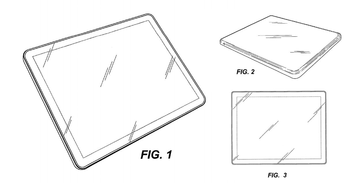
This story ends in 2011, with Apple suing Samsung for copying the design of its software and hardware products. One of the most remarkable claims: Samsung broke the law when it sold “a rectangular product with four evenly rounded corners.”
The court rejected Apple’s claim to own rounded rectangles. But it upheld the other claims, fining Samsung a blistering $539 million for patent violations.
Designers copy. We steal like great artists. But when we see a copy of our work, we’re livid. Jobs, on Google’s Android: “I will spend my last dying breath if I need to, and I will spend every penny of Apple’s $40 billion in the bank, to right this wrong. I’m going to destroy Android, because it’s a stolen product.”
Steve Jobs was unmatched in his visionary dedication to innovation. But he never came to terms with the inevitability of copying.
III
John Carmack had a different relationship with copying. For him, copying was a way to learn, a challenge to overcome, and a source of new ideas.
Carmack was — still is — a brilliant coder. He’s best known for programming the ultraviolent and action-packed first-person shooters Doom and Quake. Those games pushed the limits of consumer computers and defined a genre. But his first real breakthrough game was simpler, cuter, more whimsical. It was called Commander Keen.
Growing up in the early ’90s, I loved Commander Keen. It’s a goofy adventure game; you guide an eight-year-old boy wearing a football helmet and red Converses through alien planets, collecting candy bars and zapping monsters with a ray gun.
Keen began life as a copy of another of my favorite games: Super Mario Bros. 3.
Before Keen, Carmack was working for a subscription software company called Softdisk. Carmack and the other programmers at Softdisk churned out these games at a prodigious rate: today, blockbuster games can take more than five years to create; Softdisk produced a brand-new full-length game every single month.
In September 1990, Carmack decided that for his next game, he’d try to tackle a new and daunting challenge: scrolling. At the time, only consoles like the Nintendo had enough computing power to smoothly scroll scenery, characters, and enemies. The PCs were stuck to simple one-screen-at-a-time games. But if Carmack was going to sell millions of games like Nintendo had with Super Mario Bros., he needed to figure out how to recreate the effect.
So, on September 19, 1990, Carmack and another developer named Tom Hall decided to reverse-engineer the first level of Super Mario Bros. 3. Working through the night, Carmack coaxed his PC into scrolling and animating the world of Super Mario; Hall jumped back and forth between a TV screen and his computer, playing the Nintendo version, pausing to copy the images pixel-for-pixel.

© Nintendo

The next day, their coworkers were floored. Nobody had ever seen a PC game work like this. John Romero, Carmack’s closest colleague and future collaborator on Doom and Quake, called it “the fucking coolest thing on the planet.” He insisted that they keep copying until they had finished an exact replica of the full game. They were going to send it to Nintendo.
Unfortunately for Carmack and his team, Nintendo wasn’t interested in a PC version of Super Mario (their console version was doing just fine, thank you very much).
Disappointed, but not defeated, they resolved to build a better version of Mario. Starting with Carmack’s code for scrolling and animating the screen, the coders — calling themselves Ideas from the Deep, keeping the game a secret from their day jobs at Softdisk — put their Super Mario copy through a complete metamorphosis. In place of Mario, it starred eight-year-old Billy Blaze. Instead of turtles and mushrooms, the enemies were aliens called Yorps. Instead of eating a mushroom to jump higher, Billy Blaze hopped on a pogo stick.
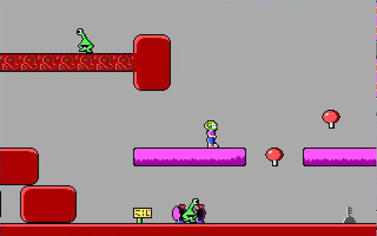
©3D Realms
The debut Commander Keen game, Commander Keen in Invasion of the Vorticons, was a huge success. More than 50,000 copies were sold, making Keen one of the best-selling PC games of its time.
Unlike Steve Jobs, John Carmack never changed his mind about copying. When his boss at Softdisk suggested that they patent Carmack’s PC scrolling technique, Carmack reeled. “If you ever ask me to patent anything,” he said, “I’ll quit.”
In a 2005 forum post, John Carmack explained his thoughts on patents. While patents are framed as protecting inventors, he wrote, that’s seldom how they’re used. Smart programmers working on hard problems tend to come up with the same solutions. If any one of those programmers patents their solution, the rest are screwed.
He concluded: “I’ll have no part of it. Its [sic] basically mugging someone.”
In his games after Keen, Carmack would go beyond simply refusing to patent his inventions. He would release the source code to the biggest games of the ’90s, Wolfenstein 3D, Doom, and Quake. Everyone is free to download, modify, or copy them.
IV
It’s one thing to copy. It’s another to encourage others to copy from you. Richard Stallman went even further — he made copying a right.
In 1983, Richard Stallman wanted to build a new operating system. At the time, Unix was the most popular and influential operating system, but it was expensive to license. Commercial licenses cost $20,000 — that’s $52,028 in 2020 money. And Unix was closed-source.
So on September 27, 1983, he wrote this message on the Unix Wizards message board:
Free Unix!
Starting this Thanksgiving I am going to write a complete Unix-compatible software system called GNU (for Gnu's Not Unix), and give it away free to everyone who can use it. Contributions of time, money, programs and equipment are greatly needed.
That Stallman would write software and give it to others to use, for free, was a radical notion. To drive the point home, Stallman wrote a manifesto, defining the idea of free software (“Free software is software that users have the freedom to distribute and change.”) The manifesto kicked off the free software movement.
The enduring innovation of Stallman’s movement was how he and his co-conspirators used software licenses. They flipped traditional licensing on its head: instead of prohibiting the copying or distribution of the software, a free software license guarantees the right of people to use, modify, distribute, and learn from its code.
New kinds of software licenses weren’t the only product of the free software movement. Ideological offshoots quickly spun out into new groups, like the open-source software movement. While Stallman’s free software faction was centered around a small group of hard-line progressive coders, the open-source movement was broad and inclusive, abandoning some of Stallman’s more political language to spread farther and find new audiences.
Permissive licensing and distributed source control form the engine of modern software development. They create a feedback loop, or a symbiotic pair, or a living organism, or maybe even a virus: the tools that software developers use are themselves products of the open-source philosophy. Free and open-source code replicates itself, mutates, and spreads instantly across the world.
The free and open-source software movements (sometimes combined into a single acronym, FOSS) were echoed by another revolution in how creative works are licensed. In 2001, Lawrence Lessig, Hal Abelson, and Eric Eldred started Creative Commons, a non-profit and international network dedicated to enabling the sharing and reuse of “creativity and knowledge through the provision of free legal tools.”
Nearly 20 years later, nearly half of a million images on Flickr have Creative Commons (or CC) licenses. Wikipedia uses CC licenses on all its photos and art. MIT provides more than 2,400 courses online for free under Creative Commons licenses. Countless millions of creative works have benefited from the open-source approach to licenses and permissions.
A decade ago, the open-source movement came to design. Michael Cho created Unsplash in 2013 to share a few photographs he thought might be useful to designers at startups; as of September 2020, Unsplash hosts 2,147,579 photos, and all-time photo downloads are well over 2 billion. Pablo Stanley recently released Humaaans, a collection of Creative Commons-licensed designs that can be re-assembled into editorial graphics. Feather icons, Heroicons, and Bootstrap Icons are all open-source and free-to-use collections of UI icons, used by designers to build websites and applications.
Meanwhile, the explosion of open-source design resources has been bolstered by a new class of tools for sharing and collaborating on design. Abstract is a version-control system for design that promises “collaboration without the chaos.” With Abstract, many designers can contribute to a single file, without worrying about overwriting each other's changes or always needing to download the latest versions. Figma, too, has just launched its community feature , allowing designers to publish files and download each other’s projects. It’s not hard to imagine how this will evolve into a designer’s version of GitHub in the near future. Other design tools have followed suit: both Sketch and Framer have launched community content hubs, laying the groundwork for distributed source control.
Copying is fundamental to design, just as it is to software. The rise of permissive licenses and version control tools makes it seem like copying is a new idea, an innovative approach in an industry that thrives on novelty. But the truth is, copying has informed art and industry for thousands of years.
V
In China, there are many concepts of a copy, each with distinct subtext. Fangzhipin (仿製品) are copies that are obviously different from the original — like small souvenir models of a statue. Fuzhipin (複製品) are exact, life-size reproductions of the original. Fuzhipin are just as valuable as originals, and have no negative stigma.
In 1974, local farmers in the Xi’an region of China unearthed life-sized sculptures of soldiers made of terra cotta clay. When Chinese archeologists came to investigate the site, they uncovered figure after figure, including horses and chariots, all exquisitely detailed. All told, there were more than 8,000 terra cotta soldiers. They were dated to 210 BCE.
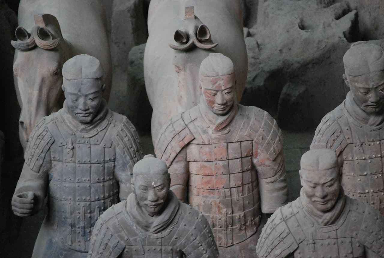
The terracotta warriors instantly became cultural treasures. A museum was built on the site of the excavation, but many of the statues were also exhibited in traveling shows. Hundreds of thousands of museumgoers all over the world lined up in galleries to see the soldiers.
Then, in 2007, a revelation rocked the Museum für Völkerkunde in Hamburg, Germany: some of the terracotta warriors it had on display were not the originals that had been discovered in the field in Xi’an. They were copies.
The Museum für Völkerkunde’s director became a pariah: “We have come to the conclusion that there is no other option than to close the exhibition completely, in order to maintain the museum’s good reputation.” The museum issued refunds to visitors. The event kicked off a rash of geopolitical finger-pointing: German officials cried foul, saying they were duped; Chinese officials washed their hands, since they never claimed the statues were originals to begin with.
The statues in the Hamburg museum were fuzhipin, exact copies. They were equivalent to the originals. After all, the originals were themselves products of mass manufacturing, made with modules and components cast from molds. Almost as soon as the terracotta warriors were discovered, Chinese artisans began producing replicas, continuing the work that had started more than 2,000 years before.
It’s easy to attribute this approach to copying as a cultural curiosity, an aberration particular to China. But copying was just as vital to Western artists.
Japanese art was one of the main sources of inspiration for Vincent van Gogh, himself one of the most influential European painters of the 19th century, if not of all time. Van Gogh was fascinated by the woodblock prints of artists like Hiroshige: stylized and vivid, they captured dramatic moments within compelling stories.
Van Gogh’s interest went beyond inspiration. To study the techniques mastered by Japanese artists, he copied prints by Keisei Eisen and Utagawa Hiroshige. He tried to replicate their bold lines, their energetic compositions, and their strong colors. For his copy of Eisen’s A courtesan, van Gogh started by tracing the outline of the courtesan’s figure directly from the May 1886 edition of Paris Illustré. For Flowering Plum Tree and The Bridge in the Rain, both copies of Hiroshige prints, he added borders of Japanese calligraphy he had seen on other prints.
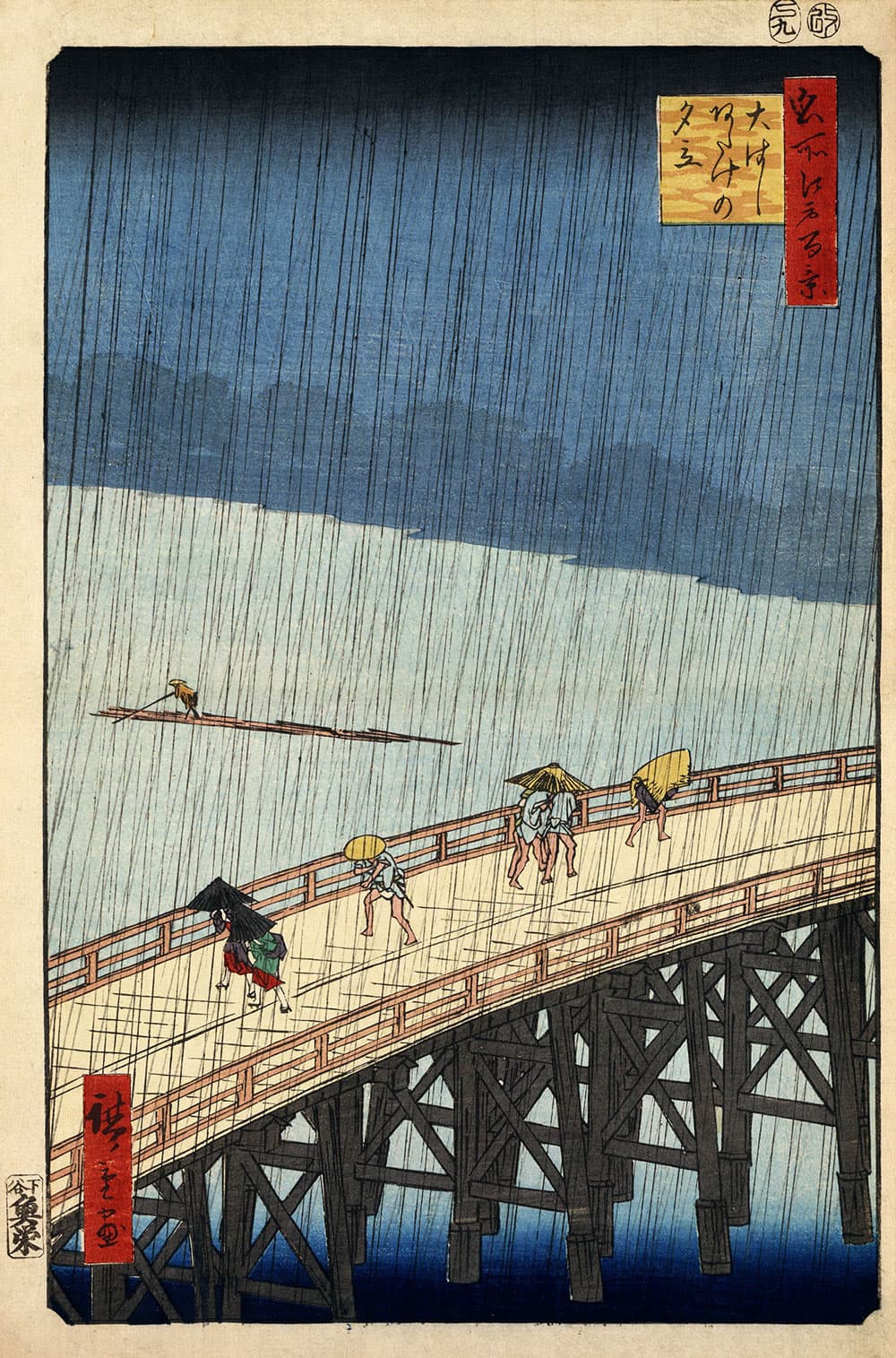
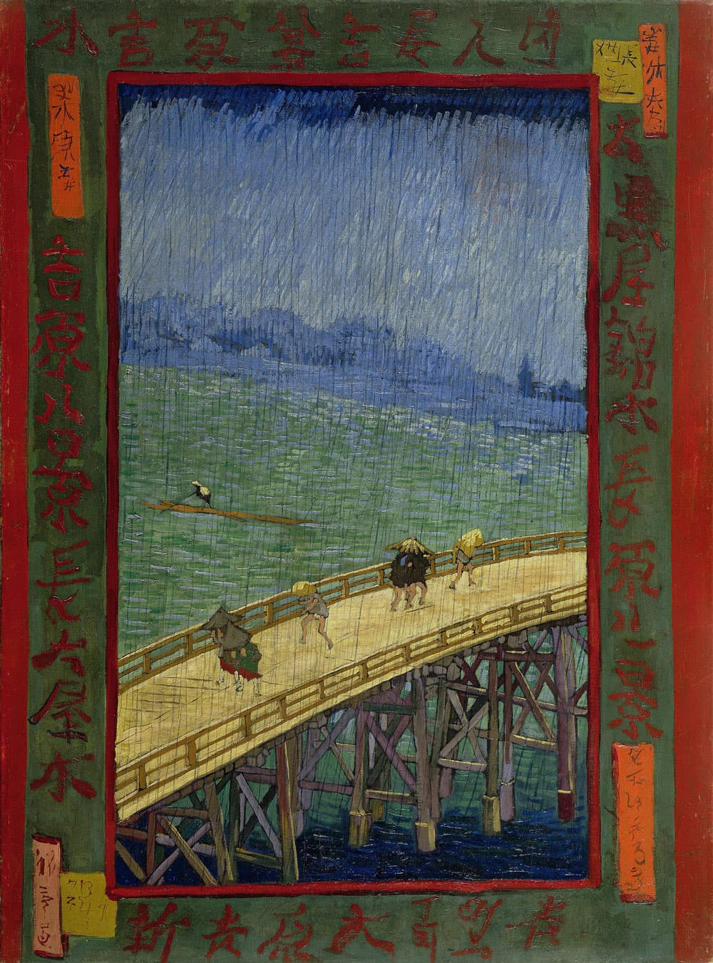
His practice with Japanese styles provided a crucial breakthrough. Van Gogh began to flatten landscapes. He outlined his subjects in bold black strokes. He painted with eye-watering colors. His interpretations of reality lit the art world on fire, influencing artists and designers to this day.
By copying directly from Japanese artists, van Gogh’s works became what we know today.
He was clear about this influence. In a letter to his brother Theo, he wrote: “All my work is based to some extent on Japanese art.”
There’s another word in Chinese for a copy: shanzhai (山寨). It’s translated to English as “fake,” but as with most Chinese words, the translation is lacking. Shanzhai literally means “mountain stronghold;” the word is a neologism, a recent invention, inspired by a famous novel in which the protagonists hide in a mountain stronghold to fight against a corrupt regime. Shanzhai products are playful, drawing attention to the fact that they aren’t original, putting their makers’ creativity on display.
Take the popular shanzhai novel Harry Potter and the Porcelain Doll; in it, Harry goes to China to stop Voldemort and Voldemort’s Chinese counterpart. It doesn’t pretend to be an original. It plays on its fake-ness: Harry speaks Chinese fluently, but he has trouble eating with chopsticks.
It’s easy to think of shanzhai as a Chinese quirk, but there are parallels in Western culture. One in particular, is a staple of the design community: the unsolicited redesign.
An unsolicited redesign demonstrates a designer’s ideas for how a well-known website or app could be improved. They range from single-screen aesthetic tweaks (like this take on Instagram) to in-depth case studies in UX, IA, and content design (like this redesign of Gmail’s mobile app).
Unsolicited redesigns copy the visual elements of the original as a starting point, then transform those elements to produce something new. Like van Gogh tracing Eisen, designers can pick up new techniques and approaches just by copying. But when a designer riffs on the original, they can create something new and inspiring.
The design community has a complicated relationship with unsolicited redesigns. On the one hand, they’re the mainstay of talented young designers looking to demonstrate their ability to think critically about design and apply their skills. Companies have used the unsolicited redesign to position themselves as leaders: in 2003, 37signals (creator of the popular project management tool Basecamp) created redesigns of PayPal, Google, and FedEx to critical acclaim: their redesign of an online car dashboard “could do for cars what TiVo did for television,” Jason Kottke proclaimed.
In rare cases, unsolicited redesigns turn into solicited ones. In 2018, Adam Fisher-Cox published a redesign of the digital signage of the AirTrain system at John F. Kennedy International Airport. The agency overseeing AirTrain saw the redesign and hired Fisher-Cox to implement it.


On the other hand, unsolicited redesigns are often looked down on. In a 2013 essay titled “Keep Your Unsolicited Redesign to Yourself,” Eric Karjaluoto argued that without acknowledging the constraints and incentives that guided an original design, the redesign is “utter fluff.” Those working on unsolicited redesigns “should know better than to waste their time.” There are countless other invectives against unsolicited redesign across the internet of design blogs.
In 2011, Andy Rutledge’s unsolicited redesign of The New York Times drew the attention of design pundits in countless blog posts and tweets. But if they disagreed with Rutledge’s conclusions, many defended his approach. “Sometimes we need to go crazy and mock up stuff that can’t absolutely work in its pure form,” wrote Stijn Debrouwere, because “a full-on rethink might be what we need to move forward.” Even Khoi Vinh, previous design director for the Times, supported the practice: “Unsolicited redesigns are terrific and fun and useful, and I hope designers never stop doing them.”
The shanzhai approach of copying — to learn, to invent, to comment, to make a statement — is just at home in the West as it is in China.
VI
Copying can be instructive, challenging, devious, or revolutionary. To me, copying is fun.
When I was young, I liked to trace. My mom would buy me tracing paper, and I’d copy comic book characters line for line. Pulling the paper back from the original was a rush. I drew this! With my hand! Sure, it was a copy, but once I signed my name in the corner, it was my copy.
These days, there’s automatic copy protection on just about everything. You can’t easily pirate Netflix streams, copy Kindle books, or torrent Adobe Creative Cloud. But designs are different. To copy a design, all you need is tracing paper.
In fact, you don’t even have to draw. Pull out your phone, take a picture, and save it to your Pinterest board. You can use a color picker to extract the exact shade from the design, use a physical or digital measuring tool to get the pixel-perfect dimensions, and use WhatTheFont to learn the typefaces in the design.
If you’re looking at a website, you can just click “view source” and see all the design decisions laid out in granular detail. That’s exactly how I went from tracing comic books to being a designer: I copied designs from websites I liked and pasted them onto my Xanga blog.
I copied because I could.
In my first design job, I copied relentlessly. I had created a music magazine with friends and tried to recreate the layouts I saw in my favorite mags. Wired was a constant source of inspiration: I obsessed over their typography. When I figured out that they were using Joshua Darden’s Freight Micro, I switched our magazine to use it, too.
Copying helped me develop as a designer without needing to go to design school. For lots of people too young for college-level design programs, or without the means to attend these schools or bootcamps, copying serves the same function.
And then, when folks like me wind up in a career in design, we find that copying is still useful. I eyedropper colors from Apple’s marketing websites. I start my color palettes from Google’s Material Design examples. I screenshot and recreate components from Facebook’s new redesign.
I don’t fancy myself to be the van Gogh of design, to be anywhere on the level of Stallman or Carmack in my approach to copying, possessing even one-one-hundredth of Steve Jobs’ ability to steal artfully, or to be in any way comparable to Charles or Ray Eames. But I can certainly copy all of their work. I can copy their mindset, their process, and their designs.
I can make cheap, small-scale facsimiles, fangzhipin, to demonstrate some quality of the original. I can make exact replicas, pixel-perfect fuzhipin, to learn how the originals and their creators work. Or I can create shanzhai, unsolicited redesigns, commenting and riffing on the work of others. All these copies have an important role to play in the process of design.
Whether you believe that it’s worthwhile or worthless to copy, whether you think that copies are a valuable part of the design community or a scourge, you are using software, hardware, websites and apps that all owe their existence to copying.
As long as there is design, there will be copying.
