index.md 10KB
title: The modern web is becoming an unusable, user-hostile wasteland
url: https://omarabid.com/the-modern-web
hash_url: 685842ac9d
In one of Gerald Weinberg’s books, probably The Secrets of Consulting, there’s the apocryphal story of the giant multinational hamburger chain where some bright MBA figured out that eliminating just three sesame seeds from a sesame-seed bun would be completely unnoticeable by anyone yet would save the company $126,000 per year. So they do it, and time passes, and another bushy-tailed MBA comes along, and does another study, and concludes that removing another five sesame seeds wouldn’t hurt either, and would save even more money, and so on and so forth, every year or two, the new management trainee looking for ways to save money proposes removing a sesame seed or two, until eventually, they’re shipping hamburger buns with exactly three sesame seeds artfully arranged in a triangle, and nobody buys their hamburgers any more.
Joel Spolsky from There’s no place like 127.0.0.1
As I keep browsing today’s internet, I keep recalling this extract. It’s the same thing happening with the modern web: If you add another advertisement to your pages, you generate more revenue. If you track your users better, now you can deliver tailored ads and your conversion rates are higher. If you restrict users from leaving your walled garden ecosystem, now you get all the juice from whatever attention they have.
The question is: At which point do we reach the breaking point?
And I think the answer is: We are very close.
Here are some of these websites, who have managed over time to turn the user experience almost unusable for anyone who doesn’t have an account.
Facebook #
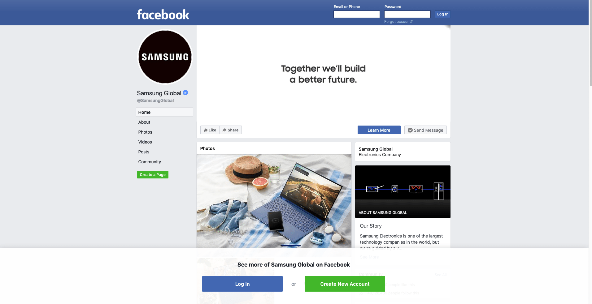
If you try to open a Facebook page without an account, this is what you get.
There is a blue header at the top that has the login form. But in case you missed it, Facebook has made another big white one at the bottom. Have you signed up yet?
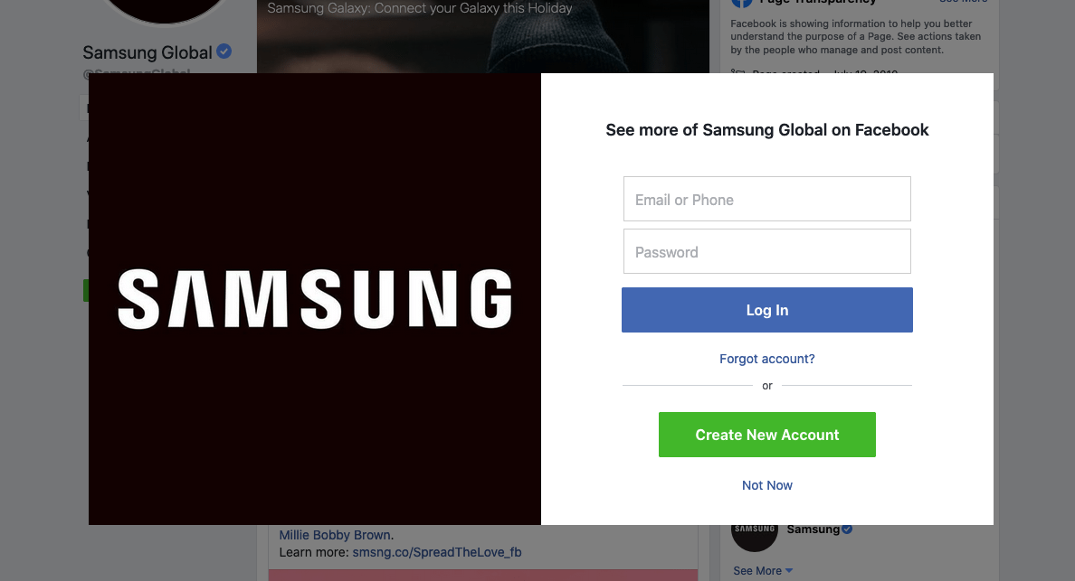
Let’s try to scroll a little bit more.
Wooha! Looks like you didn’t login, or you haven’t signed up yet! But there is a small “Not Now” button; because we know you’ll have to create an account later.
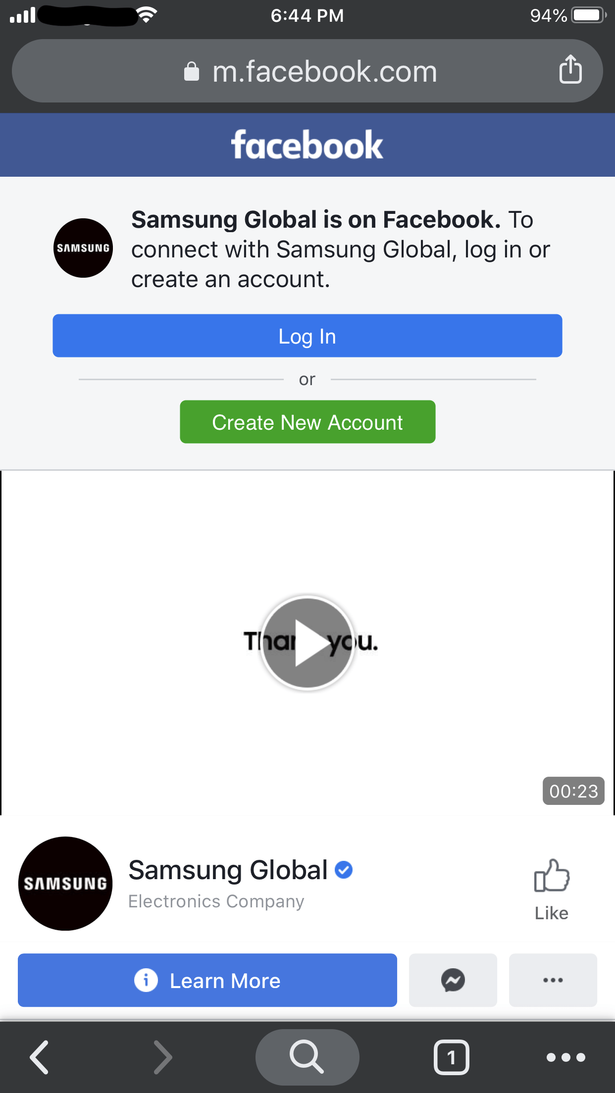
In case you think this experience is garbage; wait until you see the mobile version.
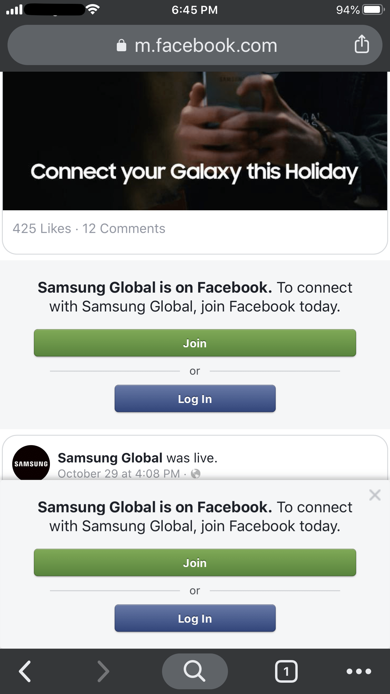
It’s not even clear, at this point, what the actual page is about. Let’s try to scroll a bit more.
There isn’t even any content in this page. Who designed and approved this mess?
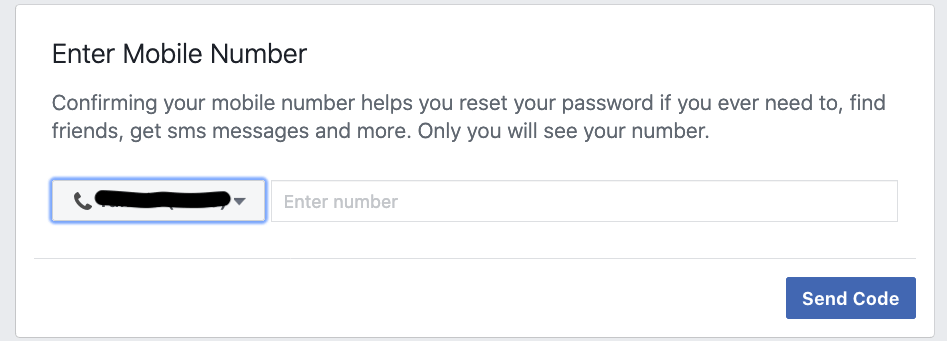
Think you are a smart-ass? You can create a fake account. But after a while, Facebook will think you are dodgy and ask for more identifiable information.
There is a solution: To buy a disposable phone number and use it to complete the verification. But this was the breaking point. At this point, I no longer bother.
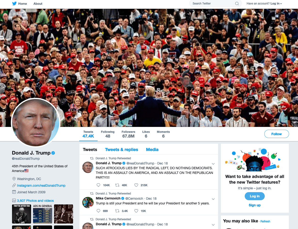
Is Twitter any better? Well, it looks like they are trying to strike a balance between giving you free data and their craving for your identity. You can still read the president tweets from his main page.
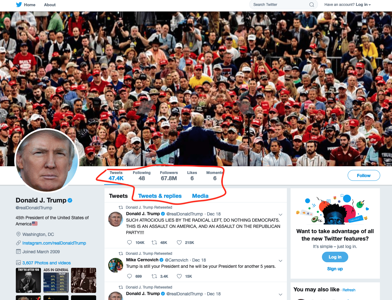
Trying to read his “Tweets & replies” is less fruitful though.
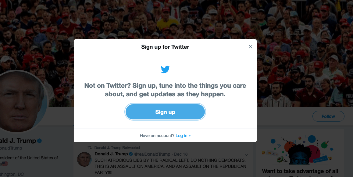
Actually, all of these buttons are inaccessible as for right now.
Extrapolating on the progress these websites have been making, it’s only a matter of time before nothing on Twitter is readable without an account. Maybe, you’ll get a spoiler in the future; but that’s it.
Medium #
Everyone is complaining about these tech-giants these days, but are the new incumbents doing any better? Medium is one these dudes and they claim to be the good guys.
Keep it ad-free
Medium doesn’t accept advertising. Please don’t market yourself or other products, feature advertisements, or include requests for claps or donations.
No ads? Time to check the terms of service.
In consideration for Medium granting you access to and use of the Services, you agree that Medium may enable advertising on the Services, including in connection with the display of your content or other information. We may also use your content to promote Medium, including its products and content. We will never sell your content to third parties without your explicit permission.
So they are advertising, but you are not. But hey! at least they are not selling your content without your permission. Don’t hold your breath, though. The terms can change at a moment notice.
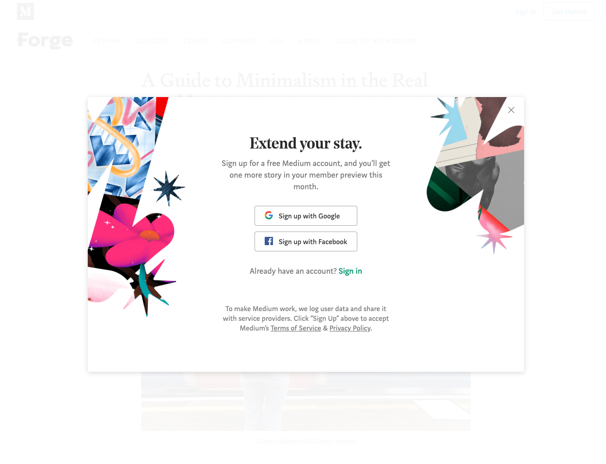
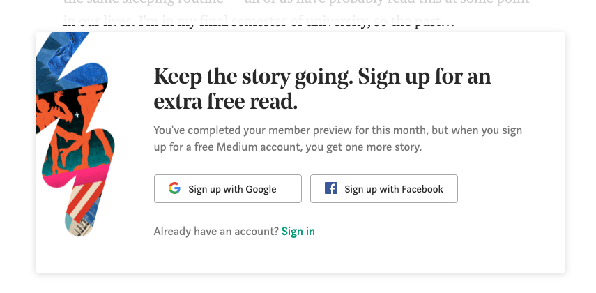
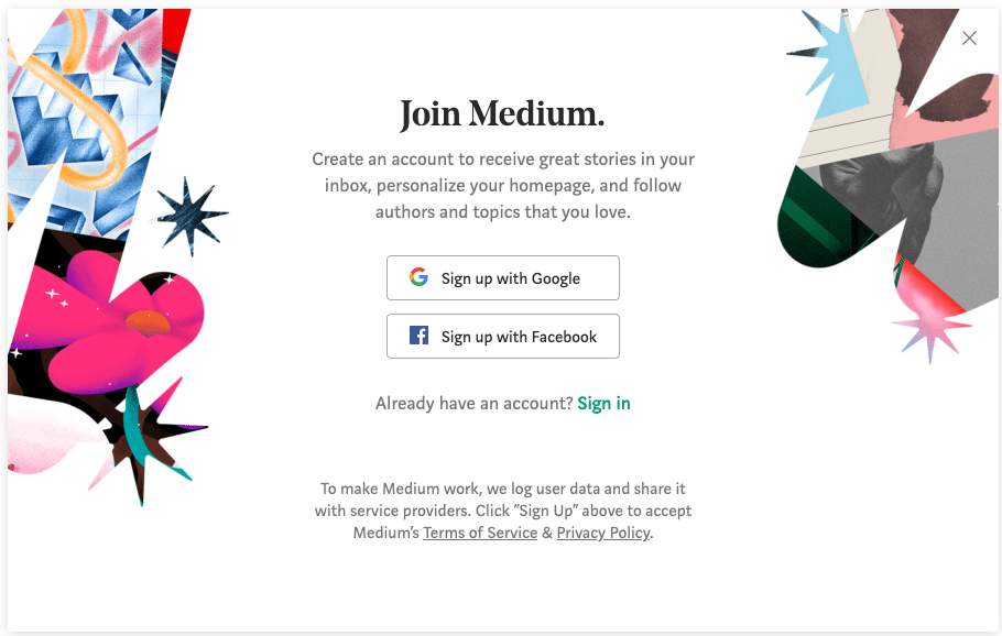
And in case you wondered what the experience of browsing medium is, here it is:
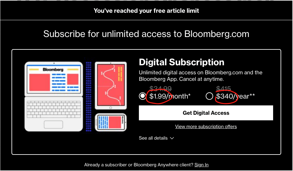
But what if you pay? That is you are not the product like they said. Let’s say you check a supposedly reputable company (i.e. Bloomberg) and think of opting for a digital subscription.
I mean it’s only $2/month. Less than what you’d pay for a cup of coffee. Or $340/year; here hoping you are very bad at math.
In a nutshell, if I can describe my browsing experience in 2019.
- Websites asking to login, register or enter an email.
- Websites asking for your phone number after you gave up your email.
- Websites asking to allow HTML5 notifications.
- Websites downloading 50Mb of data and making hundreds of requests to serve 6Kb worth of text.
- Websites that are not functioning because they have too much JavaScript.
- Websites that are not functioning because some of the JavaScript was caught by uBlock Origin.
- Websites asking to turn off the Ad Blocker.
- Websites asking to accept the cookies in 41,484 different ways.
- Websites asking to download their mobile app which is non-native and requires around 200Mb of storage.
- Popups to buy a deal or download some random crap.
- reCaptcha with random street images; that are sometimes impossible to solve.
- CloudFlare DDoS protection thinking I’m a bot.
- Youtube running a 2:30 minutes ad for a 3:30 minutes music video.
- Video or Website not showing up because I’m not in said country.
- Linkedin that keeps sending dozens of emails despite unsubscribing multiple times; and somehow evades the Spam filter
The breaking point #
I used to have a bank account with a local branch of BNP Paribas. When I signed up, I opted for various services like Online Banking, a “Platinum” debit card and other services. It made sense at the time to pay for online banking since it was long ago, but does it make sense now?
Worse, in the last few years, I have seen the bill for these services increase three fold in the last 3 years. And they started charging for small crap: Deposit money? There is a small fee. Deposit a check? There is a small fee. Withdraw from another bank ATM? The fee now is so high I have to think twice. Inconvenient.
Changing banks is annoying but not impossible. It’d be better if I can avoid such a thing but there is a point where the system breaks. And at some point, you look at the bill and decide: That’s the breaking point.

