
index.md 4.8KB
title: Proportional leading
url: https://stuffandnonsense.co.uk/blog/about/proportional_leading_with_css3_media_queries/
hash_url: 4ac7753495
msnbc.com’s article pages are divided into two area types. The first, it’s header navigation and branding feels right with its fixed-width layout. The second — the article content getting most the discussion, and the one redesigned for readability — cries out to be fluid.
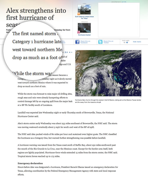
msnbc.com’s article page redesign
Browsers that support min-width and max-width the article content could easily be made fluid, for example (using my content element naming).
.content {
width : 80%;
min-width : 640px;
max-width : 1200px;
margin : 0 auto; }
Even the site’s fixed-width assets, including floated images, videos and other content could be made flexible using Ethan Marcotte’s solution for fluid images
img,
object {
max-width : 100%; }
Which brings me to my other problem. msnbc.com's leading (line-height) of its body copy is a little too open for my taste and, in a fluid layout should be responsive to the width of the columns of text. This problem, of proportional leading, is what holds many designers back from adopting fluid layouts.
Type tip: As the width of the measure (line width) becomes wider, leading (line-height) should be increased to aid readability.
How can we solve this, and adjust the amount of leading as the width of a browser window changes? With CSS3 Media Queries.
I won’t attempt to sell the case for Media Queries. Ethan’s Responsive Web Design does that better than I ever could, and has already inspired two of the best designers I know, Simon Collison and Jon Hicks to make their designs responsive. Instead I’ll simply add my two-penneth.
Proportional leading
First, the Proportional Leading example.
Next the HTML, nothing more than two sections, .content-main and .content-sub. One’s floated left, the other right.
section.content-main {
float : left;
width : 57%; }

section.content-sub {
float : right;
width : 38%;  }
Finally the CSS3 Media Query magic. As the measures in the main and sub content areas are different, we’ll set individual line-height units for each.
.content-main {
line-height : 1.8; }

.content-sub {
line-height : 1.6; }
Default line-height values (above)
Next decide on the increments where the leading should shift to a new value. We’ll be resetting line-height values in three steps when the maximum browser width is 1000px, 900px and 800px. (You’ll need to adjust these values to suit your own designs.)
@media all and (max-width : 1000px) {
.content-main {
line-height : 1.6; }

.content-sub {
line-height : 1.5; }
}
(max-width : 1000px)
@media all and (max-width : 900px) {
.content-main {
line-height : 1.5; }

.content-sub {
line-height : 1.4; }
}
(max-width : 900px)
@media all and (max-width : 800px) {
.content-main {
line-height : 1.4; }

.content-sub {
line-height : 1.3; }
}
(max-width : 800px)
Using a contemporary browser, one that supports CSS3 Media Queries, re-size the window and watch the leading change. The wider the measure becomes, the more open the leading.
Try Proportional Leading on your own fluid, responsive designs and let me know what you think. Oh, and don’t forget, there’ll be plenty more like this in Hardboiled Web Design.
Update
See also Ethan Marcote’s responsive typesetting example from his A List Apart article where he changes font sizes in response to changes in the measure (but doesn’t also adjust line-height.)