index.md 75KB
title: Dear Developer, The Web Isn’t About You
url: https://sonniesedge.co.uk/talks/dear-developer
hash_url: c29715f16d
If you’ve ever wanted to see an old lady’s personal anger and rants about the modern web industry turned into a talk, you’ve come to the right place.
This is Old Lady Shouts At Clouds to the nth degree.

History of the Web
I’m here to talk to you about the single biggest invention in human history. Some might say that invention is fire, or language. Some might say that it’s the printing press, or beer (actually, maybe it is beer). Some might say it’s the invention of electricity, or THE MASTERING OF THE ATOM.
Some others, perhaps less drunk on beer and easily accessible literature, might say that it’s the Internet (lower or uppercase “I”). But no, this talk is about the invention of the World Wide Web. The good old Dub Dub Dub. Or, as we all just call it in the late 2010’s - the Web.

Not a single invention
Despite what Tim Berners-Lee claims, the Web wasn’t a single invention 1. Yes, we know that one man says that he invented it (grudging thanks to Tim), but he did so on the back of a thousand other technologies, inspired and enabled to build by their previous work.
The Web is incredible. It’s incredible because it’s stupid. It’s a collection of very stupid, or more accurately, very simple, technologies, all chained together to make something much greater.2
Let’s take a - very simplified! (and possibly horrendously simplified) - look at the history of the Web, and the simple technologies that allowed it to be built. Oh, and because we don’t want to be going all the way back to Mog hitting Gog over the head with a handy stone, and proclaiming that little patch of scrubland HIS (inadvertently inventing the first nation state) we’re just going to concentrate on the last 100 years.

Telegraphs
Telegraphs. These things completely changed the face of the planet. A simple electrified wire, down which were sent simple beep beep beep messages.
Before the invention of the telegraph, messages to even the nearest city could take days. Messages to another country would take weeks, while messages to another continent would take months.
With the invention of telegraphs even the trans-continental message deliveries suddenly came down to seconds. Can you imagine how much of a headfuck that must have been? Months to seconds? People must have felt like they were living in science fiction.

Telephones
With the invention of telegraphs we had the cultural idea of messaging-at-a-distance-via-electricity. It wasn’t too soon before the same kinda lines were being used to transmit voices. Add a primitive microphone and speaker, replicate that at the other end, and you were suddenly able to talk to people thousands of kilometers away.
Soon after that we would realise that everyone was miserable and that no one actually wanted to talk to each other. But the damage was done.

Primitive computer networking
Soon after telephones become commonplace we saw the rise of computers. Almost straight away people thought about getting them to talk to each other instead of humans having to do the boring talking.
This led to the invention of the modem, which as you can see in the slide, was at first a bulky device that you placed your phone speaker and microphone into. The computer would then scream down the phone to another computer, who would happily scream back, singing the song of their people. Computers could now talk to each other!

Standardised computer networking
But bespoke one-on-one chat wasn’t enough for computers. No, they wanted group chats. Within a few years of the first modems the industry had standardised on a routine set of modem commands that allowed any computer to talk to any other computer. This was the Age of the BBS and the invention of TCP/IP.
The TCP/IP specification, incidentally, gave us Postel’s Law, possibly one of the most beautiful Laws ever:
“Be conservative in what you do, be liberal in what you accept from others.”

The Internet
Eventually all these computer systems and modems reached a critical mass, and they merged together to give us what we now call the Internet.
The INTERconnected NETwork of computers.

Application Protocols
Because the Internet allowed so many different types of things to run on it, it saw the rise of specialised application protocols. Things that we know and use today, and underly so much of what we do: SSH, DHCP, Telnet, FTP, and of course… HTTP.

Common naming conventions
Once non-technical people started using the Internet they asked the pertinent question of “what the actual fuck are all these numbers and dots about?”.
In response some clever boffin came up with the Domain Name System, while another figured out Email Addresses. These started to consolidate into Uniform Resource Identifiers, and now we’re all quite used to talking about Twitter Dot Com and orangefuckface@whitehouse.gov.

HTML
Finally, in this simplified chain of inventions, we reach HTML. “Vague, but exciting” as Tim Berners-Lee’s supervisor said, completely being chill about one of the greatest ever inventions, and the thing that provides us all with work as Web Developers.

The WWW is strong
So why do I mention all these things? Well, I really want to get the point across that the web is strong. Enormously, stupidly, strong.
We rarely stop to think about how amazing this is! It’s strong because of these simple, dumb technologies that it is built upon.

HTML is a bit suggestive declarative
Especially HTML. It is strong because it is such a simple, declarative language. It requests things from the browser. Flirts with it. It doesn’t demand, like other languages might.
Robust
It is this flirty declarative nature makes HTML so incredibly robust. Just look at this video. It shows me pulling chunks out of the Amazon homepage as I browse it, while the page continues to run.
Let’s just stop and think about that, because we take it for granted. I’m pulling chunks of code out of a running computer application, AND IT IS STILL WORKING.
Jut how… INCREDIBLE is that? Can you imagine pulling random chunks of code out of the memory of your iPhone or Windows laptop, and still expecting it to work? Of course not! But with HTML, it’s a given.

The WWW is everywhere
It is this robustness of HTML that has made the WWW so incredibly durable. It’s why it dominates the planet. In the conditions that HTML was born and raised in a strict imperative language would have broken 100%.
But HTML is utterly flexible, and survived.

No restrictions
Of course, it also benefitted from the fact that from the start there was no restrictions on HTML, HTTP, or the Web itself. Anyone could build a browser, and anyone could download a browser. On any machine, and on any Operating System.

Anyone could publish
On the early WWW anyone could publish anyting. This meant that from the start the early web was weird as fuck. It was a place of Geocities, Angelfire, and Neopets.
People stuck weird things on there and just didn’t care. Want to declare your love for Justin Beiber? Go ahead! Want to show off your stolen ladies shoe collection? Please, strange man, go for it.
People had never had such a way of easily expressing themselves before, and they jumped on this chance with gusto.

The dark times
But… this initial golden age of the web wasn’t destined to last.

Balkanised
What used to be free and weird slowly became commercialised and balkanised.

Browser wars
Some of you younger folk might not remember it, but at one point the WWW effectively got split between two browsers: Netscape 4.7 and Internet Explorer 5. People proudly added badges saying “Best viewed with [$BROWSER_OF_LOYALTY]”, and they didn’t have any shame about it. Devs had to build two versions of their site, just so that users of either browser would have an identical experience.

Frozen innovation
The Browser Wars were one of the most damaging periods of the WWW’s history. Browser development completely froze, and all innovation stopped. Most people took the web to be stagnant at that point. People left the industry in droves.
All was silent and still for eons.

Responsive Web Design
But then history restarted. And the restart came from an unexpected direction.
Because… the first iPhone appeared. While it wasn’t the first smartphone by any means, it was certainly the first popular smartphone. It completely changed the landscape of the Web.
Because it was our first great lesson in diversity.

Lessons in Diversity
Before that we had effectively assumed that a person on the WWW was making use of one of two browsers, on the desktop, using a mouse (and maybe a keyboard).
With the release of the iPhone we suddenly had to deal with a new browser (Safari for iOS), a new screen ratio (portrait, rather than landscape), a new screen size (just 320px across!), a new input interface (touchscreen, rather than a mouse), and everything else that went with using a site on a mobile device.
We had to learn about diversity of people and devices. We were forced to. Maybe not for the right reasons - we did it because we didn’t want to miss out on the market opportunity that mobile devices represented - but certainly with the right effect: we didn’t want to exclude people!
We fell on Ethan Marcotte‘s wonderful Responsive Web Design with the fervour of a drowning man clutching at a lifebelt.
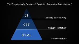
The Progressively Enhanced Pyramid of Robustness
This is a period of time that gave us incredibly robust websites. It was a period when we made the Separation of Concerns a reality.
The Pyramid of Robustness (© C Owen Enterprises Ltd) was a thing that we cared about. We put the things that were the most solid and reliable at the bottom of the pyramid - in this case server-generated HTML. We then added on a presentation layer, and then an interaction layer.
The pyramid ends up with those things that are most fragile, and least essential to the user nearer the top.
The fragile things don’t take the weight of things above, in the same way as we acknowledged that, well, you don’t place the table on top of the delicate vase.

Summer of Love
I’m not an Apple lover (she says, writing this on a Mac, like a good little web developer), but my goodness, the iPhone was a gift to us in that period. Diversity was understood; we loved and embraced different users and devices.
It was the Web’s Summer of Love!

Repeating the errors of the past?
“That’s a wonderful dollop of nostalgia there, old lady”. But my nostalgia makes me ask: are we starting the dark times cycle again?
Maybe in different ways, and with different technological aspects, but ultimately with the same results: we’re once again choosing to exclude people.

Multi megabyte average
We have got to the point where sites require ~2.5 megabytes to download, and the average content-based webpage is now bigger than a copy of Doom (a fully-fledged 3D shooter game).
Heydon Pickering reminded me recently that the 90s game Elite II simulated the entire Milky Way galaxy, and was still smaller than today’s average webpage.
So, @heydonworks just reminded me of Elite II and that you could once fit an entire ~galaxy~ into less space than today's average website. pic.twitter.com/YbQFe65cF4
— Charlie Owen (@sonniesedge) September 28, 2017
Most of this size is due to sites not offering srcset variants on their images, and not taking the time to optimise images on those that they do offer. Some of it is due to third-party tracking, advertising, and marketing scripts (marketeers may well be the most script-heavy people in any organisation).
A lot of it (but not most, by any means) is due to JS application bundles and third party scripts used to run a page (such as jQuery - still a major force on most of the web).
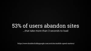
Site abandonment
But you might make a phhffftttt noise about a mere 2.5mb.
Yet consider this: we know that 53% of users leave a site if the time to user interaction is greater than 3 seconds.

Site slowness
Yet we just don’t care about page load times. Does the average site load within 3 seconds? Does yours? We don’t test this regularly. It is not part of our standard metrics in our industry, despite it being so tightly correlated with user satisfaction.
You might say “well, most users are on fast laptops, so it doesn’t matter”.
Nope.

Most average phone
They’re on this.
The Moto G4 is the most average device on the planet in early 2018.
It’s no coincidence that this is the phone that I use every day.

A11y-who?
It’s not just performance where we have inexplicably low industry knowledge. Accessibility is still an unknown to most developers. Personally, this one blows my mind - it is still somehow not a core requirement of being a front end developer. It should be a core skill, the default on any frontend developers resume.

JavaScript by default
And in 2018 we’re at a point where Javascript is being seen as a valid content delivery mechanism. For HTML content! Not interactive applications, not games, but simply long form textual content.
Instead of HTML being generated on, and delivered from, the server, a JS bundle is sent to the client, which is then decompressed and initialised and then requests data, which is then sent from the server (or another server, as now everything is a service) as JSON, where it is then converted on the fly into HTML.
Permit an old lady to rant here…

Commuting hell
Because to me, this is rather akin to building a Boeing 747 to commute to work.
Bear with me in this analogy. I’m not high, I promise.
It’s technically amazing that you’ve built this Boeing 747. It’s incredible that you’ve somehow squeezed it into your garage, and that you get into it every morning, and taxi out onto the road, and then thunder down your side street until you reach takeoff speed, and then you swoop up up up! into the sky, where you circle for a while until you find a spot at your company car park 2km away, and you then set it down, somehow, magically, into the parking space.
But…

Commuting fun
Wouldn’t it have been better, in every conceivable, practical, and financial way, to just buy a fucking bicycle?
Yes, it’s technically amazing to build your 747, or have your JS build a content page, but it’s utterly over-engineered and impractical for most occasions.
I’m laying it out here - I’m marking my line in the sand: JavaScript only when there’s no other choice. It shouldn’t be the first port of call for building a site.
All of this fascination with doing things JS-first has led to an awful situation of industry fragility.

Sites no longer robust
Sites are no longer robust! Sites that used to be resilient and tough now die easily.
Bad network conditions, blocked javascript, unexpected Content Security Policies, badly set CORs headers, JS blocked by network administrators (this happens so much more often than most realise), JS inadvertently blocked by adblockers, people turning off JS (Yes people do this. Yes it’s totally valid, and their right as a user).
All of these things can cause a JS-dependent site to fall over and die, 100%. A site that should be robust in the face of all these things, because of the declarative and flexible nature of HTML and CSS, is now fragile and brittle.
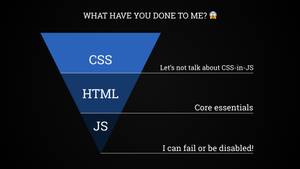
Upside-down Pyramid of Robustness
In fact, it’s as if we’ve turned the Pyramid of Robustness upside down. We’ve taken the most fragile part, and placed it at the bottom, taking all the weight!
The thing most likely to shatter catastrophically shouldn’t be taking the brunt of the weight.
If you told this to a physical materials engineer, or a construction worker, they would look at you in horror.

Upside down pyramid
They would look at your pyramid of code and say “You do know that you’ve built that thing upside down mate?” and then they would wander off for a smoke, shaking their head and muttering about “fucking muppets”.

npm install exciting-tech
In fact, this is a prime example of how we have a new collective focus. We have entered the Age of Programmerisation (yes, I just made that up, and yes it is terribly named). We now talk about tooling, packaging, and build tools. We talk about the “Modern Ecosystem” and Code Bootcamps. We get excited at the latest article on how Bleeding Edge Developer De Jour has done yet another sexy exciting thing that we must all jump onto doing.
You didn’t jump with the rest? Too bad, you’re now, like, totally uncool.
takes more anti-anxiety pills
Don’t get me wrong on this. It’s not like I’m not immersed in this culture myself. I use these things every single day. In my day job I write modularised JavaScript in ES6. I publish npm packages. I worry about state management.
But the cultural focus is on developer happiness, on developer fun and ramping up of code-related skillsets.
“How does this benefit users?” has suddenly gone missing from our vocabulary.

Suddenly exclusionary
We’re back to building sites that are not for everyone - huge, bloated sites, running fragile imperative code on the users local device. We have started to explicitly say “I think you should have this level of tech, processing power, and bandwidth before I think you’re eligible to use my site”.
Why? Because we want to have our fun with technology. Because we don’t want to think about “edge case” user needs.
“Edge case” is, to be frank, a phrase that should be banned from all developer conversations (and then tattooed onto the forehead of anyone who continues to use it).
When we say “Edge Case” we mean “Stress Case”. In their book, Design for Real Life, Eric Meyer & Sara Wachter-Boettcher point out that what we glibly call an “edge case” is normally an enormously stressful event for a user.
It often accompanies high emotions, stress, physical problems, financial problems, etc. When we discount and dismiss the “edge case”, we’re actually saying “I don’t care about that particular user’s stressful situation”.
n succinct example I saw recently was an American chap trying to use an airline website while holidaying in SE Asia. His flight had been cancelled and he were trying to rebook. However, due to terrible internet connectivity in his location the site just wasn’t loading - it was trying to pull down huge amounts of images and JS that were simply not happening on that connection.
#webperf in Cambodia: Yesterday I tried to book a domestic flight through various booking platforms and airline sites. Gave up after an hour and called a travel agent to book at a premium.
— Holger Bartel (@foobartel) December 28, 2017
He ended up calling a travel agent via telephone and rebooking. How much of an utter failure is your website if your drive someone off it and into another company’s hands?
Now imagine if that user had been able to disable Javascript and images and just have the HTML delivered. It wouldn’t have been pretty, but it would have worked.
I wondered about this, and went to check out the website in question.It turns out that no, you can’t. The website is fully JS-driven. If you disable JS then you just get a blank page.
On the same theme, here’s another example. An Angular JS app, failing because of flaky airport wifi.
Your fancy AngularJS apps are all very nice until you're trying to check in for a flight on flaky wifi: pic.twitter.com/eTEXHE5XL2
— Matt Andrews (@mattpointblank) May 5, 2015
These are real situations, for real people. And these are only the ones that are reported, because the people in the stress situations are web professionals. How many thousands, millions, of interactions occur every day that no one reports because they’re “just” regular users?

What can we do?
Maybe this is all a bit negative. You can only cope with so much bile can’t you, lovely reader?
What can we actively do, before it’s too late? What can we do to stop this cycle from restarting once again?
What can we do to make the web better?

Lessons in Humanity
If we want to make the web better for people then the most important thing that we can do is to learn the basics. Not of technology, but of our fellow humans.
Because, as we’ve show earlier, empathy is the most important skill that a developer can have.
Our job is 100% about people, about our fellow humans. How can we do an amazing job for them if we don’t understand who we are building for?

Lesson 0: Empathy is a learned skill
We somehow have this notion that empathy is something that you’re either born with, or you simply don’t have. Our friend Oppressive Patriarchy tries to tell us that 50% of the planet is incapable of empathy, that they should leave silly soft things like that to the ladies.
Which is of course, absolute bollocks.
The truth is that empathy is a skill, a muscle, that can be exercised and made stronger. If you practise empathy every day and your ability to empathise will only get stronger! So here’s a few exercise lessons for you to take time to think about and practise.

Lesson 1: Not everyone is alike
Exercising our empathy allows us to be more aware. More aware that not everyone is like us. Because, let’s face it, if you’re reading this then you’re likely a typical web developer: white, male, under 30 years old. Our entire industry is incredibly biased towards this one group.
But the rest of the world isn’t like you. It’s beautifully, hugely, impossibly diverse! This diversity means that assumptions based upon your own experiences and needs will not easily transfer into the rest of the world!

Lesson 2: Not everyone is rich
If you’re reading this then you’re likely to be quite rich. Hold on, hold on, read the rest of what I have to say before you storm off.
It’s true, we’re rich. Even compared to our national peers we’re considered at least “well-off”. In comparison to the average person on this planet?: we are fucking rolling in money.
Yes, I know it doesn’t feel like that always. This statement certainly doesn’t account for personal circumstance or other axes of oppression (I will receive tweets about this, I know it). But as a rule of thumb, it’s a valid one. Techies are more well off than most other people.
The way we just buy technology, how we will happily splurge on an Alexa or a new laptop. The way we buy new toys on a whim. Check out the tech apparel of your coworkers next time you see them. This is not normal compared to most people on this planet.
I’m not saying this to make you feel bad. It’s just something that you should bear in mind. If you ever think “ffs, why don’t those users with old laptops and browsers just upgrade??” thentry and think about their circumstances. Ask “can they afford to do so?”, and “will upgrading their laptop or phone mean that they can’t eat this month?”.
Empathy, and kindness, as always.
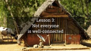
Lesson 3: Not everyone is well-connected
I’ve mentioned this a few times, and it is such a glossed-over part of our industry.
We tend to think that a “poor Internet connection” can only occur in a little wooden hut, somewhere in Africa or the Indian subcontinent. We have a hugely racist view that this kind of thing can only occur in rural zones of these continents. “Poor African people,” we think, while filling in our Oxfam donation forms, “How awful for them to not have broadband.”

30% of rural USA is on dial-up
But the reality of poor connections is actually closer to home.
30% of the rural USA is closer to dial-up speeds than broadband speeds.
Yup, you read that right. While urban broadband users are on 3.1 megabytes per second, rural users are lucky to achieve a mere 500 kilobytes per second in comparison.
Guess how long our average webpage from earlier will take to download on this kind of connection? Go on, guess.
Download of eons
Between 60 and 360 seconds, depending on the line quality.
Your website had better be amazing for it to justify that length of download time.
You can see why people might want to disable images and JS if it means a quicker download. You can certainly see why they pop a blood vessel when you send them adverts that they don’t want to view!

Lesson 4: Not everyone is able-bodied, or able-minded
Our final lesson. Not everyone is able-bodied, or neurotypical.
This is, like connectivity, heavily laden with stereotypes. Able-bodied people assume that a disability will manifest as someone using a wheelchair, or maybe as a completely blind person with a guide-dog.
But the reality is that disability covers a huge gamut of issues. Yes, wheelchair users and blind people are part of that. But a person does not have to be 100% a wheelchair user, nor do they have to be 100% blind. Percentages exist!
Disability also covers things like colour blindness, arthritis, motor control conditions such as Parkinsons or MS. It can be a neurological condition, such as ADHD, autism, or depression.
There are enormous varieties of disabilities. While you do not have to have a medical knowledge of each one, you must be aware of the range of problems.
Most importantly, you must be aware that everything you build could have an effect on any disability.

Empathy is a fundamental part of our jobs
Don’t worry if you haven’t thought about these things before. There’s no checklist on the human experiences! You may only just becoming aware of these things as you read this! That’s okay! We all have to start somewhere.
But once you’re aware, once you’re are aware of the diversity of people and experiences, you need to adapt your thinking.
Because, as an industry, we should know these things. We should all know these things. Because our job is about people. About building things for other.
Our job is fundamentally about empathy.

Building with Empathy
So, fantastic, you’ve got this far (well done!) and you’re ready to start designing with empathy! But what does empathy, accessibility, performance, etc mean in practise.
Well, let me give you a non-technical practical example.

Doorknobs
Yes, doorknobs. A weird analogy, but once again, please bear with me.
Now, both of these are lovely, beautiful things (as far as doorknobs go). Both of them are made from the same materials, both of them cost the same to manufacture.
However, one of them works for all people, while the other deliberately excludes huge segments of the population.
Such a simple thing, but offering a lever rather than a rotating knob means that the door becomes usable by people with arthritis, people who have hand or arm amputations, or people with hand/arm injuries.

Universal case
Designing for this most fundamental case helps a whole host of other use cases. Think about people carrying a baby, or having both hands full of shopping bags. The lever design helps them too.
So, given that both these doorknobs cost the same and look just as nice… well, what kind of fucking awful person would you be to deliberately not use the accessible version?
Similarly, when we build our websites we can build sites that are absolutely as beautiful as any other site, but we can choose to use techniques that work for everybody, in any condition.
Designing sites universally, designing them so that they work for people in the most stressful or dreadful situations, helps people in all situations.

Basic research
So how do you start on this journey of building products that are robust and universal?
To me the first thing is to figure out your users core journey (or journeys). On every website the user is trying to accomplish something. 3
Take, for example, a site for a new restaurant. What a visual treat to build! We can add sumptous photos of the food, we can add little animated waiters that march across the page, thrusting bowls of pasta into the air, while a full-screen video of the owner pleading with your to visit loads and plays in the background.
But in the end all the user wants to find out on the site is:
- The address.
- The opening times.
- The menu options.
That’s it.
It’s same for every sector. Find our what your user needs first, then build around that. Developing anything more than that is just… pointless.
Hopefully you’ve got access to UX research for the product that you’re building. 4 If you don’t, stop right here and go sort that out before going any further.

HTML
Now that we know them, get these core journeys quickly into HTML. And yes, I do mean just HTML, delivered fresh from the server.
Test this with your real users. Honestly! I know this may sound horrific to some (“we can’t show the user something this low fidelity!”) but HTML will form the basis your site! By testing the HTML, you’re testing the very foundation of your Robustness Pyramid. You’re testing the pure form - the essence - of your site.
When I say “this HTML will form your site” I mean that also. Don’t treat this as prototype code. Treat it as the first iteration of your website.
By designing with HTML initially you’re testing how your site works on the most fundamental level. You’re testing how it will work from an accessibility point of view. You’re testing how it will look to screenreaders. You’re testing how it will look in poor network conditions.
And you know what? This is 100% universal! Assuming you’ve built it using semantic HTML (and why wouldn’t you do that?) it will be completely accessible.
Now, let’s look at a real world example, from a project I recently worked on. Please prepare yourself, there is some unstyled HTML coming up.

Universal HTML
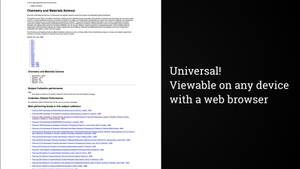
That’s it. Literally just HTML. It’s ultra basic, but it works on everything.
With no styling, no javascript, and even no images, there is literally nothing to fail, bar the server that generates the HTML and the network that passes it to the server.
You can build this initial iteration using your backend language of choice. I like seeing a variety of backend languages. Diversity of technology is a great thing!
Of course, there’s nothing to stop you componentising everything right now. You don’t have to write raw HTML files by hand to do this! (well, you can - I ain’t here to spoil your masochistic fun). Anything that can compile fragments into HTML is great. :D
Universal CSS
Now that we’ve created our universal HTML, let’s create some universal CSS.
Now, this is a slightly more tricky one, as there’s a few ways of delivering CSS that works for everybody. But for this example I’m going to show a two-stage approach. There are other equally valid ways to do this, but I’ll concentrate on the two stage for now.
This means that you initially just add an an ultra basic stylesheet. Call this your Core stylesheet. It’s barely more than styled HTML. Maybe it will add a max-width to your main content to stop it going fluid across wide screens. But no more than that. It’s all flow content, running vertically down your page, with no positioning attempted.
It still works everywhere - it’s still 100% universal!

Get creative
So now we have a working HTML and CSS foundation! The bottom layer (and a bit) of our Robust Pyramid is built!
Now you get to decorate those components that you’ve built. I just know that you’re itching for this! You want to make them look as beautiful as they are practical, don’t you?
What does support mean?
But before we go on, a word from our sponsor, Chris Heilmann. Take a look at some words that he barfed out:
“It’s not okay to block old browsers, but it’s a waste of time to support them 100%”
Too right, Chris! Because you might think that what I’ve been suggesting is that we support all browsers 100% the same, no matter what. Even IE6!
No no no, nothing is further from the truth. I’m lazy, just like every dev. I’m not going to waste time trying to make things look the same in Firefox or Chrome as a browser that even the manufacturer has left to die in the woods.
No, the trick here is to choose a cut-off point. Especially if you are a large organisation. And the place I work - Springer Nature - is very fucking large.

Cutting the Mustard
The BBC were pioneers in this. During their responsive redesign of the BBC News site they developed a novel technique called Cutting the Mustard (CTM)
What’s this? Well they serve up a core site: their HTML and some basicCSS - just the same as we developed in the previous section.
Then they then check to see what JS capabilities the browser has. It’s just a few simple lines of JS. They use this as decider as to whether the browser is “core” or “advanced”.
If it fails the test, then it’s core, and the user is presented with a fully working, but basically styled site. The styling is so simple, with no layout system, that it works on every browser ever made.
However, if the test passes then a more advanced site is offered. It uses the same HTML and core stylesheet, but on top of that is layered another set of CSS and a large amount of lovely JS.
Why do this? Well, the BBC want everyone to access their site. They are a public service broadcaster and are obligated, not just by morals and business sense, but by UK legislation to produce a site that works for all.
So how do you combine 100% universality with the fact that some people have ancient, terrible browsers that it would be a time-sink to support? CTM gives the answer! Only those browsers that are “good enough” receive the advanced features. Those that have poor technology support silently fail the test and receive the core version. No having to support ancient browsers!

Springer Nature browser support chart
Springer Nature (my wage payers) do something similiar to the BBC, but with a key difference. While the BBC do a CTM test based on JavaScript feature support, SN do a test based on a CSS media query.
This media query cuts across very specific browser lines. You can see this in our graded browser support table. In fact, it’s an exclusionary test, unlike the BBC version. It deliberately excludes those browsers marked as C-grade on our chart.
C-grade browsers receive only our core stylesheet - again, fully working, just without advanced layout styling.
Anything that isn’t C-grade receives our advanced stylesheet, and a much richer visual layout.
So why do we have anything other than Grade C in our support table? Well, this is the part where being a popular site with a global audience comes in. We explicitly offer full support to those browsers that we deem as Grade A: generally the latest version -1.
Grade X… well, grade X are between grade A and C. They probably will work with our advanced styling, but we can’t guarantee it.
So why do we do it this way? Well, for us it’s a matter of stability. Our core audience - scientific and academic researchers - like stability. By fixing our browser support we can say to them explicitly what is supported and isn’t supported, and route any and all bugs/complaints/weirdnesses against that support table.

CTM in action
Okay, we’ve talked theory on the SN CTM, so here’s that check in action.
Our crafted media query excludes the defunct Grade C browsers and serves up an advanced stylesheet to everything else.

Add the whizz bang
Now that we have a core stylesheet and we have an advanced stylesheet, it’s time to add the lovely Javascript layer. It’s the most fragile layer, so it goes last. But it has the fun aspects and the most potential to dazzle, even on a boring old scientific site.
Now is the point where we upgrade the forms so they post without doing a page refresh. Now is the time when we make pagination work without page reloads. Now is the time that we add in state management to our forms.

Conditional JS
Our CTM is done via CSS, so how do we replicate that in JS? Turns out that that there is a little-used matchmedia window property.
It can be fed a media query directly, which is great. But even more usefully it can be fed a media query from your HTML. We therefore hook up our CTM media query to our JS via matchMedia.
If our CTM test passes in CSS, and the CSS file loads, then our JS is loaded. Very neat, and very simple.
Why do it like this? Well, we don’t want our JS to even try to run if it’s an old browser, and we don’t want it to run before our CSS, or if our CSS fails to load. Upgraded Javascript is unlikely to be useful if the associated CSS isn’t there.
Once the JS is progressively loaded then we do lots of things. Add tabs, add animations, handle modal dialogs, etc. On this site the JS was relatively simple (but still modern and modularly written). But there’s no reason that it couldn’t be much more complex. As long as the base HTML site offers the core user journey then your JS can do lots of fancy extra things.

All progressively enhanced
There we go, a small, practical example of progressively enhanced universal design. Make a site universal from the start and then upgrade bits of it when necessary.
It works for everybody and it’s robust as hell.

Ultimate in agility
It’s also the ultimate in Agile software development.
None of this design-first and then try to code it up nonsense. That’s just waterfall with glossy packaging.
No, here you build, and test an MVP right from the start. You iterate, over and over and over, making it better and better each time.
It’s the ultimate in Lean UX.

Labour saving
It’s also the ultimate in labour-saving. For real - you only build what you need. No bootstrapping into expensive frameworks. No taking on other peoples heavy systems.
You only add more advanced things as they are proven necessary by user feedback and testing.

Fights FOMO
And because you’re only adding what you need to the page, it’s a lovely FOMO fighting mechanism.
Because we do get awfully excited by latest tech, don’t we?
Rather than asking “does this help my users?”, we drop a lot of crap onto a page because we read about it on hackernews.
I love this deliberate brake on getting over-excited.

KISS
Because we really do build things too complex. We desperately try to keep up with the large companies like Facebook and Google, crying ourselves to sleep at night that we’re simply not as good as them. We seem to forget that they’re generally overstaffed with overpaid and underworked techboys, enormous huge engineering departments! For some reason we beat ourselves up for not “keeping up” with them!
Oh, they’ve produced lots of lovely code for us to use. But with complexity comes fragility. They’ve got the resources to debug this stuff to hell. The rest of us generally haven’t. Keep it simple and save yourself the trouble.

Limitations?
“But this can’t cope with modern techniques!” you might say.
Sure it can. The biggest one you’re thinking of is likely state management. We do exactly the same thing as we did before. We make sure our forms work at a basic level in HTML, and then we enhance it.
State management solutions like Redux work perfectly well on vanilla JS sites.
It won’t work with something like React though, and I don’t cry about that.
This is a distinct robust design pattern, which we feel is durable and doesn’t lock us into a limited-life framework that will get replaced by something else in a year or two.
Excels
It excels in being robust and universal. It always works. Broken JS, blocked JS, no JS, poor networks, nothing can break this, because it relies on streamed HTML, and not all-or-nothing JS.
It’s lightweight and loves low powered devices.
It excels at being people-first!

What else can you do?
Even if you feel that lean progressive enhancement is somehow too much to commit to, there’s still plenty of things you can do to upskill your empathy and make you realise what costs there are to coding in certain ways.

3G performance
An incredibly easy one is to start simulating slow network conditions in your browser. You can do this in just one tab of Chrome (other browsers will vary) by opening the Network tab in dev tools and turning on “slow 3G”. Now you get to experience your site as the average person wandering around the average city does!
If you’re not on Chrome then try using Charles Proxy. A similar thing, but for your entire OS.

Use real hardware
If you can, test on real hardware. Your 3000€ Mac is vastly more than the average computer of most users. The iPhone X that you bought on the first day of sale is infinitely more powerful average phone that most people are making use of.
Don’t assume everyone has these amazingly powerful supercomputers! Make sure that your site runs well on the average Lidl laptop, because someone will be using it on that, and cursing your lack of testing.
Perhaps more relevant to the developer mindset - proving that your site can run on the lowest end computer means that your site will run like a bat out of hell on anything more powerful!

Listen to the web
Turn on your screenreader and start navigating your sites by sound. If you’re on a Mac then it’s as easy as hitting CMD + F5. Just try it now!
There’s a learning curve, and you’ll be embarrassed at first. But if you can learn DOM or framework APIs by heart, then you can do this.

Navigate with your keyboard
Similarly, start to navigate only by keyboard. I bet half of you reading this can already do this with Vim or Emacs. Using the tab and return key is an order of magnitude easier.
You will be amazed at how much better keyboard accessibility can be done when you’re actually using a keyboard every day yourself.

These aren’t my users!
Often when I speak about these issues I hear “but these are not my users” from an indignant developer. “I don’t have users like that” he will angrily tell me, apparently knowing each and every one of the users that visit his React-powered website.
“All my users are rich young healthy people, living in metropolitan areas with excellent network coverage” they tell me, gulping furiously they do so.
“These. Are. Not. My Users!”

Yes they are
I will always answer with “Yes they are!”. Because, sweetpea, you simply don’t know a users situation.
Oh, you can guess at it. You can assume that they’re always sitting at their desk, or always on wifi, or have time to concentrate on your task.
But knowing what their situation is? Uh uh, sorry, you don’t know that.
They could be on a borrowed device. They could be using a work computer that they have no control over. They could have suffered a temporary or permanent disability. You simply don’t know!
Look at it this way: you don’t just build cars that only work in the best conditions, do you? Imagine a car that only worked on a sunny day, on a flat road! Oh, how silly that would be. No, you build it so that it works in horrible weather, so that it works when driven over grass or a gravel dirt road. In the same way you don’t just build sites that only work in the best conditions.
You’re a web developer. Your job is to make a site work for everyone, in all conditions.
"We don't have any non-JavaScript users" No, all your users are non-JS while they're downloading your JS
— Jake Archibald (@jaffathecake) May 28, 2012

Conclusion
The web’s success is built on it being robust.
that robustness has made it work for everybody
As a result, people all over that planet now depend on the web, for their livelihoods, for social interaction, for their health.
It means we have to defend the web for everybody. It’s our job to keep it accessible and usable for all.

Keep it weird
We need to keep that beauty and weirdness going that first came with the early web.
Because the webs beauty comes from its diversity. A diversity of tech, and a diversity of people.
We’re the enablers and the defenders of that diversity.
So let’s not make it about us. Let’s make it about the wonderfulness of the Weird Wild Web.
Thank you.
Special thanks for the many photos from Women of Color in Tech. ❤️
