
index.md 11KB
title: #132: The contagious visual blandness of Netflix
url: https://haleynahman.substack.com/p/132-the-contagious-visual-blandness
hash_url: 4d3fa4020f
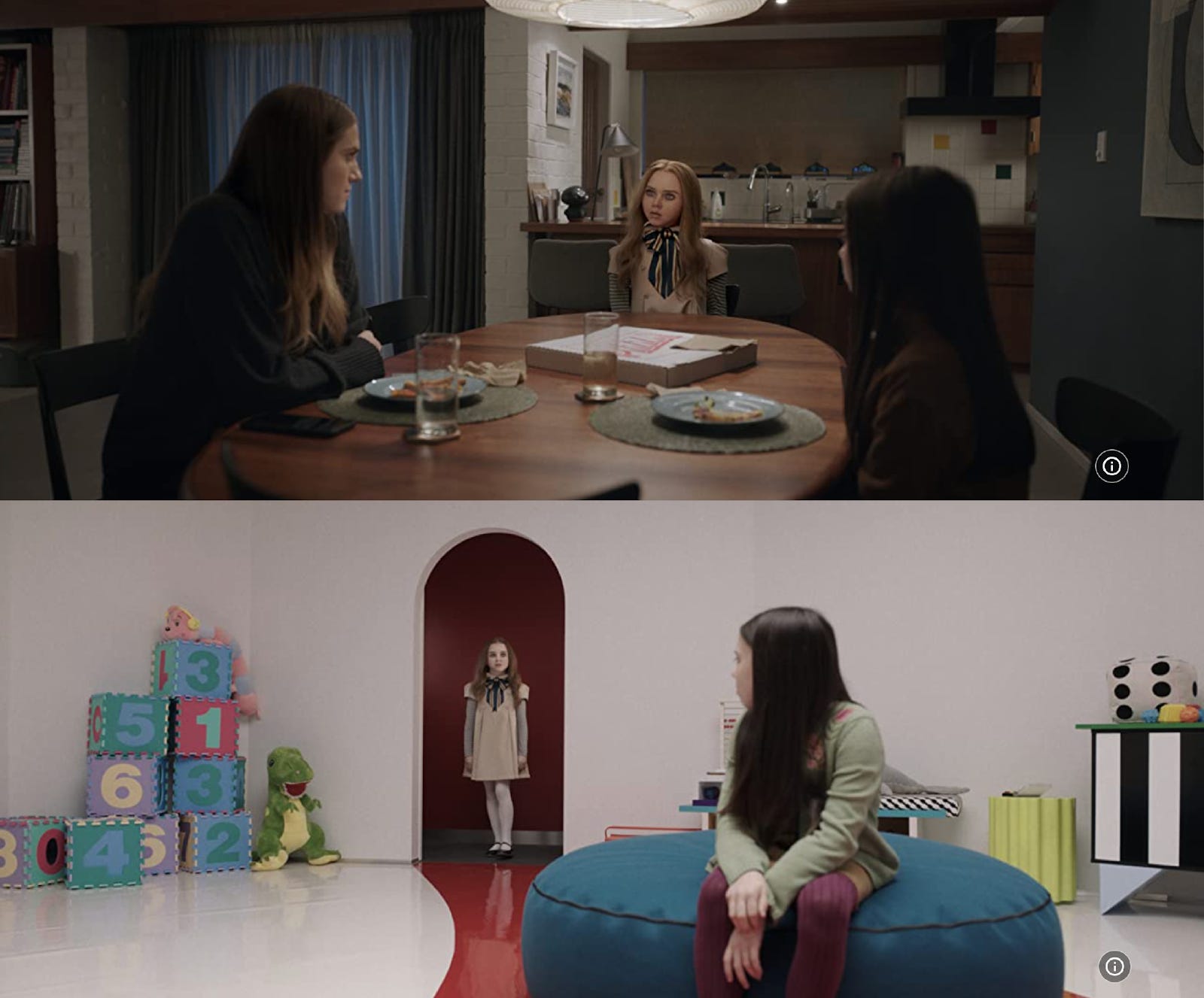
Last week I saw M3GAN, the new horror-comedy starring Allison Williams and a robot-doll in a blond wig. I liked it enough. The doll character is genuinely well-done—a seemingly hard-to-nail mix of creepy and campy—but I walked out of the theater with a vaguely empty feeling. I couldn’t quite place it until I started talking with my friends about where the movie was set, and I realized I had no idea. One answer is somewhere in Silicon Valley, given its bald critique of big tech. It didn’t actually feel like Silicon Valley, though. It didn’t feel like anywhere at all. (Update: I’ve been informed it’s set in Seattle, although it didn’t feel like there either.) Every backdrop was generic and crisp: the scrubbed tech-compound where Gemma (Allison Williams) works; the bland, Wayfair-decorated house she lives in; the clean, non-specific streets she drives on. I thought little of this while watching. The movie looked expensive and professional, or at least had the hallmarks of those things: glossy, filtered, smooth. Only after it ended did it occur to me that it seemed, like so many other contemporary movies and shows, to exist in a phony parallel universe we’ve come to accept as relevant to our own.
To be clear, this isn’t about whether the movie was “realistic.” Movies with absurd, surreal, or fantastical plots can still communicate something honest and true. It’s actually, specifically, about how movies these days look. That is, more flat, more fake, over-saturated, or else over-filtered, like an Instagram photo in 2012, but rendered in commercial-like high-def. This applies to prestige television, too. There are more green screens and sound stages, more CGI, more fixing-it-in-post. As these production tools have gotten slicker and cheaper and thus more widely abused, it’s not that everything looks obviously shitty or too good to feel true, it’s actually that most things look mid in the exact same way. The ubiquity of the look is making it harder to spot, and the overall result is weightless and uncanny. An endless stream of glossy vehicles that are easy to watch and easier to forget. I call it the “Netflix shine,” inspired by one of the worst offenders, although some reading on the topic revealed others call it (more boringly) the “Netflix look.”
In a 2022 Vice piece called “Why Does Everything on Netflix Look Like That,” writer Gita Jackson describes the Netflix look as unusually bright and colorful, or too dark, the characters lit inexplicably by neon lights, everything shot at a medium close-up. She discovered this aesthetic monotony is in part due to the fact that Netflix requires the same “technical specifications from all its productions.” This is of course an economic choice: more consistency = less risk. They’ve also structured their budgets to favor pre-production costs like securing top talent. So despite the fact that their budgets are high, they’re spending it all on what is essentially marketing, pulling resources away from things like design and location. This style-over-substance approach is felt in most things Netflix makes, and it’s being replicated across the industry. (For more proof of concept, Rachel Syme’s recent New Yorker profile of Netflix Global Head of Television Bela Bajaria is perfectly tuned and genuinely chilling. I’m still thinking about her “Art is Truth” blazer and lack of jet lag despite constant world travel. She’s a walking metaphor.)
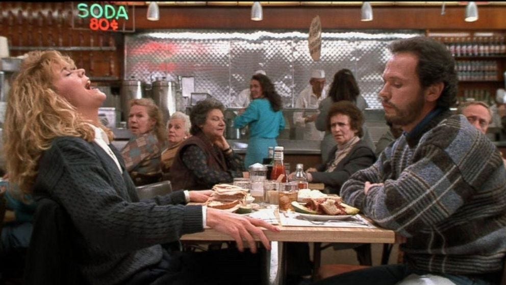
I’m not a film buff, so I write this from a layman’s perspective. But every time I watch something made before 2000, it looks so beautiful to me—not otherworldly or majestic, but beautiful in the way the world around me is beautiful. And I don’t think I’m just being nostalgic. Consider these two popular rom-com movies stills: The first from When Harry Met Sally, shot on film in 1989, the second from Moonshot, shot digitally in 2022.
The latter is more polished and “perfect,” but to what effect? It looks strange, surreal, both dim and bright at the same time. Everything is inexplicably blue or yellow, and glows like it’s been FaceTuned. Meg Ryan and Billy Crystal, meanwhile, are sitting in a downtown New York deli that actually exists. The image is a little grainy, the lighting falling somewhere in the normal daytime range, and they look like regular human beings. The table’s lopsided, the kitchen’s bent out of shape—the charm is earned. Today the restaurant might be built on a sound stage, or shot in front of a green screen, the appearance of daylight added in post-production. They could make it look convincing and moody, but it would lack character. It would feel somehow outside the world we inhabit every day, because it would be.
At the risk of using an anonymous Redditor as an expert, lol, I found a comment under a thread called “Why do movies look so weird now?” that captures a lot of these same complaints:
“Everyone is lit perfectly and filmed digitally on raw and tweaked to perfection. It makes everything have a fake feeling to it. Commercials use the same cameras and color correction so everything looks the same. Every shot looks like it could be used in a stock photo and it looks completely soulless. No film grain, no shadows on faces, and no wide shots. I have a theory that going from tungsten to LED lighting added to this as well. Tungsten allows for more accurate color in camera but LEDs are cheaper, cooler, and more convenient. So the solution is to film on a nice digital camera and fix the color in post. However, this makes for less creativity on set and less use of shadows. Green screens make it worse as they also require flatter lighting to work. Marvel films are very obviously mostly made in post and they all look very flat and not real. Even shitty low-budget 90's comedies look better and I think this can be attributed to the lighting.”
Another user mentioned that shooting on film required a level of forethought, planning, and patience that digital simply doesn’t. Similar to the predicament brought on by smartphone cameras and our now-endless photo rolls, the result is more, sure, and at higher fidelity, but not necessarily better. A photo today has never been worth less. I’ve long believed that constraints can improve creative work. But today’s shrinking production budgets, paired with the limitlessness of computer technology, aren’t inspiring scrappiness. They’re inspiring laziness. It’s too easy to fix things in post. Why wait around all day for the light to be just right when you can make it look half as good in Final Cut Pro for half the price? There’s an expansive possibility to digitization that defies the logic of constraint.
That the film and TV industry is obsessed with making as much money as possible isn’t a surprise. But as with any cost-cutting strategy, the approach is necessarily an expression of priorities. What’s worth the trouble? What isn’t? Looking at what studios are and aren’t willing to spend on today paints a pretty unflattering (if predictable) picture of modern values. And what’s interesting is how recognizable those values are across other pillars of culture. To name a few: the idea that imperfection is inhibitive to beauty; an over-emphasis on growth, speed, ease, and innovation; a cynical over-reliance on marketing; a lack of interest in locality and place; the funneling of resources to the top; the focus on content over form, entertainment over art. I could be talking about anything here—the beauty and cosmetics industry, tech, corporate America, manufacturing, social media, politics, labor disputes.
I’m not saying the proliferation of shitty-looking shows and movies will bring about our cultural downfall, only that they express, in a satisfyingly literal way, a specific wrong-think that’s pervading our off-screen lives, too. Most usefully, their hollowness offers, by way of counter-example, a key to what does feel meaningful: texture, substance, imperfection, slowing down, taking the scenic route, natural light, places you can touch, making more considered creative choices, making less. There’s a certain momentum to the mid right now, but there are other ways forward, if we’re willing to indulge them.
My favorite thing I read last week was “The ‘Scooby Doo’ Psyop,” by Ryan Broderick for his newsletter Garbage Day about the specific badness of Mindy Kaling’s new show (and an introduction to the phrase “sacrificial trash”). Friday’s 15 Things also included my latest investment purchase, my favorite new iPhone feature, my “eh” review of a buzzy new book, and more. The rec of the week was, selfishly, “veggie sides that travel well,” lol, because I needed ideas for a dinner party on Friday. And you delivered!
Tuesday’s podcast will be a pop culture roundup with Avi and my siblings Andy and Kelly (finally got them back on the pod!). We’ll be discussing M3GAN, nepo babies, Jen Shah, and that Madonna video, among other things…
Hope you have a nice Sunday!
Haley