index.md 80KB
title: The Performance Inequality Gap, 2024
url: https://infrequently.org/2024/01/performance-inequality-gap-2024/
hash_url: 0676c7ccf1
archive_date: 2024-01-31
og_image: https://infrequently.org/2024/01/performance-inequality-gap-2024/single_core_scores.png
description: How much HTML, CSS, and JavaScript can we afford? More than in years past, but much less than frontend developers are burdening users with.
favicon: https://infrequently.org/assets/images/favicons/ino-dark-opt-192x192.png
language: en_US
It's time once again to update our priors regarding the global device and network situation. What's changed since last year? And how much more HTML, CSS, and (particularly) JavaScript can a new project afford?
The Budget, 2024 #
In a departure from previous years, we'll evaluate two sets of baseline numbers for first-load under five seconds on 75th (P75) percentile devices and networks. First, we'll look at limits for JavaScript-heavy content, and separately we'll enunciate recommendations for markup-centric stacks.
This split decision was available via last year's update, but was somewhat buried. Going forward, I'll produce both as top-line guidance. The usual caveats also apply:
- Performance is a deep and nuanced domain, and much can go wrong beyond content size and composition.
- How sites manage resources after-load can have a big impact on perceived performance.
- Your audience may justify more stringent, or more relaxed, limits.
With that stipulated, global baselines matter because many teams have low performance management maturity, and today's popular frameworks – including some that market performance as a feature – fail to ward against catastrophic results.
Until and unless teams have better data about their performance, the global baseline budget should be enforced.
This isn't charity; it's how teams ensure products stay functional, accessible, and reliable in a market awash in bullshit. Limits help teams steer away from complexity and towards tools that generate simpler output that's easier to manage and repair.
JavaScript-Heavy #
Since at least 2015, building JavaScript-first websites has been a predictably terrible idea, yet most of the sites I trace on a daily basis remain mired in script. For these sites, we have to factor in the heavy cost of running JavaScript on the client when describing how much content we can afford. HTML, CSS, images, and fonts can all be parsed and run at near wire speeds on low-end hardware, but JavaScript is at least three times more expensive, byte-for-byte.
Most sites, even those that aspire to be "lived in", feature short median sessions, which means we can't actually justify much in the way of up-front code, and first impressions always matter.
Over the estimated P75 global network, and targeting the slower of our two representative devices — and to hit five seconds to interactivity with only two critical-path network connections — we can afford ~1.3MiB of compressed content, comprised of:
- 650KiB of HTML, CSS, images, and fonts
- 650KiB of JavaScript
If we set the target to a much more reasonable three seconds, our total payload must fit in only ~730KiB, with no more than 365KiB of compressed JavaScript.
Similarly, if we keep the five second target but open five TLS connections, our budget would be closer to 1MiB. If the target were reset to three seconds with five connections, our total payload falls to ~460KiB, leaving only ~230KiB for scripts.
Markup-Heavy #
Sites comprised mostly of markup (HTML and CSS) can afford a lot more, although CSS complexity and poorly-loaded fonts can still slow down otherwise quick content. Conservatively, to load in five seconds over, at most, two connections, we should try to keep content under 2.5MiB, including:
- 2.4MiB of HTML, CSS, images, and fonts, and
- 100KiB of JavaScript.
To hit a more reasonable three second first-load target with two connections, we should aim for a max 1.4MiB transfer, made up of:
- 1.325MiB of HTML, CSS, etc., and
- 75KiB of JavaScript.
These are generous targets. The blog you're reading loads over a single connection in ~1.2 seconds on the target device and network profile, consuming 120KiB of critical path resources to become interactive, only 8KiB of which is script.
Calculate Your Own #
As in years past, you can use the interactive estimate chart to understand how connections and devices impact budgets. This year the chart has been updated to also allow you to select from JavaScript-heavy and JavaScript-light content composition, as well as updated network and device baselines (see below).
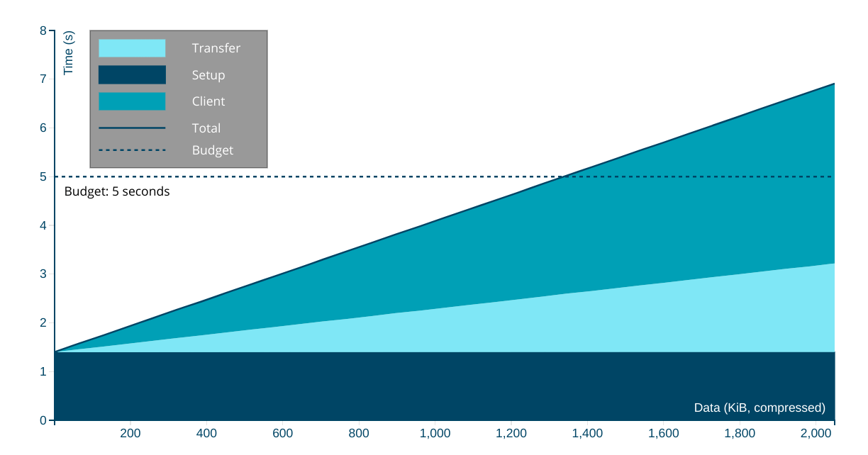
It's straightforward to understand the number of critical path network connections for a site from DevTools and to eyeball the content composition. Armed with that information, it's possible to use this estimator to quickly understand what sort of first-load experience users at the margins can expect. Give it a try!
Situation Report #
These recommendations are not context-free, and you may disagree with them in whole or in part. To the extent that other estimates are more grounded, or based on different situational data, they may be more appropriate for specific products and teams. Many critiques are possible, both of the target (five seconds for first load), the sample population (worldwide internet users), and of the methodology (informed reckons). Regardless, I present the thinking behind them because it can provide teams with informed points of departure, and also because clarifying the ritual freakout taking place as INP begins to put a price on JavaScript externalities.
It's clear that developers are out of touch with market ground-truth, but it's not obvious why. Understanding the differences in the experiences of wealthy developers versus working-class users helps to make the diffuse surface of the privilege bubble perceptible.
Engineering is the discipline of designing solutions under specific constraints. For the front end to improve, it must finally learn to operate within the envelope of what's possible on most devices.
Mobile #
The "i" in iPhone stands for "inequality".
Owing to the chasm of global wealth inequality, premium devices are largely absent in markets with billions of users. India's iOS share has surged to an all-time high of 7% on the back of last-generation and refurbished devices. That's a market of 1.43 billion people where Apple doesn't even crack the top five in terms of shipments.
The Latin American (LATAM) region, home to more than 600 million people and nearly 200 million smartphones shows a similar market composition:
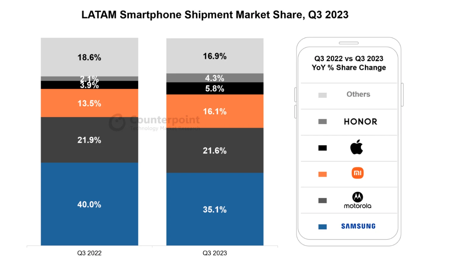
Everywhere wealth is unequally distributed, the haves read about it in Apple News over 5G while the have-nots struggle to get reliable 4G coverage for their Androids. In country after country (PDF) the embedded inequality of our societies sorts ownership of devices by price, and brand through price segmentation.
This matters because the properties of those devices dominate the experiences we can deliver. In the U.S., the term "smartphone dependence" has been coined to describe folks without other ways to access the increasing fraction of essential services only available through the internet. Unsurprisingly, folks who can't afford other internet-connected devices or a fixed broadband subscription are also most likely to buy less expensive (and therefore slower) smartphones:
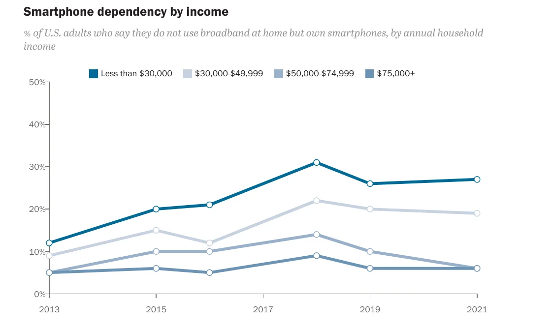
As smartphone ownership and use grow, the front ends we deliver are ever-more mediated by the properties of those devices. The inequality between the high-end and low-end, even in wealthy countries, is only growing. What we choose to do in response defines what it means to practice UX engineering ethically.
Device Performance #
Extending the SoC performance by price point series with another year's data, the picture remains ugly. The segments are roughly "fastest iPhone", "fastest Android", "budget", and "low-end":
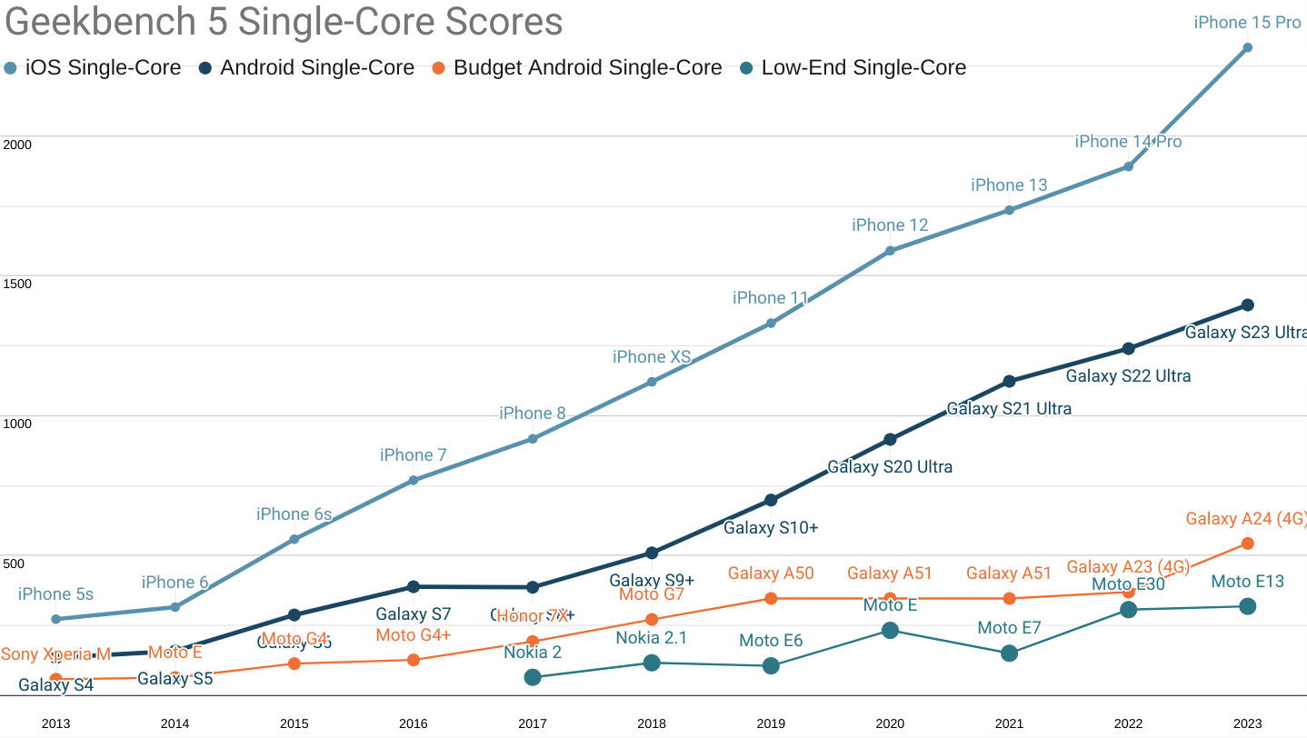
Geekbench 5 single-core scores for each mobile price point.
Not only have fruity phones extended their single-core CPU performance lead over contemporary high-end Androids to a four year advantage, the performance-per-dollar curve remains unfavourable to Android buyers.
At the time of publication, the cheapest iPhone 15 Pro (the only device with the A17 Pro chip) is $999 MSRP, while the S23 (using the Snapdrago 8 gen 2) can be had for $860 from Samsung. This nets out to 2.32 points per dollar for the iPhone, but only 1.6 points per dollar for the S23.
Meanwhile a Samsung A24 that is $175 new, unlocked, and available on Amazon today scores a more reasonable 3.1 points per dollar on single-core performance, but is more than 4.25× slower than the leading contemporary iPhone.
The delta between the fastest iPhones and moderately price new devices rose from 1,522 points last year to 1,774 today.
Put another way, the performance gap between what devices the wealthy carry and what budget shoppers carry grew more this year (252 points) than the year-over-year gains from process and architecture at the volume price point (174 points). This is particularly depressing because single-core performance tends to determine the responsiveness of web app workloads.
A less pronounced version of the same story continues to play out in multi-core performance:
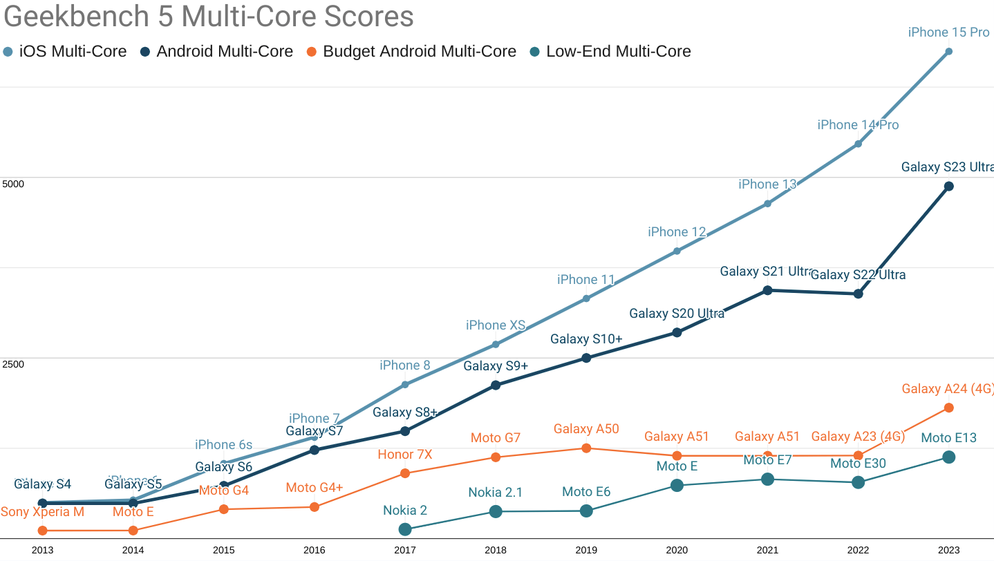
Round and round we go: Android ecosystem SoCs are improving, but the Performance Inequality Gap continues to grow. Even the fastest Androids are two-plus years behind iOS-ecosystem devices.
Recent advantages in high-end Android multi-core performance have closed the gap to previous three-year gap to 18 months. Meanwhile, budget segment devices have finally started to see improvement (as this series predicted), thanks to hand-me-down architecture and process node improvements. That's where the good news ends.
The multi-core performance gap between i-devices and budget Androids grew considerably, with the score delta rising from 4,318 points last year to 4,936 points in 2023.
Looking forward, we can expect high-end Androids to at least stop falling further behind owing to a new focus on performance by Qualcomm's Snapdragon 8 gen 3 and MediaTek's Dimensity 9300 offerings. This change is long, long overdue and will take years to filter down into positive outcomes for the rest of the ecosystem. Until that happens, the gap in experience for the wealthy versus the rest will not close.
iPhone owners live in a different world than high-end Android buyers, and light-years away what the bulk of the market experiences. No matter how you slice it, the performance inequality gap is growing for CPU-bound workloads like JavaScript-heavy web apps.
Networks #
As ever, 2023 re-confirmed an essential truth when it comes to user experience: when things are slow, users engage less often. Doing a good job in an uneven network environment requires thinking about availability and engineering for resilience and a lightweight footprint — always better to avoid testing the radio gods than it is spending weeks or months appeasing them after the damage is done.
5G network deployment continues apace, but as with the arrival of 4G, it is happening unevenly and in ways and places that exacerbate (rather than lessen) performance inequality.
Data on mobile network evolution is sketchy, and the largest error bars in this series' analysis continue to reside in this section. Regardless, we can look industry summaries like the GSMA's report on "The Mobile Economy 2023" (PDF) for a directional understanding that we can triangulate with other data points to develop a strong intuition.
For instance, GSMA predicts that 5G will only comprise half of connections by 2030. Meanwhile, McKinsey predicts that high-quality 5G (networks that use 6GHz bands) will only cover a quarter of the world's population by 2030. Regulatory roadblocks are still being cleared.
As we said in 2021, "4G is a miracle, 5G is a mirage."
This doesn't mean that 4G is one thing, or that it's deployed evenly, or even that the available spectrum will remain stable within a single generation of radio technology. For example, India's network environment has continued to evolve since the Reliance Jio revolution that drove 4G into the mainstream and pushed the price of a mobile megabyte down by ~90% on every subcontinental carrier. But that's not the whole story! Speedtest.net's data for India shows dramatic gains, for example, and analysts credit this to improved infrastructure density, expanded spectrum, and back-haul improvements related to the 5G rollout — all of which is to say that 4G users are getting better experiences than they did last year because of 5G's role in reducing contention.
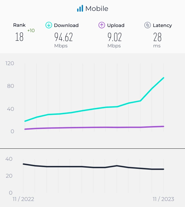
These sorts of gains are easy to miss if we look only at headline "4G vs. 5G" coverage, so it's important to level-set as new data becomes available. Improvements can arrive unevenly, with the "big" story happening slowly, long after the initial buzz of headlines wears off. These effects reward us for looking at P75+, not just means or medians, and intentionally updating priors on a regular basis.
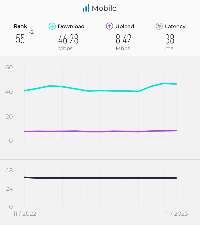
Events can turn our intuitions on their heads, too. Japan is famously well connected. I've personally experienced rock-solid 4G through entire Tokyo subway journeys, more than 40m underground and with no hiccups. And yet, the network environment has been largely unchanged by the introduction of 5G. Having provisioned more than adequately in the 4G era, new technology isn't having the same impact from pent-up demand. But despite consistent performance, the quality of service for all users is distributed in a much more egalitarian way:
Fleet device composition has big effects, owing to differences in signal-processing compute availability and spectrum compatibility. At a population level, these influences play out slowly as devices age out, but still have impressively positive impacts:
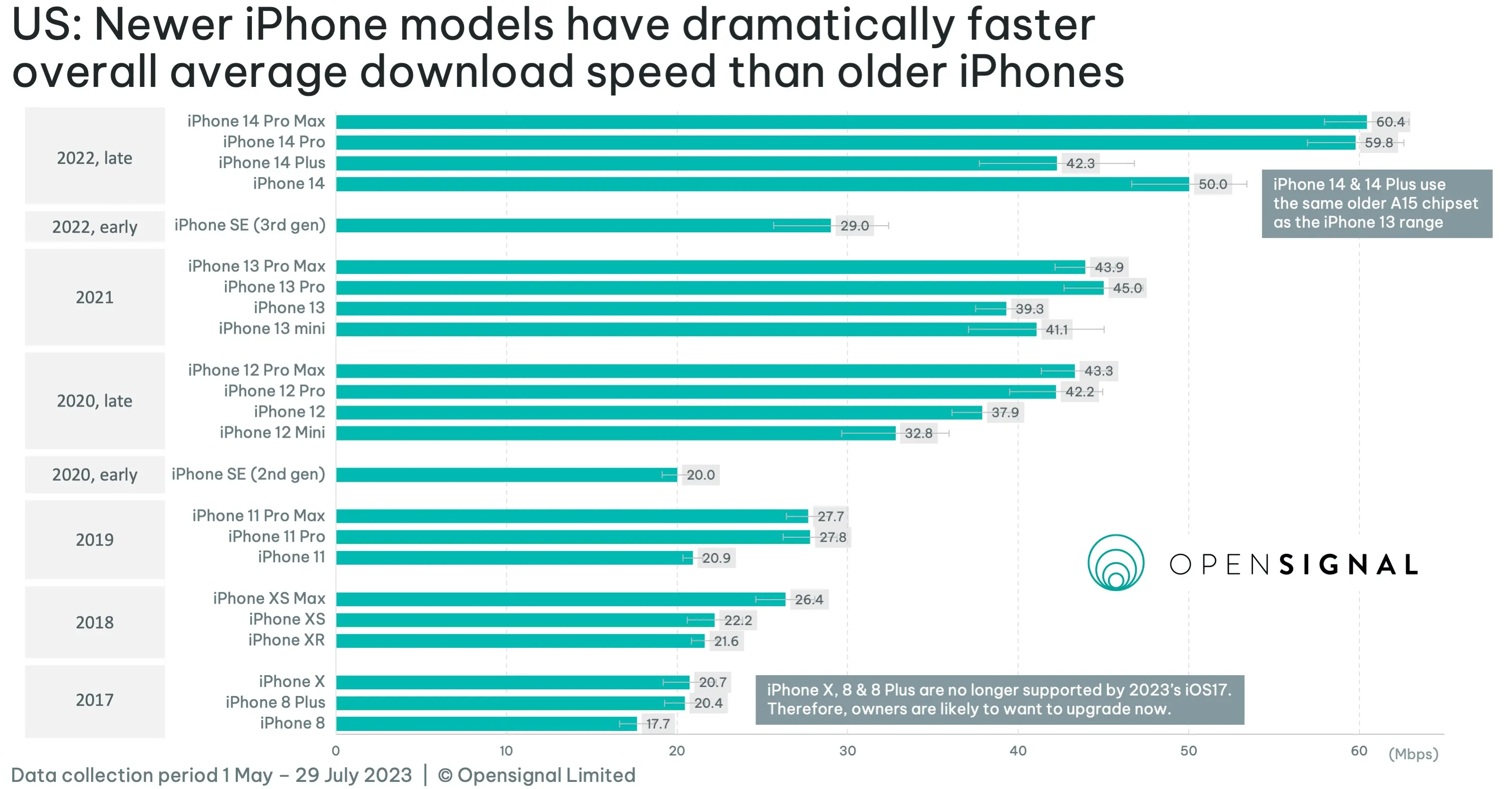
As inequality grows, averages and "generation" tags can become illusory and misleading. Our own experiences are no guide; we've got to keep our hands in the data to understand the texture of the world.
So, with all of that as prelude, what can we say about where the mobile network baseline should be set? In a departure from years prior, I'm going to use a unified network estimate (see below). You'll have to read on for what it is! But it won't be based on the sort of numbers that folks explicitly running speed tests see; those aren't real life.
Market Factors #
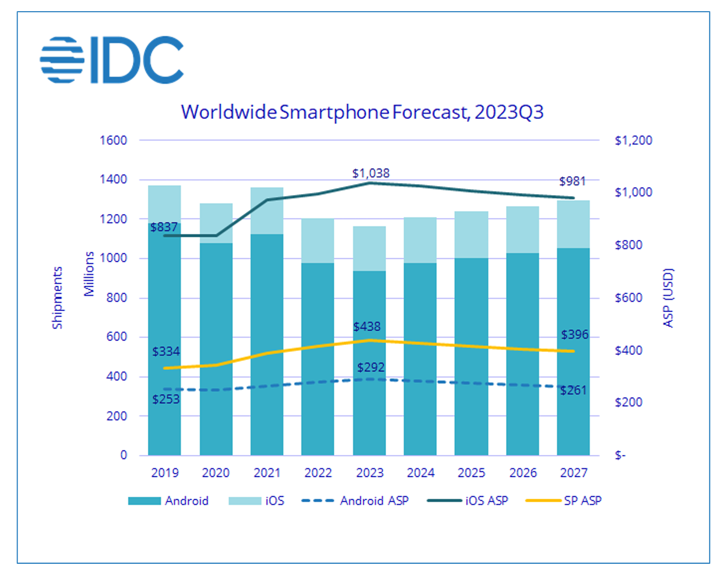
The market forces this series previewed in 2017 have played out in roughly a straight line: smartphone penetration in emerging markets is approaching saturation, ensuring a growing fraction of purchases are made by upgrade shoppers. Those who upgrade see more value in their phones and save to buy better second and third devices. Combined with the emergence and growth of the “ultra premium” segment, average selling prices (ASPs) have risen.
2022 and 2023 have established an inflection point in the regard, with worldwide average selling prices jumping to more than $430, up from $300-$350 for much of the decade prior. Some price appreciation has been due to transient impacts of the U.S./China trade wars, but most of it appears driven by iOS ASPs which peaked above $1,000 for the first time in 2023. Android ASPs, meanwhile, continued a gradual rise to nearly $300, up from $250 five years ago.
              https://infrequently.org/2024/01/performance-inequality-gap-2024/idc_forecast.png?nf_resize=fit&w=2400 1600w,
              https://infrequently.org/2024/01/performance-inequality-gap-2024/idc_forecast.png?nf_resize=fit&w=1800 1200w,
              https://infrequently.org/2024/01/performance-inequality-gap-2024/idc_forecast.png?nf_resize=fit&w=1200   800w,
              https://infrequently.org/2024/01/performance-inequality-gap-2024/idc_forecast.png?nf_resize=fit&w=900   600w,
              https://infrequently.org/2024/01/performance-inequality-gap-2024/idc_forecast.png?nf_resize=fit&w=750   500w,
              https://infrequently.org/2024/01/performance-inequality-gap-2024/idc_forecast.png?nf_resize=fit&w=600   400w">
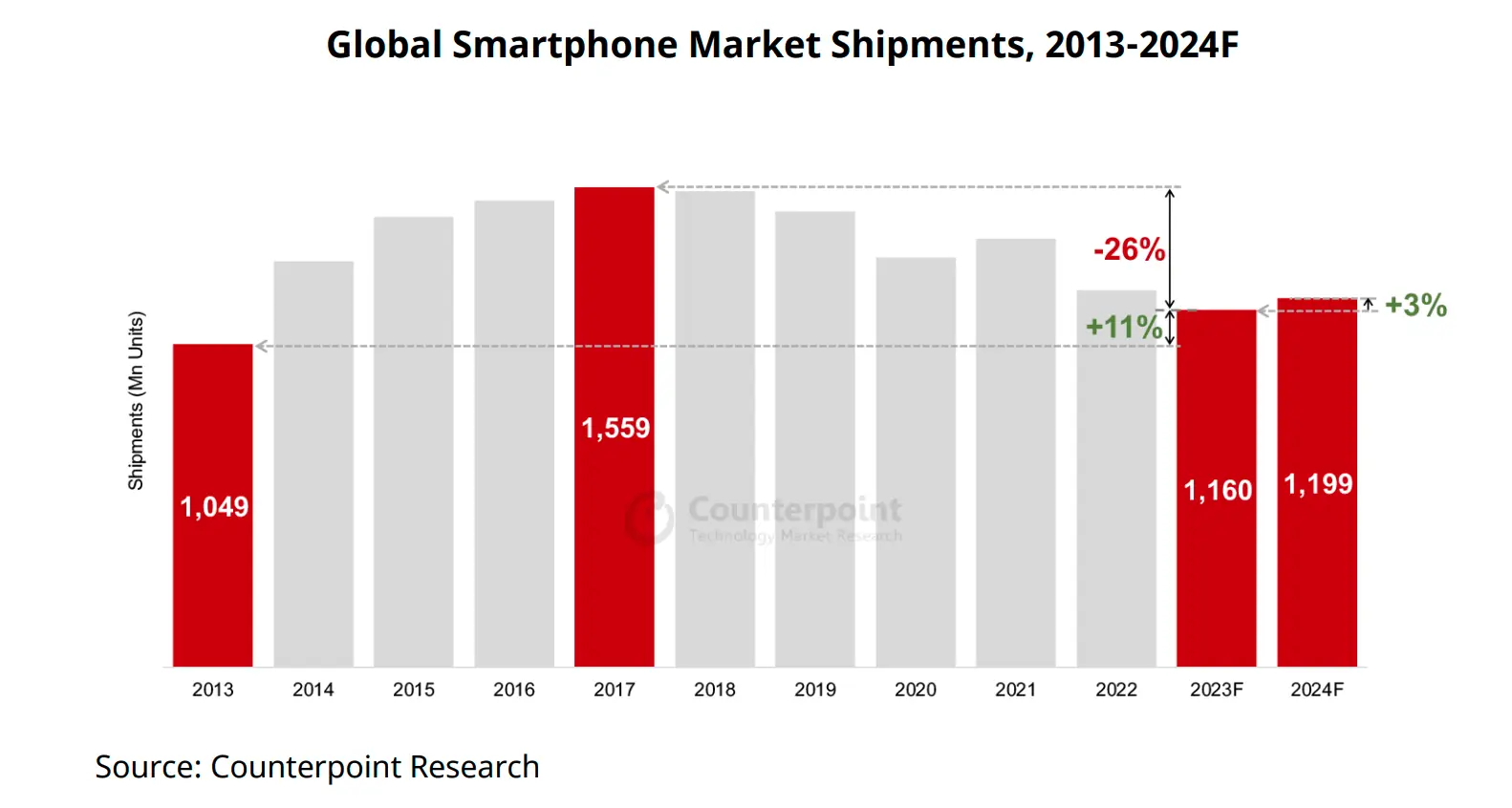
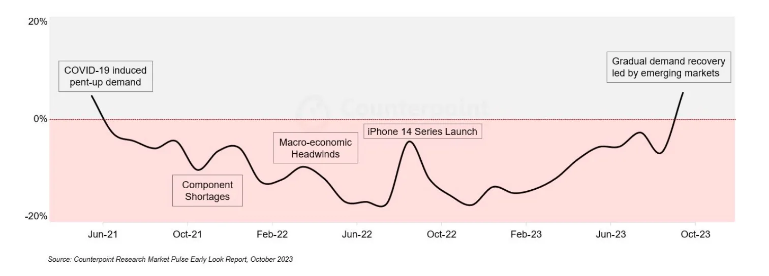
A weak market for handsets in 2023, plus stable sales for iOS, had an notable impact on prices. IDC expects global average prices to fall back below $400 by 2027 as Android volumes increase from an unusually soft 2023.
              https://infrequently.org/2024/01/performance-inequality-gap-2024/smartphone_shipments_2023.webp?nf_resize=fit&w=2400 1600w,
              https://infrequently.org/2024/01/performance-inequality-gap-2024/smartphone_shipments_2023.webp?nf_resize=fit&w=1800 1200w,
              https://infrequently.org/2024/01/performance-inequality-gap-2024/smartphone_shipments_2023.webp?nf_resize=fit&w=1200   800w,
              https://infrequently.org/2024/01/performance-inequality-gap-2024/smartphone_shipments_2023.webp?nf_resize=fit&w=900   600w,
              https://infrequently.org/2024/01/performance-inequality-gap-2024/smartphone_shipments_2023.webp?nf_resize=fit&w=750   500w,
              https://infrequently.org/2024/01/performance-inequality-gap-2024/smartphone_shipments_2023.webp?nf_resize=fit&w=600   400w">
              https://infrequently.org/2024/01/performance-inequality-gap-2024/return_to_growth_driven_by_em.webp?nf_resize=fit&w=2400 1600w,
              https://infrequently.org/2024/01/performance-inequality-gap-2024/return_to_growth_driven_by_em.webp?nf_resize=fit&w=1800 1200w,
              https://infrequently.org/2024/01/performance-inequality-gap-2024/return_to_growth_driven_by_em.webp?nf_resize=fit&w=1200   800w,
              https://infrequently.org/2024/01/performance-inequality-gap-2024/return_to_growth_driven_by_em.webp?nf_resize=fit&w=900   600w,
              https://infrequently.org/2024/01/performance-inequality-gap-2024/return_to_growth_driven_by_em.webp?nf_resize=fit&w=750   500w,
              https://infrequently.org/2024/01/performance-inequality-gap-2024/return_to_growth_driven_by_em.webp?nf_resize=fit&w=600   400w">
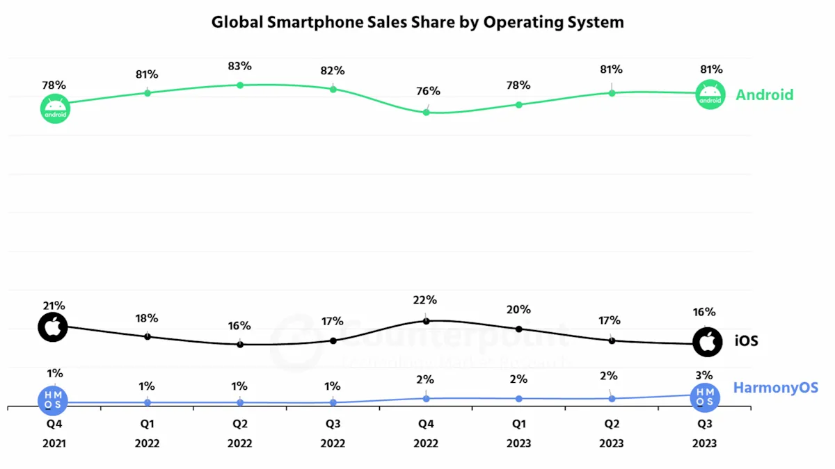
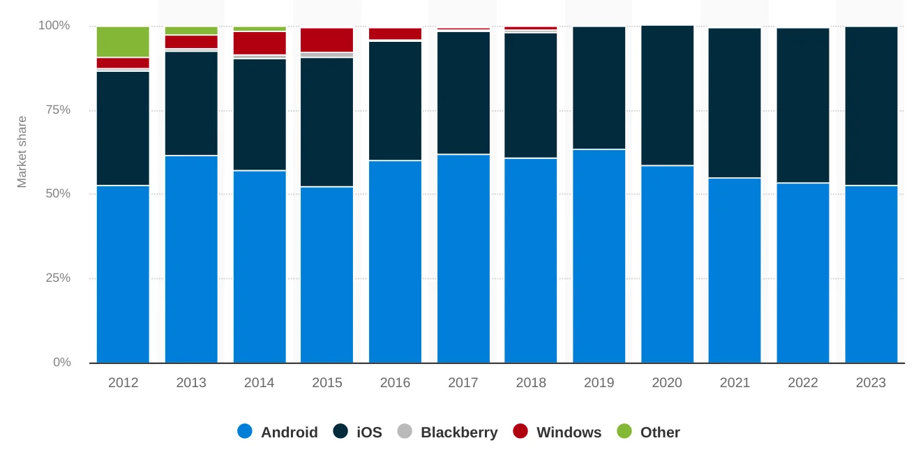
Despite falling sales, distribution of Android versus iOS sales remains largely unchanged:
              https://infrequently.org/2024/01/performance-inequality-gap-2024/counterpoint_smartphone_sales_by_OS_Q3-2023.webp?nf_resize=fit&w=2400 1600w,
              https://infrequently.org/2024/01/performance-inequality-gap-2024/counterpoint_smartphone_sales_by_OS_Q3-2023.webp?nf_resize=fit&w=1800 1200w,
              https://infrequently.org/2024/01/performance-inequality-gap-2024/counterpoint_smartphone_sales_by_OS_Q3-2023.webp?nf_resize=fit&w=1200   800w,
              https://infrequently.org/2024/01/performance-inequality-gap-2024/counterpoint_smartphone_sales_by_OS_Q3-2023.webp?nf_resize=fit&w=900   600w,
              https://infrequently.org/2024/01/performance-inequality-gap-2024/counterpoint_smartphone_sales_by_OS_Q3-2023.webp?nf_resize=fit&w=750   500w,
              https://infrequently.org/2024/01/performance-inequality-gap-2024/counterpoint_smartphone_sales_by_OS_Q3-2023.webp?nf_resize=fit&w=600   400w">
              https://infrequently.org/2024/01/performance-inequality-gap-2024/au_smartphone_share_by_os.webp?nf_resize=fit&w=2400 1600w,
              https://infrequently.org/2024/01/performance-inequality-gap-2024/au_smartphone_share_by_os.webp?nf_resize=fit&w=1800 1200w,
              https://infrequently.org/2024/01/performance-inequality-gap-2024/au_smartphone_share_by_os.webp?nf_resize=fit&w=1200   800w,
              https://infrequently.org/2024/01/performance-inequality-gap-2024/au_smartphone_share_by_os.webp?nf_resize=fit&w=900   600w,
              https://infrequently.org/2024/01/performance-inequality-gap-2024/au_smartphone_share_by_os.webp?nf_resize=fit&w=750   500w,
              https://infrequently.org/2024/01/performance-inequality-gap-2024/au_smartphone_share_by_os.webp?nf_resize=fit&w=600   400w">
Smartphone replacement rates have remained roughly in line with previous years, although we should expect elongation in the data from next year. Survey reports and market analysts continue to estimate average replacement at 3-4 years, depending on segment. Premium devices last longer, and a higher fraction of devices may be older in wealthy geographies. Combined with discretionary spending pressure and inflationary impacts on household budgets, consumer intent to spend on electronics has taken a hit, which will be felt in device lifetime extension until conditions improve. Increasing demand for refurbished devices also adds to observable device aging.
The data paints a substantially similar picture to previous years: the web is experienced on devices that are slower and older than those carried by affluent developers and corporate directors whose purchasing decisions are not impacted by transitory inflation.
To serve users effectively, we must do extra work to live as our customers do.
Test Device Recommendations #
Re-using last year’s P75 device calculus, our estimate is based on a device sold new, unlocked for the mid-2020 to mid-2021 global ASP of ~$350-375.
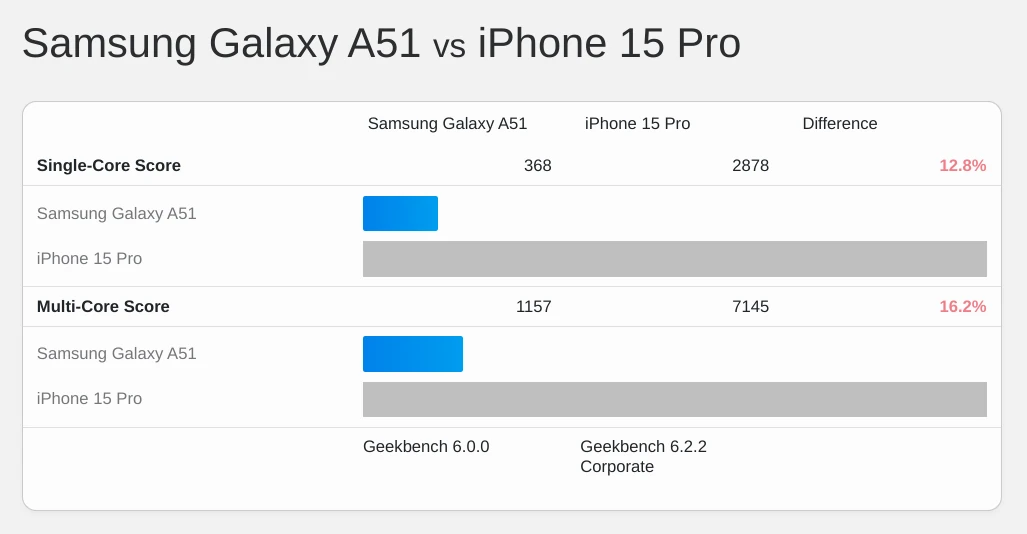
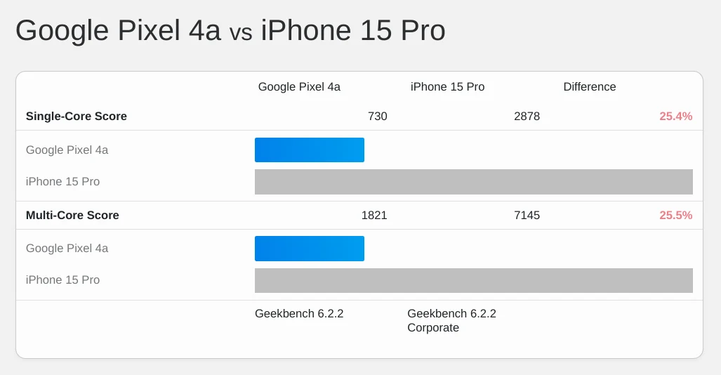
Representative examples from that time period include the Samsung Galaxy A51 and the Pixel 4a. Neither model featured 5G, and we cannot expect 5G to play a significant role in worldwide baselines for at least the next several years.
The A51 featured eight slow cores (4x2.3 GHz Cortex-A73 and 4x1.7 GHz Cortex-A53) on a 10nm process:
              https://infrequently.org/2024/01/performance-inequality-gap-2024/a51_vs_iphone_15_pro.webp?nf_resize=fit&w=2400 1600w,
              https://infrequently.org/2024/01/performance-inequality-gap-2024/a51_vs_iphone_15_pro.webp?nf_resize=fit&w=1800 1200w,
              https://infrequently.org/2024/01/performance-inequality-gap-2024/a51_vs_iphone_15_pro.webp?nf_resize=fit&w=1200   800w,
              https://infrequently.org/2024/01/performance-inequality-gap-2024/a51_vs_iphone_15_pro.webp?nf_resize=fit&w=900   600w,
              https://infrequently.org/2024/01/performance-inequality-gap-2024/a51_vs_iphone_15_pro.webp?nf_resize=fit&w=750   500w,
              https://infrequently.org/2024/01/performance-inequality-gap-2024/a51_vs_iphone_15_pro.webp?nf_resize=fit&w=600   400w">
The Pixel 4a’s slow, eight-core big.LITTLE configuration was fabricated on an 8nm process:
              https://infrequently.org/2024/01/performance-inequality-gap-2024/pixel_4a_vs_iphone_15_pro.webp?nf_resize=fit&w=2400 1600w,
              https://infrequently.org/2024/01/performance-inequality-gap-2024/pixel_4a_vs_iphone_15_pro.webp?nf_resize=fit&w=1800 1200w,
              https://infrequently.org/2024/01/performance-inequality-gap-2024/pixel_4a_vs_iphone_15_pro.webp?nf_resize=fit&w=1200   800w,
              https://infrequently.org/2024/01/performance-inequality-gap-2024/pixel_4a_vs_iphone_15_pro.webp?nf_resize=fit&w=900   600w,
              https://infrequently.org/2024/01/performance-inequality-gap-2024/pixel_4a_vs_iphone_15_pro.webp?nf_resize=fit&w=750   500w,
              https://infrequently.org/2024/01/performance-inequality-gap-2024/pixel_4a_vs_iphone_15_pro.webp?nf_resize=fit&w=600   400w">
Pixels have never sold well, and Google’s focus on strong SoC performance per dollar was sadly not replicated across the Android ecosystem, forcing us to use the A51 as our stand-in.
Devices within the envelope of our attention are 15-25% as fast as those carried by programmers and their bosses — even in wealthy markets.
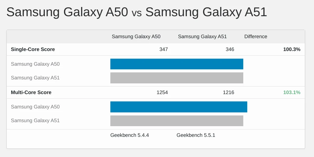
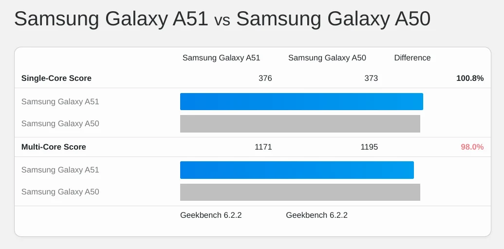
The Galaxy may be slightly faster than last year’s recommendation of the Galaxy A50 for testing, but the picture is muddy:
              https://infrequently.org/2024/01/performance-inequality-gap-2024/a50_vs_a51_gb5.webp?nf_resize=fit&w=2400 1600w,
              https://infrequently.org/2024/01/performance-inequality-gap-2024/a50_vs_a51_gb5.webp?nf_resize=fit&w=1800 1200w,
              https://infrequently.org/2024/01/performance-inequality-gap-2024/a50_vs_a51_gb5.webp?nf_resize=fit&w=1200   800w,
              https://infrequently.org/2024/01/performance-inequality-gap-2024/a50_vs_a51_gb5.webp?nf_resize=fit&w=900   600w,
              https://infrequently.org/2024/01/performance-inequality-gap-2024/a50_vs_a51_gb5.webp?nf_resize=fit&w=750   500w,
              https://infrequently.org/2024/01/performance-inequality-gap-2024/a50_vs_a51_gb5.webp?nf_resize=fit&w=600   400w">
              https://infrequently.org/2024/01/performance-inequality-gap-2024/a50_vs_a51_gb6.webp?nf_resize=fit&w=2400 1600w,
              https://infrequently.org/2024/01/performance-inequality-gap-2024/a50_vs_a51_gb6.webp?nf_resize=fit&w=1800 1200w,
              https://infrequently.org/2024/01/performance-inequality-gap-2024/a50_vs_a51_gb6.webp?nf_resize=fit&w=1200   800w,
              https://infrequently.org/2024/01/performance-inequality-gap-2024/a50_vs_a51_gb6.webp?nf_resize=fit&w=900   600w,
              https://infrequently.org/2024/01/performance-inequality-gap-2024/a50_vs_a51_gb6.webp?nf_resize=fit&w=750   500w,
              https://infrequently.org/2024/01/performance-inequality-gap-2024/a50_vs_a51_gb6.webp?nf_resize=fit&w=600   400w">
If you’re building a test lab today, refurbished A51s can be had for ~$150. Even better, the newer Nokia G100 can be had for as little as $100, and it’s faithful to the sluggish original in nearly every respect.
If your test bench is based on last year’s recommended A50 or Nokia G11, I do not recommend upgrading in 2024. The absolute gains are so slight that the difference will be hard to feel, and bench stability has a value all its own. Looking forward, we can also predict that our bench performance will be stable until 2025.
Claims about how “performant” modern front-end tools are have to be evaluated in this slow, stagnant context.
Desktop #
It’s a bit easier to understand the Desktop situation because the Edge telemetry I have access to provides statistically significant insight into 85+% of the market.
Device Performance #
The TL;DR for desktop performance is that Edge telemetry puts ~45% of devices in a “low-end” bucket, meaning they have <= 4 cores or <= 4GB of RAM.
<tr>
  <td>Device Tier</td>
  <td>Fleet %</td>
  <td>Definition</td>
</tr>
<tr>
<td>Low-end</td>
<td>45%</td>
<td>Either:<br><= 4 cores, or<br><= 4GB RAM</td>
</tr>
<tr>
<td>Medium</td>
<td>48%</td>
<td><abbr>HDD</abbr> (not <abbr>SSD</abbr>), or<br>4-16 GB RAM, or<br>4-8 cores</td>
</tr>
<tr>
<td>High</td>
<td>7%</td>
<td><abbr>SSD</abbr> +<br>> 8 cores +<br>> 16GB RAM</td>
</tr>
20% of users are on HDDs (not SSDs) and nearly all of those users also have low (and slow) cores.
You might be tempted to dismiss this data because it doesn’t include Macs, which are faster than the PC cohort. Recall, however, that the snapshot also excludes ChromeOS.
ChromeOS share has veered wildly in recent years, representing 50%-200% of Mac shipments in a given per quarter. In ‘21 and ‘22, ChromeOS shipments regularly doubled Mac sales. Despite post-pandemic mean reversion, according to IDC ChromeOS devices outsold Macs ~5.7M to ~4.7M in 2023 Q2. The trend reversed in Q3, with Macs almost doubling ChromeOS sales, but slow ChromeOS devices aren’t going away and, from a population perspective, more than offset Macs today. Analysts also predict growth in the low end of the market as educational institutions begin to refresh their past purchases.
Networks #
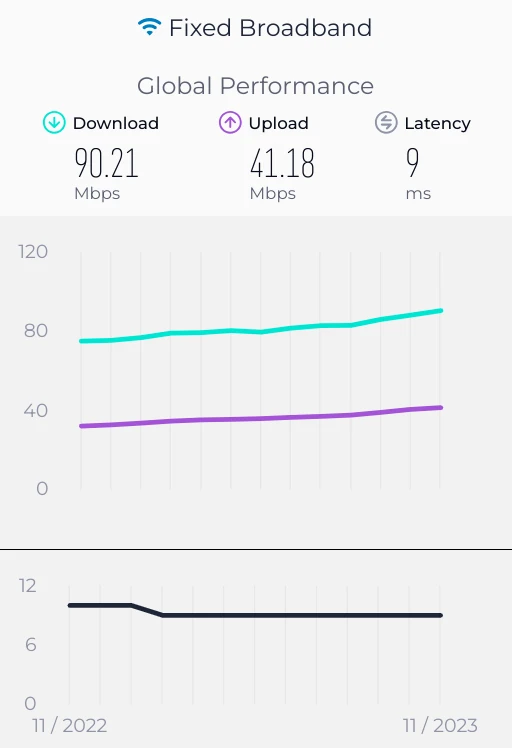
Desktop-attached networks continue to improve, notably in the U.S. Regulatory intervention and subsidies have done much to spur enhancements in access to U.S. fixed broadband, although disparities in access remain and the gains may not persist.
This suggests that it’s time to also bump our baseline for desktop tests beyond the 5Mbps/1Mbps/28ms configuration that WebPageTest.org’s “Cable” profile has defaulted to for desktop tests.
How far should we bump it? Publicly available data is unclear, and I’ve come to find out that Edge’s telemetry lacks good network observation statistics (doh!); Windows telemetry doesn’t capture a proxy for network quality, I no longer have access to Chrome’s data, the population-level telemetry available from CrUX is unhelpful, and telcos li…er…sorry, “market their products in accordance with local laws and advertising standards.” All of this makes it difficult to construct an estimate.
One option is to use a population-level assessment of medians from something like the Speedtest.net data and then construct a histogram from median speeds. This is both time-consuming and error-prone, as population-level data varies widely across the world. Emerging markets with high mobile internet use and dense populations can feature poor fixed-line broadband penetration compared with Western markets.
Another option is to mathematically hand-wave using the best evidence we can get. This might allow us to reconstruct probable P75 and P90 values if we know something about the historical distribution of connections. From there, we can gut-check using other spot data. To do this, we need to assume some data set is representative, a fraught decision all its own. Biting the bullet, we could start from the Speedtest.net global survey data, which currently fails to provide anything but medians (P50):
              https://infrequently.org/2024/01/performance-inequality-gap-2024/global_fixed_speedtest_medians.webp?nf_resize=fit&w=2400 1600w,
              https://infrequently.org/2024/01/performance-inequality-gap-2024/global_fixed_speedtest_medians.webp?nf_resize=fit&w=1800 1200w,
              https://infrequently.org/2024/01/performance-inequality-gap-2024/global_fixed_speedtest_medians.webp?nf_resize=fit&w=1200   800w,
              https://infrequently.org/2024/01/performance-inequality-gap-2024/global_fixed_speedtest_medians.webp?nf_resize=fit&w=900   600w,
              https://infrequently.org/2024/01/performance-inequality-gap-2024/global_fixed_speedtest_medians.webp?nf_resize=fit&w=750   500w,
              https://infrequently.org/2024/01/performance-inequality-gap-2024/global_fixed_speedtest_medians.webp?nf_resize=fit&w=600   400w">
After many attempted Stupid Math Tricks with poorly fitting curves (bandwidth seems to be a funky cousin of log-normal), I've decided to wing it and beg for help: instead of trying to be clever, I'm leaning on Cloudflare Radar's P25/P50/P75 distributions for populous, openly-connected countries with >= ~50M internet users. It's cheeky, but a weighted average of the P75 of download speeds (3/4ths of all connections are faster) should get us in the ballpark. We can then use the usual 5:1 downlink:uplink ratio to come up with an uplink estimate. We can also derive a weighted average for the P75 RTT from Cloudflare's data. Because Cloudflare doesn't distinguish mobile from desktop connections, this may be an overly conservative estimate, but it's still be more permissive than what we had been pegged to in years past:
<tr>
  <td>Country</td>
  <td>P75 Downlink (Mbps)</td>
  <td>P75 <abbr>RTT</abbr> (ms)</td>
</tr>
<tr>
  <td>India</td>
  <td>4</td>
  <td>114</td>
</tr>
<tr>
  <td>USA</td>
  <td>11</td>
  <td>58</td>
</tr>
<tr>
  <td>Indonesia</td>
  <td>5</td>
  <td>81</td>
</tr>
<tr>
  <td>Brazil</td>
  <td>8</td>
  <td>71</td>
</tr>
<tr>
  <td>Nigeria</td>
  <td>3</td>
  <td>201</td>
</tr>
<tr>
  <td>Pakistan</td>
  <td>3</td>
  <td>166</td>
</tr>
<tr>
  <td>Bangladesh</td>
  <td>5</td>
  <td>114</td>
</tr>
<tr>
  <td>Japan</td>
  <td>17</td>
  <td>42</td>
</tr>
<tr>
  <td>Mexico</td>
  <td>7</td>
  <td>75</td>
</tr>
<tr>
  <td>Egypt</td>
  <td>4</td>
  <td>100</td>
</tr>
<tr>
  <td>Germany</td>
  <td>16</td>
  <td>36</td>
</tr>
<tr>
  <td>Turkey</td>
  <td>7</td>
  <td>74</td>
</tr>
<tr>
  <td>Philippines</td>
  <td>7</td>
  <td>72</td>
</tr>
<tr>
  <td>Vietnam</td>
  <td>7</td>
  <td>72</td>
</tr>
<tr>
  <td>United Kingdom</td>
  <td>16</td>
  <td>37</td>
</tr>
<tr>
  <td>South Korea</td>
  <td>24</td>
  <td>26</td>
</tr>
<tr>
  <td><em>Weighted Avg.</em></td>
  <td>7.2</td>
  <td>94</td>
</tr>
We, therefore, update our P75 link estimate 7.2Mbps down, 1.4Mbps up, and 94ms RTT.
This is a mild crime against statistics, not least of all because it averages unlike quantities and fails to sift mobile from desktop, but all the other methods available at time of writing are just as bad. Regardless, this new baseline is half again as much link capacity as last year, showing measurable improvement in networks worldwide.
If you or your company are able to generate a credible worldwide latency estimate in the higher percentiles for next year’s update, please get in touch.
Market Factors #
The forces that shape the PC population have been largely fixed for many years. Since 2010, volumes have been on a slow downward glide path, shrinking from ~350MM per year in a decade ago to ~260MM in 2018. The pandemic buying spree of 2021 pushed volumes above 300MM per year for the first time in eight years, with the vast majority of those devices being sold at low-end price points — think ~$300 Chromebooks rather than M1 MacBooks.
Lest we assume low-end means “short-lived”, recent announcements regarding software support for these devices will considerably extend their impact. This low-end cohort will filter through the device population for years to come, pulling our performance budgets down, even as renewed process improvement is unlocking improved power efficiency and performance at the high end of the first-sale market. This won’t be as pronounced as the diffusion of $100 smartphones has been in emerging markets, but the longer life-span of desktops is already a factor in our model.
Test Device Recommendations #
Per our methodology from last year which uses the 5-8 year replacement cycle for a PC, we update our target date to late 2017 or early 2018, but leave the average-selling-price fixed between $600-700. Eventually we’ll need to factor in the past couple of years of gyrations in inflation and supply chains into account when making an estimate, but not this year.
So what did $650, give or take, buy in late 2017 or early 2018?
One option was a naf looking tower from Dell, optimistically pitched at gamers, with a CPU that scores poorly versus a modern phone., but which blessedly sports 8GB of RAM.
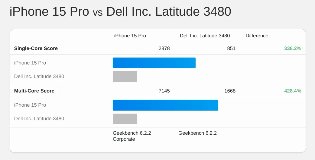
In laptops (the larger segment), ~$650 bought the Lenovo Yoga 720 (12”), with a 2-core (4-thread) Core i3-7100U and 4GB of RAM. Versions with more RAM and a faster chip were available, but cost considerably more than our budget. This was not a fast box. Here’s a device with that CPU compared to a modern phone; not pretty:
              https://infrequently.org/2024/01/performance-inequality-gap-2024/i3-7100U_vs_iphone_15_pro.webp?nf_resize=fit&w=2400 1600w,
              https://infrequently.org/2024/01/performance-inequality-gap-2024/i3-7100U_vs_iphone_15_pro.webp?nf_resize=fit&w=1800 1200w,
              https://infrequently.org/2024/01/performance-inequality-gap-2024/i3-7100U_vs_iphone_15_pro.webp?nf_resize=fit&w=1200   800w,
              https://infrequently.org/2024/01/performance-inequality-gap-2024/i3-7100U_vs_iphone_15_pro.webp?nf_resize=fit&w=900   600w,
              https://infrequently.org/2024/01/performance-inequality-gap-2024/i3-7100U_vs_iphone_15_pro.webp?nf_resize=fit&w=750   500w,
              https://infrequently.org/2024/01/performance-inequality-gap-2024/i3-7100U_vs_iphone_15_pro.webp?nf_resize=fit&w=600   400w">
It’s considerably faster than some devices still being sold to schools, though.
What does this mean for our target devices? There’s wild variation in performance per dollar below $600 which will only increase a inflation-affected cohorts grow to represent a larger fraction of the fleet. Intel’s move (finally!) off of 14nm also means that gains are starting to arrive at the low end, but in an uneven way. General advice is therefore hard to issue. That said, we can triangulate based on what we know about the market:
My recommendation, then, to someone setting up a new lab today is not to spend more than $350 on new a test device. Consider laptops with chips like the N4120, N4500, or the N5105. Test devices should also have no more than 8GB of RAM, and preferably 4GB. The 2021 HP 14 is a fine proxy. The updated ~$375 version will do in a pinch, but try to spend less if you can. Test devices should preferably score no higher than 1,000 in single-core Geekbench 6 tests; a line the HP 14's N4120 easily ducks, clocking in at just over 350.
Takeaways #
There's a lot of good news embedded in this year's update. Devices and networks have finally started to get a bit faster (as predicted), pulling budgets upwards.
At the same time, the community remains in solid denial about the disastrous consequences of an over-reliance on JavaScript. This paints a picture of path dependence — front-end isn't moving on from approaches that hurt users, even as the costs shift back onto teams that have been degrading life for users at the margins.
We can anticipate continued improvement in devices over the next few years, and network pace may level out somewhat as the uneven deployment of 5G lurches forward. Regardless, the gap between the digital haves and have-nots continues to grow. Those least able to afford the fast devices are actively taxed by developers high on their own developer experience (DX).
It's not a mystery why folks who spend every waking hour inside a digital privilege bubble are not building with empathy or humility when nobody calls them to account. What's mysterious is that anybody pays them to do it. The Product Management (PM) and Engineering Management (EM) disciplines have utterly failed organisations building on the web, failing to put pro-user and pro-business constraints on the enthusiasms of developers.
Instead of cabining the the enthusiasms of the FP crowd, managers meekly repeated bullshit about how "you can't hire for fundamentals" as they waved in busloads of bootcampers whose React-heavy CV paint jobs had barely dried. They could have run bake-offs. They could have paid for skills that would serve the business over time. They could have facilitated learning anything the business valued. Instead, they abdicated. The kicker is that they didn't even reliably make things better for the class they imagined they were serving.
This post was partially drafted on airplane wifi, and I can assure you that wealthy folks also experience RTT's north of 500ms and channel capacity in the single-digit-Mbps.
Even the wealthiest users step out of the privilege bubble sometimes. Are these EMs and PMs really happy to lose that business?
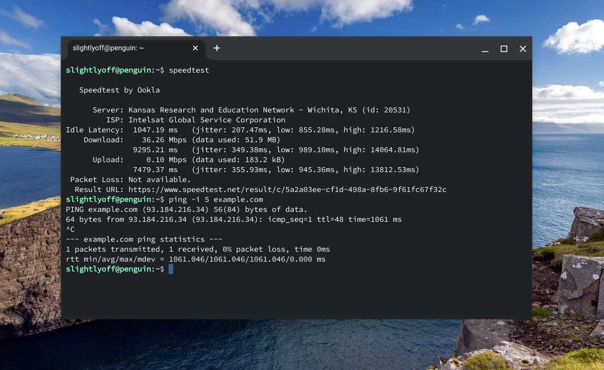
Wealthy users are going to experience networks with properties that are even worse than the 'bad' networks offered to the Next Billion Users. At an altitude of 40k feet and a ground speed for 580 MPH somewhere over Alberta, CA, your correspondent's bandwidth is scarce, lopsided, and laggy.
Of course, any trend that can't continue won't, and INP's impact is already being felt. The great JavaScript merry-go-round may grind to a stop, but the momentum of consistently bad choices is formidable. Like passengers on a cruise ship ramming a boardwalk at flank speed, JavaScript regret is dawning far too late and interacting very poorly with something we ate. As the good ship Scripting shudders and lists on the remains of the Ferris Wheel, it's not exactly clear how to get off, but the choices that led us here are at least visible, if only by their belated consequences.
The Great Branch Mispredict #
We got to a place where performance has been a constant problem in large part because a tribe of programmers convinced themselves that it wasn't and wouldn't be. The circa '13 narrative asserted that:
- CPUs would keep getting faster (just like they always had).
- Networks would get better, or at least not get worse.
- Organisations had all learned the lessons of Google and FaceBook's adventures in Ajax.
It was all bullshit, and many of us spotted it a mile away.
But tribalism-boosted confirmation bias mixed with JavaScript's toxic positivity culture to precipitate out a Silicon Prosperity Gospel; all resources would go infinite if you just believed. No matter how wrong the premise, we kept executing down the obviously-falsified branch until the buffers drained.
The solutions are social, not technical, because the the delusions are social, rather than technical.
The stories that propped up IE8-focused frameworks like Angular and React in the mobile era have only served as comforting myths to ward off emerging device and network reality. For the past decade, the important question hasn't been if enough good technology existed, but rather how long the delusions would keep hold.
The community wanted to live in a different world than the one we inhabit, so we collectively mis-predicted. A healthy web community will value learning faster.
How deep was the branch? And how many cycles will the fault cost us? If CPUs and networks continue to improve at the rate of the past two years, and INP finally forces a reckoning, the answer might be as little as a decade. I fear we will not be so lucky; an entire generation has been trained to ignore reality, to prize tribalism rather than engineering rigor, and to devalue fundamentals. Those folks may not find the next couple of years to their liking.
Front-end's hangover from the JavaScript party is gonna suck.

