
index.md 7.8KB
title: Invisible animation
url: https://medium.com/@stevenfabre/invisible-animation-ffa27d0b77e5
hash_url: 59a994ab62
There’s no doubt that animating user interfaces is a rising trend. Risen enough that the emphasis is often put on the animation itself, rather than on improving the user experience through subtle and functional animation. Pasquale D’Silva gave some good advice in his talk at Web Direction South in 2013, including:
Good animation is invisible.
You shouldn’t notice that you’re looking at animation.
It’s great advice that we — the team behind Campaign Monitor’s email builder — have been trying to apply with a few principles in mind: animation must improve the usability, feel natural and subtle, and give feedback to the user.
Having spent the last year working on the email builder, I’ve learned that animation on the web — as opposed to native apps — comes with many challenges that go beyond finding the right timing, spacing, poses or easing. Animations just don’t render the same on all devices and browsers, and that rendering inconsistency has led us to compromise things to create a good user experience. In fact, some beautiful and useful interactions on our powerful 27" iMacs didn’t make it to the final product, because they felt jerky and slow on a device some of our users were more likely to use.
Of all the animation and interactive prototypes we put together in the concept and design stages, only the most useful and performant made it into the final product. For us, it was about hand-picking the most useful animations, and spending the time to get it just right — all in the interest of improving the user experience. Here are a selection of animations that made the cut:
Add layout drop-down
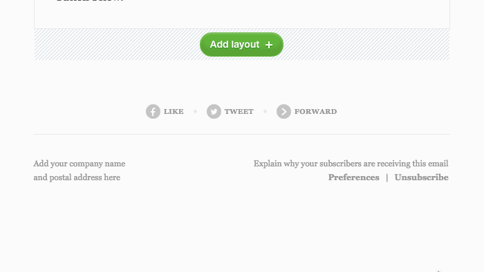
When users press the “Add layout” button, the layout drop-down fades in and comes from the button itself. This highlights that what just appeared is linked to the button.
Sidebar accordion
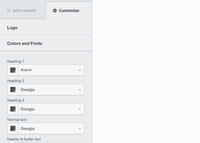
By sliding the other headings down, it’s easy to correlate the content and heading. Also, fading the types of logo from the content area after a little delay makes it more obvious that the user is in the “Image” type settings.
Button states
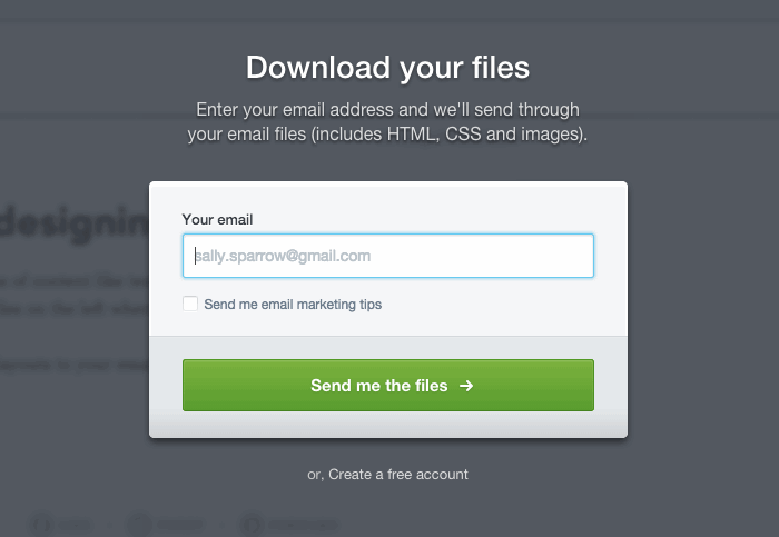
When you’re waiting for something, time tends to slow down. When users are waiting to receive their files by email, we’re just showing them what’s happening behind the scene. This animation makes the process feel much snappier, even though the actual time to receive the email stays the same.
Add or duplicate a layout
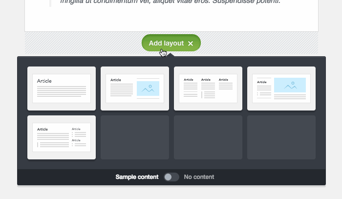
When users add or duplicate a layout, a space is created over a short period of time and the new layout fades in from the middle. It becomes clearer that something new has been added.
Delete a layout

When your email contains a lot of similar or almost identical layouts, this animation becomes really useful. It shows what layout has been deleted by sliding up the content of the email.
Layout controllers
When users are hovering a layout, we show them some controllers. Those come from the layout they control, so it’s clear that the action they are about to take will affect the layout they are hovering.
I’m sure the best motion designers out there would easily point out how those animations could be improved. It’s sad to say that performance issues on certain devices forced us to cut off some of the highly polished details of an animation. But this is a conscious decision we’ve made to provide the best user experience across devices.
Seeing more and more people talking, writing, designing interfaces with animation doesn’t mean that you should animate everything. If we’ve done our job right, you shouldn’t notice the animations shown previously while using the email builder.
Invisible, that’s how animation should be.