
index.md 14KB
title: Links are broken. These three alternatives have improved our readers’ reading experience.
url: https://medium.com/de-correspondent/links-are-broken-these-three-alternatives-have-improved-our-readers-reading-experience-796c302c8930
hash_url: 36c784e8e4
It’s all about focus, relevance and context
At De Correspondent, a Dutch journalism platform with 30,000 paying subscribers (60 p/y), we’re all about providing context to the world in a thoughtful and in-depth way. This takes an effort, both from our writers as our readers. Because, after years and years of being bombarded with ever easier content, how do you get readers to take the time again to start reading longer publications online?
One of the most distracting phenomenons during reading are links. They keep pointing us to directions that are probably valuable, but at the same time force us to make a decision: to click or not to click.
These links are the backbone of the internet. And yet, no improvements have made to this quintessential part of the web for decades. We took up the challenge. Here’s how.
Here are three things we tried to improve the link-experience at De Correspondent
Being a very unfocused and highly distractible reader myself when it comes to online content, I find many good and interesting publications escaping my attention when they really shouldn’t. My thinking about why this happens soon boiled down to a rather simple conclusion: nearly everything on the internet is architected around distraction. Everything is carefully thought out to grab your attention at any moment, no matter if you are just looking around, or worse case, if you are actually consuming the content offered to you.
Menu items want to show you other interesting sections, related items are there to make you aware of more content you might like and ads try to lure you into buying something (we solved this by being a deliberately ad-free publication, but that’s another story), in many cases on some other website than yours.
And then there is links.
Flawed by design
Links are great. They connect content, topics and views and all you have to do as a user is click on one of them to start another endless journey into a world of knowledge, entertainment, or utter nonsense. That said, they do have a few fatal drawbacks. They provide little or no context, they are distracting and they litter articles with small blind spots asking you to trust that your click will be rewarded with something useful.
For a publication that wants to provide you with insightful longreads, this is a huge problem.
Links offer your readers reasons to leave. For example: if you put a link in the first sentence of your piece, you’re basically saying “Eh whatever, the rest of this text isn’t worth your time anyway. Just click here. It will explain everything!”. And of course, often I don’t return. After a short clicking frenzy I have lost track of where I started in the first place. And how could I remember? I didn’t even get the chance to properly read anything of the original article yet.
Also, reading is passive. A click is active. Instant gratification. “I did something. Yay!”. It’s effortless and quick, whereas reading the whole article is, well, from time to time sooo much more work. The fact that every now and then I plan a whole day free to catch up on reading all my open browser tabs goes to show the consequences of this behaviour.
A new kind of linking
At De Correspondent, a Dutch journalism startup we founded at the end of 2013 and which currently has over 30.000 paying members, we wanted to face these issues full on. Our publications don’t contain any traditional in-text links. This prevents a lot of the possible clutter and reasons to leave, usually found in many articles. When we want to tell a story, we’d like you to take it in from start to end. There is a flow we would like you to follow. We introduce you into a topic, investigate our findings and come to some kind of conclusion. If we gave our readers too many options to leave the article before finishing it, we wouldn’t get to convey whatever it is we want to convey.
To enforce this principle, our editor, called Respondens, doesn’t allow our authors to add common links to their stories. However, we offer them three alternatives: an info card, a side note and a featured link. I will explain each’s purpose and the reasoning behind their approach.
1. Info cards
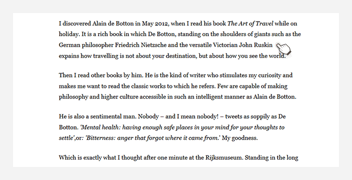
One of the issues we wanted to address is the reader’s knowledge gap. If you don't know enough about a person, company or topic mentioned in a story, an article becomes unreadable. Chances are you will stop reading or at best pause while you search for the necessary information to understand about the importance of this specific part in relation to the full story. For this reason the author needs to add the required background to make sure everybody is sufficiently able to read the story. For readers who do actually have enough background knowledge, these superfluous additions are an annoyance. It’s even a slight insult to their intelligence. ‘Yeah, yeah, I know this. Why do you waste my time with the obvious.’
We solved this by introducing something we call the ‘info card’. This piece of additional content is only presented when you have a need for it by clicking on the indicator behind the name or term mentioned in the story. Because, by default, it is in a closed state, you are able to easily skip over it when you do have the required background knowledge. Opening it however adds the additional information inline in the text so you don't have to wander your eyes to another part of the page. Your eyes will never have to leave the main story and you can keep continue reading the story as if this addition was part of it in the first place.
2. Side notes
At De Correspondent we are all about providing context. We don't report the news. We want to explain why something is news, or why it should be news. We try to give context to the world around us. With this in mind, we felt that the way we present our stories should reflect this same philosophy.
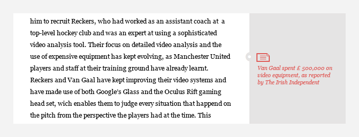
The main purpose of most links is to provide an additional layer of information, a more in-depth view or simply to share your sources. Links however usually offer little information about what the user is going to see once clicked on them. As a reader you will have to extract this from the context of the link. Sometimes the linked word or part of the sentence will provide you with some idea what the link will link to, other times the surrounding paragraph could be used as an indicator.
We wanted to do more with this. An external link is a valuable addition to an article, especially if it provides additional background information for the interested user. It would however be very useful if it wasn't up to the user to find out why the author added the link in the first place. To achieve this we introduced something we call a ‘side note’. It functions as a regular link, but is placed next to the related paragraph and has a label that describes the content that was linked to. Next to this, every side note has an icon indicating the type of content you are about to see, like a video, audio fragment or report.
The added benefit, of presenting our links in the bar next to the article, besides clearing the text of links, is that it functions as sort of a checklist. No need to remember the exact location of an interesting link for later consumption. Just quickly scroll past the article to get an overview of all the relevant additional information that might interest you.
3. Featured links
And then there is a third distraction we wanted to get rid of: the premature link. I’ve always found it quite strange when authors link to a page, tool or whatever, the first time they mention it while you as a reader didn't even get a chance yet to read why the author has added that link.
Think about an article that recommends, for instance, a music festival. In many cases the first part of such an article contains a link to the festival’s website. It’s not so much a problem that the link is there. It’s just that the author didn't get to the point yet of explaining why it is such a great festival to go to. A reader who clicks on that link as soon as it appears will go to that website underinformed (or at least in the eyes of the author who wanted to tell you something about it). Why would you want to send the user off to another place in order to do the exact same investigation that you’ve already done.
On our platform such important links, which we refer to as ‘featured links’, are placed underneath the article. Placing them down there ensures enough attention and focus on the reader’s side for the story covering it and as an added bonus, it consistently places important links in a manner everybody knows where to find them.
Read more about our world-record in journalism crowdfunding
True to our philosophy of the presentation of links, here are a few related to things mentioned in this article:
Example publications — Why we should give free money to everyone — 6 secret traits that make Louis van Gaal the humble genius he is and mainstream media fail to see — The Critics of Alain de Botton got it all wrong. Here’s why