
index.md 41KB
title: HTML Sketches: Whither Cards?
url: https://www.colophon.cards/notes/whither-cards/
hash_url: b333641888
Warning: this post contains mockups done in HTML and CSS which aren’t likely to work well in feed readers.
The list in the previous post has a lot of open questions related to cards. Now, there are a lot of approaches to answering these sorts of questions—research, surveys, testing—but in this specific context I think it would be a mistake to dive right into one of those.
- I’ve already done a lot of research on this, it’s been a big part of my life for the past five years
- I’ve deliberately chosen a target audience of which I am somewhat representative (knowledge worker in tech or publishing)
- I may have the questions I need answered but I don’t have the questions I need to ask
It’s the last one that’s tricky. If you ask questions that people don’t know the answer to or is outside of their expertise, most of the time you’re just going to get whatever they think you want to hear. The best thing to do is to observe their behaviour as they are doing the work you are aiming to help with. See what problems crop up. Things get difficult if you can’t do that but you can somewhat make do if, say, you are a part of the audience you are aiming to serve. But you still need to figure out if the audience understands the conceptual model of the UIs you are planning to use, if it actually does the job it’s supposed to, if the job it’s supposed to do actually solves the problem they have.
To do that I need to be clearer about what I’m asking. I need to clarify, in my mind, what I mean when I say ‘card’.
This is where sketches come in. Some use special apps for doing these kind of sketch mockups. Some just sketch it, literally. I like to sketch in HTML and CSS as that’s a lot quicker and simpler for me than most of these other tools.
So, the goal is to sketch out a few approaches and iteratively inch my way towards a cohesive card concept that will then become the basis of future testing, research, and work.
Plain text with modes
First up is plain text, first line of the card body serves as a summary, the rest is the card detail. Separate modes on card for editing and viewing.
This is a card body. Or card text. What does this look like? What does this feel like? How does this work? Does it need rich text? Will plaintext do? Is markdown a useful compromise?
This is a card body. Or card text. What does this look like? What does this feel like? How does this work? Does it need rich text? Will plaintext do? Is markdown a useful compromise?
Ugh.
How about we just assume I get autosaving working and skip the whole “Cancel” and “Save” thing?
This is a card body. Or card text. What does this look like? What does this feel like? How does this work? Does it need rich text? Will plaintext do? Is markdown a useful compromise?
Then the issue is how do you exit the edit mode? Automatically exiting edit mode whenever the card loses focus might be one way, but that would get frustrating quickly.
Plain text, always edit
What about just having the card always in edit mode? That’s how most native apps work. You don’t have to click ‘edit’ anywhere in Bear to edit a note.
So, plain text, first line of the card body serves as a summary, the rest is the card detail. Always editing but with autosave of some sort.
Always being in the edit mode has issues when it comes to interacting with links and references but, provided that it’s the right overall direction, I think we might be able to get around that using link previews much like you see in Facebook’s posting widget or by using tooltips like Google Docs. It would be hassle and make accessibility a bit more complicated, but overall doable.
If the single-mode direction is worth it, overall.
So…
This feels a bit cluttered but most of the buttons are just guesses at the sort of functionality a card might have. But, one notion that I think might be a useful guide here is Taskpaper’s idea that the note’s text is the API so links are just links in the text. Possibly extracted and presented with preview widgets as you see on Twitter or Facebook. But either way it doesn’t need a button. And the star thing was just a whim. Let’s drop both and clean things up a little bit.
I can tweak the implementation of the textarea a bit as well. Use a simple contenteditable to make it autogrowing.
This is a card body. Or card text. What does this look like? What does this feel like? How does this work? Does it need rich text? Will plaintext do? Is markdown a useful compromise?
How to handle deletes, archiving, or trashing of a card is its own set of problems. But I’m thinking that it might actually belong in the margin or outside the card in some way.
Something like this (if you’ll excuse the poor snap):
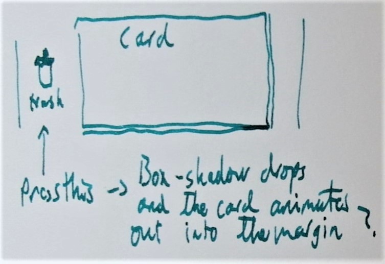
So:
This is a card body. Or card text. What does this look like? What does this feel like? How does this work? Does it need rich text? Will plaintext do? Is markdown a useful compromise?
The idea with the grab handle is that you should be able to rearrange the order of the cards in a thread/stack and even drag it out into the sidebar and position as you wish. You need it as the card body itself is always editable so you can’t make the whole card draggable. This feels like a core affordance for the app so, until testing reveals otherwise, I’m going to keep it in the sketches.
But it doesn’t have to be where it is here. It could be placed in the empty space in the header.
This is a card body. Or card text. What does this look like? What does this feel like? How does this work? Does it need rich text? Will plaintext do? Is markdown a useful compromise?
This could work but I honestly don’t think it’s objectively superior to the margin grab handle.
Either way, the grab handle isn’t even close to being an intuitive affordance and will need a complete rethink and design but this will do while sketching to get a feel for the card problem and figure out what to test.
But, wait, this doesn’t work
All of the above is useful for hashing out certain themes and directions
Now I know that I need to:
- Avoid the Edit → Save cycle. Maybe not avoid the edit mode, per se.
- Avoid
savegestures and loops in general. Autosave needs to work. - Use the card’s text as an API surface for links, much like social media does. (Leverage familiarity.)
- Consider trash, archiving, and delete in context, which means we need to tackle it in the thread/stack view.
- The grab handle needs more work, probably in the thread context, like deletions.
The problem with the above sketches is that they wouldn’t work with the app’s concept as I’ve planned it.
Namely, the concept is that it’s a ‘find first’ UI. Each card is supposed to have a unique name or summary. With a single body card, the first 500 or so characters* would serve as the card’s summary.
The problem with single-body cards is that the app needs to validate the card’s summary: it has to be unique. There’s also the question as to whether you’d allow null or anonymous cards. These would have an internal DB identifier but no external name/summary. Basically, these would be cards that you could only find through a full-text search at some point down the line or by scrolling to its position in the thread. Anonymous cards could be useful. But it could potentially make a clumsy ‘select all’ disastrous. I semi-regularly delete an entire file’s contents by accident this way. Not much of an issue when you have undos and version control but a major issue if doing so made the file unfindable. It’s much harder to revert changes to a file if you can’t find it.
It’s likely that we’re going to need a separate field for the name or summary and it’s certain that this field is going to need stricter validation than the details or body field.
I’m going to need to sketch out a slightly more realistic card.
Even without links, attachments, or cross-references, this feels more clunky. You could finesse the design, streamline it here and there, but if we’re going to have the card always editable then this would mean a fairly high inherent ‘clunkiness’ baseline that you can’t avoid.
I think it’s clear that we’ll need an edit mode. Can the edit mode be made nicer if we assume I can get autosaving to work nicely?
Revisiting the “Edit Mode” and makig it nicer
Having separate “read/browse” and “edit” modes gives me a little bit more freedom when designing each version. I still think they need to be very similar, for usability’s sake. This one’s using Scott O’Hara’s switch component though since this is just an HTML mockup it doesn’t do anything.
You’ll use this to find this card
This is a card body. Or card text. What does this look like? What does this feel like? How does this work? Does it need rich text? Will
plaintextdo? Is markdown a useful compromise?
One issue that this card sketch doesn’t highlight is that the card-and-thread model is supposed to offer similar affordances as many social media services, like Twitter or Facebook. Those services have both highly optimised posting flows (they want to make it really, really easy for you to post quickly) and are also familiar to many. But the creation of a full card with title feels a bit off for a default in this context. You pretty much need to be able to create the simple kind of plain text cards that I sketched up above but without the anonymity issue that would prevent cards from being found or referred to.
This is why I prefer the summary label for the card’s ‘name’, at least for the moment. It implies a potentially longer text than ‘name’. (Thanks for the suggestion, John!) So, I could support a slightly different style for cards that only have a summary and no text in the body.
This is a card summary. As a summary it would work more like a tweet would and wouldn't support Markdown or rich text.
With edit mode on:
Edit mode would need to validate the summary on the fly, make sure it isn’t empty and that it is unique. And it could lock the card in edit mode if you enter an invalid summary.
This is aesthetically a bit rough but it feels right as an initial conceptual model. But I need to see it with more ‘stuff’ to be sure. Some links and attachments.
You'll use this to find this card
This is a card body. Or card text. What does this look like? What does this feel like? How does this work? Does it need rich text? Will
plaintextdo? Is markdown a useful compromise?
With an example description of that link
With an example description of that card
With an example description of that file
Even though I haven’t bothered to add the images to the link previews this feels like the right track. This doesn’t work as the final design, of course. But it would work as an initial sketch that can inform initial testing. Specifically, I need to do some testing to see if the conceptual model of the app is something that prospective users can figure out, what terms and labels make sense for them, that sort of thing. There’s nothing worse than testing a sketch or an idea for an UI and then figuring out afterwards that the basic design was never going to work for other reasons.
This is not the final design
The final design would have to be a lot less rough around the edges but an actual design for implementation needs to answer quite a few questions that this sketch doesn’t:
- Does it reuse the apps other, pre-existing affordances?
- How does drag and drop work, of the card and on the card? How do you indicate draggability? Does a grab handle work?
- Does it match the overall app’s design and UI?
- How much does it lean on OS conventions? Web conventions?
- Does it use rich text, markdown, syntax highlighting?
- How do we animate behaviours and transitions?
- How does it work with keyboard controls?
- What does it sound like to a screen reader?
- How do you distinguish links, cross-references, and attachments? How are they alike? How do they behave differently?
- How are the summary-only cards different? Does having a different style for these cards work? Will it be confusing or break the user’s mental model of what’s happening?
- Does this all make sense and fit together for the intended audience?
- How should the card’s summary reflect the current ‘find’ text?
And so many more. But this is a first step.