index.md 37KB
title: A Crash Course in UX Design Research
url: https://medium.com/user-experience-design-1/a-crash-course-in-ux-design-research-ea00c3307c82
hash_url: b516a25fa1
A Crash Course in UX Design Research
The material in this article was originally presented to the Downtown UX Meetup here in Orlando. A member described it as “a firehose of UX information” but one that built a solid foundation for him to continue learning from. It is the longest article I have written for Medium. I didn’t split it up because I want it to serve as a complete introduction to the field.
First off we will discuss why research is so important, then what we are after, and finally how to go about getting it. But, before we continue, let’s get a little help defining design research.
“The work that uncovers and articulates the needs of individuals and/or groups in order to inform the design of products and services in a structured manner.”
— Nick Remis, Adaptive Path
In that single sentence Nick has packed a lot of really interesting insights. Maybe we can get a clearer picture by diving into the why.
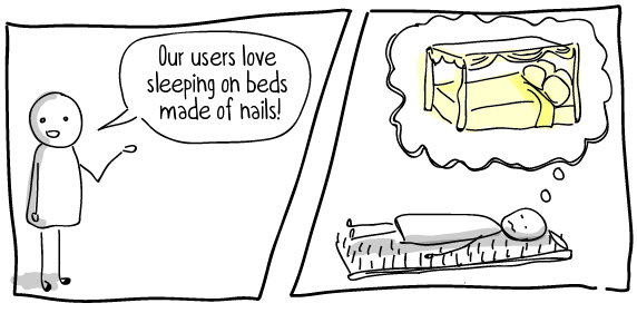
Many of us have a lot of thoughts about our customers and users. We have tribal knowledge, information that we have gained just from engaging in an industry for some period of time. But what do we know?
Often we work on assumptions. Assumptions are great! They are absolutely necessary for us to work as designers, but they become dangerous when treated as facts. Design research gives us a structured, methodical approach to a understanding our users. With it we are able to to represent and articulate them in an unbiased way.
Through design research we are able to:
- Inform the design of products & services
- Validate Assumptions
- Reduce the cost of reaching success

We are knee deep in the Age of the Customer and UX is booming. It has become obvious that earlier models of designing for humans are not quite accurate. We are not sheep who — with the right advertising — will buy any product and abide its flaws. We are not vulcans looking for the one swiss army knife that has more features than any competing product. And we are not robots looking for the most efficient workflow.
Human beings are weird. We don’t always do the most logical thing. And often we go out of our way to experience things that bring us joy. These reasons illustrate why research can help you to understand your users in ways that no other approach can.
So what are we after?
When it comes down to it, we are really after three things with our design research:
- Discover patterns and unknown insights
- Set objectives, Create hypotheses, and reach conclusions
- Invent possible futures
As we collect data throughout our research, synthesizing findings can be a daunting task.
But it doesn’t have to be. Identify patterns in ways that people react to the interfaces we ask them to interact with, the tasks we ask them to complete, the experiences we ask them to share, or the way they engage with us when we ask key questions.
Often times some of these insights and patterns stand out. Or we can depend less on intuition and use a synthesis framework. Either way, by using index cards and post its we get these insights out of your head and into the world. This will help you to more easily notice the patterns and collaborate with your team.
How?
Let me start of by saying that we are not “pure” researchers. We don’t have to follow a strict scientific method.
We do create hypotheses and test them. BUT we can be nimble, we can change the prototypes on the fly. We measure our success by the outcomes we reach.
There are many user research methods that we can use to gather data. I am going to cover several of them in this article, but this is by no means an all inclusive list.
There are three dimensions by which we can categorize these research methods. They are not black and white, and fit more as conceptual pairings than opposing ideas. Some times you can get both sides of a dimension in a single method.
They are:
- Qualitative & Quantitative
- Generative & Evaluative
- Behavioral & Attitudinal
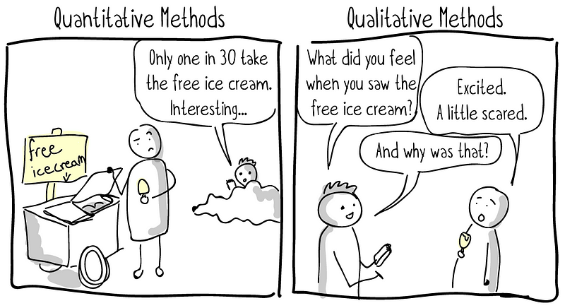
Qualitative & Quantitative
Quantitative methods are typically anything that you can count: time on page, percent of users engaging with x, page views, user flows, time to task completion. A lot of quantitative data in the tech world lives in the things you can do with analytics. Beyond analytics you can get into methods such as surveys and A/B testing. A point to note is that quantitative data thrives with large data sets.
Qualitative methods are typically anything that fall on the other side of the fence. This involves researchers engaging users and digging into their behaviors, feelings, attitudes and emotions by utilizing a plethora of well practiced soft skills. It can also involve users recording themselves, their surrounding and their thoughts while they go through experiences with techniques like diary studies and video ethnography.

One thing that you should keep in mind is that qualitative and quantitative research are not on opposite ends of the same spectrum. They each have their own spectrum and are really more like two sides of the same coin.
Quantitative research can help you to gain confidence and know that your qualitative research candidates weren’t outliers. Qualitative research can give you a deeper understanding of the picture you have pulled from quantitative data, and prevent you from jumping to false conclusions. With quantitative data you may know what a user did, but you don’t know why they did it or if they even liked it.
Generative & Evaluative
Where are you at in your research process? Depending on your answer you might want to focus on more generative research (early on ideation) or more evaluative research (is what were building right?).
One thing to keep in mind is you are not required to be on one side of the fence or the other. Like Qualitative and Quantitative, these can play in harmony to help you get a clearer understanding. I’ll often use techniques from both categories during a session.
Attitudinal & Behavioral
This final dimension categorizes our research methods into the realms of “What opinions do a user have about a product or service?” and “How is a user actually interacting with a product or service?” For certain situations you may need to know what your users think, but for others it is more important what your users do. Again, use the appropriate methods to assess one, the other, or both.
Let’s get a better understanding by looking at several research methods. As you read about each one, think about how you might leverage it to collect Qualitative and/or Quantitative data, to generate ideas and/or to evaluate them, and to assess behaviors and/or attitudes of your users.
Design Research Methods
A quick aside — I share some resources to dig in deeper with each of these methods. I recommend reading through them all and then coming back to follow links for the ones you would like to learn more about!
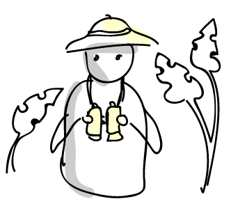
Service Safaris
A service safari involves going out into the wild and experiencing a service first hand. This tends to be much easier if you work at a large organization, or if you are new to or a consultant for the organization. As you go through the experience, take note of the interactions you have with the organization. Are there gaps in the experience that you have to leap? Are you passed from one person to another? Dig into this method more with this worksheet.
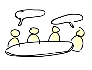
Focus Groups
Focus groups involve getting users together to talk about your product or service. This method has been around for a long time. It is sometimes criticized because it tends to emphasize group think and doesn’t identify “unmet needs.” To learn more about running a focus group, there’s a great list of “Do’s and Dont’s” from UX Matters.

Interviews
In much of our research we talk to users in one way or another. Often these methods bleed into each other in practice. Interviewing users is valuable much in the way you interview potential new hire at your organization. The focus here is to gain a deeper understanding of your user, their motivations and background. This is useful data when it comes to building personas. The NN/g have a spectacular article on when interviews are useful.

Surveys
This is an often inexpensive method you can use to gain insight quickly. Surveys are tricky because of two problems that tend to arise with them. First off, there is a significant selection bias at the type of user who will fill out your survey, even when using incentives. Secondly, it can be difficult to ask questions that don’t lead your participants to the answers you were looking for. Caroline Jarrett gives us some great tips for writing surveys in this Sideshare.

Directed storytelling
You can pair this method with almost any in which you are interacting with a user. Being intentional about how we dig in is important. Directed storytelling may be my favorite research method because it helps us gain that deeper understanding. It involves listening empathically and guiding the user to dig deeper when they answer a question. There is often more to reveal just under the surface. Jamin Hegeman has an awesome short story about how this works.

Diary Studies
Also called Annotated Experiences, these are not “Dear Diary” but more a user documenting their thoughts as they go through an experience. This might be a process you are hoping to improve by building a tool. Or it could involve going through your service as it is today, like a Service Safari by proxy. UXPA Magazine published an article that gets into some of the nitty-gritty details of Diary Studies.
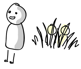
Field Studies
Do you enjoy people watching? Have you ever sat in a hotel lobby and observed someone checking in? A field study is that but with more intention. They can be a great way to get beyond what a user can tell you they need, identifying the areas where they struggle and don’t even think about it. The areas that have just become part of life or “just the way it is.” We don’t settle for that in UX, and field studies can be a great way to unearth those problems. Jared spool goes so far as to call them “the best tool to discover user needs.”

Intercepts
If you were doing research on redesigning a High End Cocktail Ordering Experience you might want to go to a few bars and, after a customer finishes ordering their drink, jump in and ask them what they liked and didn’t like about the experience. This is an intercept. You swoop in just as a user completes a task and then ask them about their experience while they are still in that moment. You can even do this with a digital task, but there is a lot more risk of putting someone off when they have a modal in their face as opposed to another human being who is reaching out to them. Read more about digital intercepts on the User Testing blog and how NN/g used intercepts to drive remote field studies.

Video Ethnography
This research method works well for remote activities that it is difficult to get all or any of the researchers to. You can equip your subject with some inexpensive camera gear and ask them to record their experience going through a service, activity or while working with a product. This method leverages some of the elements of a Diary Study with some of the elements of Field Studies. Tomer Sharon gives us a deeper understanding by highlighting 10 examples of video ethnography.
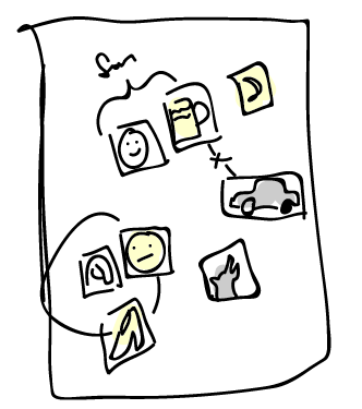
Picture Cards
Also called Collaging, this method involves equipping users with a focus and a set of randomized pictures, words, drawings and symbols. The user is then invited to tell a story using those supplies. This can be particularly useful when a topic is difficult or emotional to discuss. For example, asking patients or family members to tell you a story about a time they sat in a waiting room. Providing these tools can help that person share emotions that might be difficult otherwise. Minnie Bredouw from IDEO shares a story on Design Kit about a time she utilized collaging in a workshop with users in rural Nigeria.
Mental Model Mapping
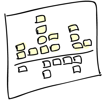
I only learned about this method recently but it is fun and can be really insightful. As you research the needs of your user, you put those motivations above a line. Then, place the features that address those needs below the line in the same column. This can help you to identify where there may be deficiencies in your application and where you are doing something that isn’t necessarily needed by your users. You should definitely check out this cartoon that explains Mental Model Maps from Indi Young and Brad Colbow.

Usability Testing
This method involves testing a mockup, prototype, drawing, or even live code by giving a user tasks and inviting them to complete those tasks while you observe. I am always amazing at the things I learn when I run a usability test. I use this method more than any other and strongly recommend you try it out if you don’t already. Often I hear concern over how expensive this method is perceived to be, but I can tell you from experience that it can actually be rather inexpensive. Check out Steve Krug’s book Rocket Surgery Made Easy and this UX Booth article on usability testing to learn more.

A/B Testing
One potential issue with Usability Testing is that human beings often want to be pleasing and might not be honestly critical of your work. This problem can be addressed with A/B Testing. Showing a user two options and asking them to give you feedback comparing the pros/cons of both opens up the conversation and can provide more honest feedback. You can use technology to run A/B Tests in a quantitatively relevant way by presenting users with interface variations in the wild. To make another book recommendation, The Handbook of Usability Testing is an oldie but a goodie and does a great job of digging into both methods. Also, NN/g digs into some intriguing concepts of A/B Testing in this article.

Participatory Design
This is a bit of a broad category of research but essentially boils down to engaging stakeholder in design activities that enable them to share ideas with you in a collaborative way. Often this is an effective way to get customers, executives or other SMEs to share concepts that they otherwise might have a difficult time communicating. It is worth noting that this does not mean you don’t have to design. It can be a common misconception that gives this method a bad name. Dig in deeper with the folks over at Wicked Problems as they explore what Participatory Design means to them.
Card Sorting
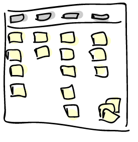
Card Sorting is a great tool when working on primary navigational elements. In a simple exercise you provide a user with a stack of index cards that have the titles of pages or content on them. The user is then asked to organize these cards into groups. Depending on your needs you can do this in an open way where the user may define their own categories, or in a closed way where the categories are predefined. Read more about this method with Donna Spencer’s Definitive Guide to Card Sorting on Boxes and Arrows.

Analytics
Okay, this last one is unfair as there are many kinds of research methods you can bundle into “Analytics.” How long does a user spend completing a task? Which features are most commonly utilized? What page flows do users typically take? These and so many more questions are answered with analytics. The one tricky thing is in the interpretation of the data. Remember the need for both qualitative and quantitative data? If you only look at analytics it can be easy to jump to conclusions, but without marrying the data to real qualitative research you might be missing out on some important insights. Dig in deeper with Luke Hay and An Analytics-First Approach to UX on UX Booth.
Creating Opportunities for Research

Now that you are beginning to build a toolbelt of research methods, you may be wondering how you can actually do this research. Well, depending on your needs you may want to target specific candidates based on these four factors (and others more unique to your situation). But if I can give you one piece of adivce it would be to go big or go anyways. It doesn’t matter if you don’t have the opprituinty to do a big in-depth study, just do a small not in depth study. Some research is better than no research, some insight is better than no insight, and the more you do it, the more evidence you will collect to show why it is so beneficial.
Practice on your friends, or your spouse, or your coworkers. It’s a great way to discover if you are asking leading questions or to catch some of the surprises you might encounter when you are actually in it.
You Did It!
You just learned about 16 design research methods. Great job! As you read about each one were you able to categorize them in our three dimensions? Do you have an idea how they might be able to serve your needs through the different stages of the design process?
The last resource I will leave you with is another NN/g article that categorizes them across two of our dimensions and helps reveal insight into when they might be useful to you.
But perhaps now is a great moment to take a break and grab a cup of coffee or tea. When you’re ready, come back and dig into the resources I linked to for more in depth details about the research methods you are most intrigued by.
Thank you to those who wrote the further reading I’ve shared:
Nick Remis, Masuma Henry, Indi Young, Jakob Nielsen, Caroline Jarrett, Jamin Hegeman, Carine Lallemand, Jared Spool, Aidan Bryant, Tomer Sharon, Minnie Bredouw, Brad Colbow, Steve Krug, Jeffery Rubin, Dana Chisnell, Jennifer Cardello, Liz Sanders, Donna Spencer, Luke Hay, Christian Rohrer, and anyone I may have missed— your generous contributions to the field of UX have inspired a generation of UX professionals.
And thanks to the platforms they share their thoughts on:
Adaptive Path, Artefact Group Blog, Johnny Holland, UX Matters, NN/g, UXPA Magazine, UIE, User Testing Blog, Usabilla Blog, Design Kit, Smashing Magazine, UX Booth, Wicked Problems
Also a huge thanks to the members of the Downtown UX Meetup in Orlando. Presenting this material to them inspired me to write this article and share it with you. Special thanks to Gus Hernandez, Erin Fonzi Denton, and Denise Benkert for giving me feedback on this article.
Finally, thank you!
I really appreciate you reading this introduction to UX Design Research. I would love to hear from you on twitter (@MattPLavoie) and am always happy to talk about UX.
