index.md 23KB
title: Tailwind marketing and misinformation engine
url: https://nuejs.org/blog/tailwind-misinformation-engine/
hash_url: 44c12c8fbb
archive_date: 2024-02-18
og_image: https://nuejs.org/img/tailwind-messaging-pillars.jpg
description: The origins of Tailwind and how it is framed against semantic CSS
favicon: https://nuejs.org/img/favicon.svg
language:

<h4>Tero Piirainen</h4>
<p><a href="//twitter.com/tipiirai">@tipiirai</a></p>
Tailwind CSS was born out of this sentence:
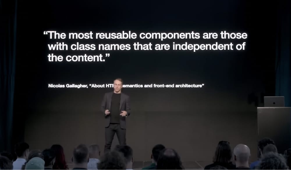
The sentence is from Nicolas Gallagher’s article about HTML semantics and front-end architecture. It was a turning point for Adam Wathan, the creator and frontman of Tailwind. After reading the article he was “fully convinced that optimizing for reusable CSS was going to be the right choice”
Phase 1: The Origins of Tailwind
Nicholas points out in the article that scalable HTML/CSS must “rely on classes within the HTML to allow for the creation of reusable components”. So instead of using a content-dependent class name like “news”, one should use a content-independent name like “uilist” or “uilist-item”:
<nav class=“uilist“> <span class=“uilist-item“><i>.</i><i>.</i><i>.</i>
</span> </nav>
The more generic the name, the more reusable it is. He used the famous media object as a prime example of reusable CSS.
But that’s not how Adam understood the sentence. Instead of moving towards more reusable class names, he introduced a custom grammar to inline styling rules directly to HTML:
<!-- “uilist” --> <div class=“ sticky top-0 z-40 w-full backdrop-blur flex-none transition-colors duration-500 lg:z-50 lg:border-b bg-white/95 supports-backdrop-blur:bg-white/60 dark:bg-transparent“><!-- “uilist-item” --> <span class=“ py-4 border-b border-slate-900/10 lg:px-8 lg:border-0 dark:border-slate-300/10 px-4“>
<i>.</i><i>.</i><i>.</i>
</span> </div>
This was quite a big step away from what Nicolas was saying, who resisted the idea of coupling visual information to elements, like everyone else in the industry back then.
However, in his keynote speech, Adam makes us believe that the language he created was a prime example of Nicholas’ thinking. And because Nicolas was working at Twitter, Adam’s take on CSS should work for sites small and large.
On August 7, 2017, Adam wrote an article about CSS utility classes and “Separation of Concerns”. It demonstrates with cleverly chosen examples, how his new creation leads to more maintainable CSS architecture.
But there was a challenge: to make such a statement, he needed to reshape the established CSS best practices. So he introduced new terms to back his contradictory idea:
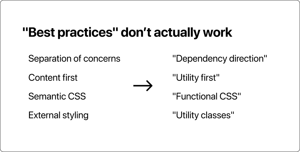
The new approach can be summarized as follows:
“Semantic class names” are the reason CSS is hard to maintain
This was a hefty statement as it contradicts with all the prior work and studies about CSS.
In his keynote speech, Adam uses harsh words to describe the traditional way of structuring CSS, as opposed to how Tailwind is described:
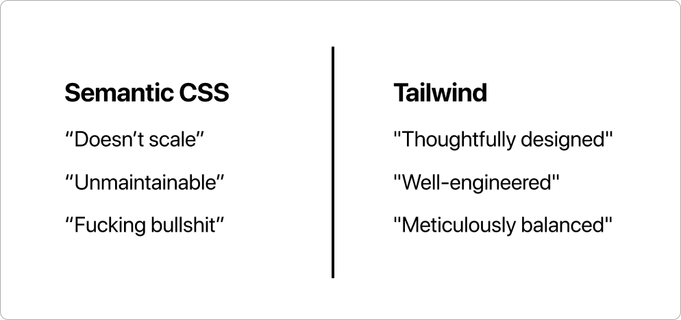
Old best practices like “semantic”, “separation of concerns”, or “clean” are usually quoted, which is a common way to question the validity of the word.
Unfair or not, this marketing scheme worked. Developers took the new terms and practices for granted and started tweeting and blogging about them. It was a gold mine for Talwind’s commercial business model.
Phase 2: Utility-first workflow
Once they started cashing, Tailwind wanted to make sure the users were properly onboarded and locked in to the system. They introduced “utility-first workflow”
Tailwind encourages a utility-first workflow, where designs are implemented using only low-level utility classes. This is a powerful way to avoid premature abstraction and the pain points that come with it.
Here’s how the flow works:
Step 1: Onboarding
In the utility-first approach, the idea is to “build everything out of utilities, and later extract repeating patterns as they emerge”. You are encouraged to try the system. Adam says:
If you give it a chance, I really think you’ll wonder how you ever worked with CSS any other way.
Sounds good, so let’s try it.
Once installed, you quickly start to see why people enjoy Tailwind. You can write your styling in the same place as your markup and never think about semantic class names. You feel productive with all the handy shortcuts together with hot-module replacement.
Step 2: “Premature abstraction”
At some point, hundreds of utilities later, the code you’ve written doesn’t look pretty. You start wondering what comes next after the utility-first step. How to clean things up?
Turns out there is no next step. Or it kind of exists, but it’s called “premature abstraction”. You can start extracting classes with @apply, but the documentation for reusing styles describes it as a bad practice.
Whatever you do, don’t use @apply just to make things look “cleaner”
But what should I use @apply for if not for cleaning up? The documentation does not say. It only tells me why it should not be used.
Step 3: Vendor lock-in
So I keep coming back to the first step resulting in more and more utility classes. I’m locked inside a loop:
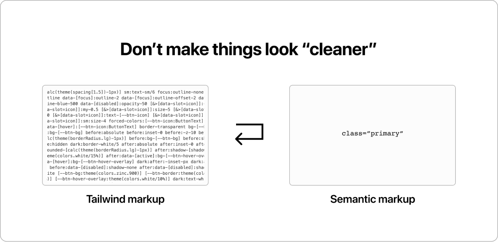
I find this a rather clever way to lock people using Tailwind, resulting in more retention, loyalty, and money.
Phase 3: Catalyst UI kit
In December 2023, Tailwind introduced Catalyst with a richer set of language expressions and a React-based UI library.
Domain-specific language (DSL)
To keep up with the ever-evolving CSS standard Tailwind introduced another set of language literals. Over the years Tailwind has grown from a simple set of atoms to a vendor-specific language with expressions, operators, and method calls.
Let’s look at the source code of the first button on Catalyst demo page:
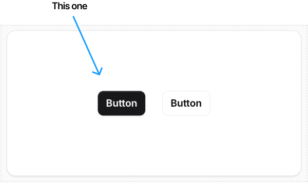
The black button source code. The expressions are sorted alphabetically:
<button class=“
[&>[data-slot=icon]]:-mx-0.5
[&>[data-slot=icon]]:my-0.5
[&>[data-slot=icon]]:shrink-0
[&>[data-slot=icon]]:size-5
[&>[data-slot=icon]]:sm:my-1
[&>[data-slot=icon]]:sm:size-4
[&>[data-slot=icon]]:text-[--btn-icon]
[--btn-bg:theme(colors.zinc.900)]
[--btn-border:theme(colors.zinc.950/90%)]
[--btn-hover-overlay:theme(colors.white/10%)]
[--btn-icon:theme(colors.zinc.400)]
after:-z-10
after:absolute
after:data-[active]:bg-[--btn-hover-overlay]
after:data-[disabled]:shadow-none
after:data-[hover]:bg-[--btn-hover-overlay]
after:inset-0
after:rounded-[calc(theme(borderRadius.lg)-1px)]
after:shadow-[shadow:inset_0_1px_theme(colors.white/15%)]
before:-z-10
before:absolute
before:bg-[--btn-bg]
before:data-[disabled]:shadow-none
before:inset-0
before:rounded-[calc(theme(borderRadius.lg)-1px)]
before:shadow
bg-[--btn-border]
border
border-transparent
dark:[--btn-bg:theme(colors.zinc.600)]
dark:[--btn-hover-overlay:theme(colors.white/5%)]
dark:after:-inset-px
dark:after:rounded-lg
dark:before:hidden
dark:bg-[--btn-bg]
dark:border-white/5
dark:text-white
data-[active]:[--btn-icon:theme(colors.zinc.300)]
data-[disabled]:opacity-50
data-[focus]:outline
data-[focus]:outline-2
data-[focus]:outline-blue-500
data-[focus]:outline-offset-2
data-[hover]:[--btn-icon:theme(colors.zinc.300)]
focus:outline-none
font-semibold
forced-colors:[--btn-icon:ButtonText]
forced-colors:data-[hover]:[--btn-icon:ButtonText]
gap-x-2
inline-flex
isolate
items-center
justify-center
px-[calc(theme(spacing[3.5])-1px)]
py-[calc(theme(spacing[2.5])-1px)]
relative
rounded-lg
sm:px-[calc(theme(spacing.3)-1px)]
sm:py-[calc(theme(spacing[1.5])-1px)]
sm:text-sm/6
text-base/6
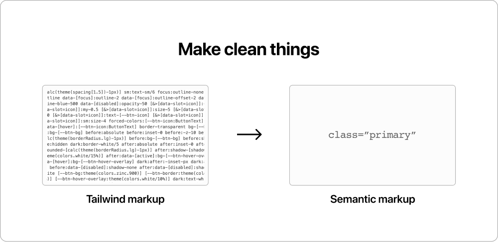
text-white“> Button </button>I have many questions about this:
Most importantly: how is this wall of text more maintainable than a class name like “primary”?
Do I need another wall for the white button?
Also: are there any limits to the utility-first workflow? When can I use @apply to clean things up? After 50 expressions? 100 expressions? 1000?
“Modeled after HTML”
Another major feature in Catalyst was a new markup language that separates all the language literals behind React components. Here’s a dialog example using Catalyst components:
<Dialog>
  <DialogTitle>Join mailing list</DialogTitle>
  <DialogDescription>
    Expect <Strong>no spamming</Strong>
  </DialogDescription>

  <DialogBody>
    <Field>
      <Label>Email</Label>
      <Input name=“email” />
    </Field>
  </DialogBody>

  <DialogActions>
    <Button plain>Cancel</Button>
    <Button>Join</Button>
  </DialogActions>
</Dialog>
The markup feels surprisingly similar to semantic HTML:
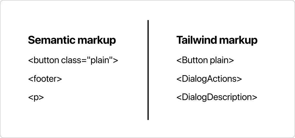
This raises more questions:
Most importantly: How is <button class=“plain”> different from <Button plain>? Isn’t this “semantic” — the root of all bad in CSS?
And standard HTML <dialog> is bad, but <Dialog> with uppercase is legit?
Why introduce so many different versions of the <p> tag?
<!-- Catalyst <p> tags -->
<Text>
<Description>
<DialogDescription>
<AlertDescription>
...
Why is content-aware naming okay in element names but bad in class names?
Is separation of concerns suddenly okay with Catalyst, but bad with vanilla HTML and CSS?
I’m confused, to say the least.
I love ❤️ CSS
I started web development at the age of a <blink> tag and CSS has always been my favorite part of the web development stack. I’m particularly fascinated about the crossing between design and front-of-the frontend.
When Microsoft released Internet Explorer 4.0 with solid support for both external stylesheets and DHTML, It nailed me to the separation of concerns pattern. I see it as the most important component for software scalability and it’s particularly important with HTML and CSS. The way of organizing design has been around for centuries: there are element types and contexts. The nuanced relationship between form and function. CSS is the missing tool to bring foundational design-thinking to frontend development.
Fast forward to this date, and the solid foundation has almost disappeared. Styling is inlined and CSS is written with JavaScript. There are no element types, nor contexts. Styling is flat and not cascading. Global is feared instead of used.
We’re using maybe 30% of the full potential.
I’m not a fan of any of that.
I recommend everyone to take a closer look to what has happened to CSS there in the past 10 years. Regardless of your current stance. It’s a powerful language that far surpasses the capabilities of Tailwind. Learn to build scaleable architectures, and see how atomic class names and inline styling fit into the bigger picture.
First things first: Learn CSS
The first step is to learn CSS. It’s the ultimate design language for the web. A safe bet for years to come.
Start from the Nicholas’s post and learn the benefits of semantic naming. Understand how Adam cherry-picked one sentence and misused it to validate the contrasting practises of Tailwind.
Study MDN documentation on web standards. There’s a lot, so start with the most important aspects of CSS: the cascade and specificity.
Take inspiration. Learn how the best developers in the game like Ryan Mulligan, Ahmad Shadeed, and Josh Comeau use CSS in more stylish, and creative ways.
Content first
Here’s a better workflow. It has many names: “standards first”, “content first”, or “progressive enhancement”.

You start with a pure, semantic layout and figure out all the reusable pieces of CSS. At times, especially when building new components, you might want to prototype quickly with inline styling. But that’s okay and part of the system. You can clean things up later.
Clean code is easier to maintain
There are no “pain points” in clean code, only benefits. This is the system I want to teach to my kids. I want them to understand how web standards work, and where all the trends come from.
Because trends are temporary, but standards are forever.
Stay relevant
My guess: It’s only a matter of time before Tailwind collapses. The vendor-specific language and the misleading communication cannot hold water very long. The utility soup produced today will eventually turn into a technical debt. The next generation looks back and asks: “You actually wrote that?”
Learn to write clean HTML and CSS and stay relevant for years to come.
