New HTML Control Lands in Safari
Native toggle switches landed in one browser. Safari introduced this new HTML control as part of the Safari Technology Preview 185 release and then expanded it in the 186 release.
Creating a semi-native HTML toggle switch component is quite hacky. It involves using a checkbox, adding the "switch" ARIA role, removing its appearance with CSS, and adding styles to make it look like the classic switch or however we want —check this toggles collection.
And even doing all that, some things cannot be avoided. For example, developers can still set the indeterminate attribute into the base checkbox using JavaScript, which would make the toggle switch invalid.
A native solution would prevent these problems and provide a better experience. Even when it's only an experiment on one browser and has some issues (as we'll describe soon), this attempt is welcomed, and I hope it gets traction.
How does it work?
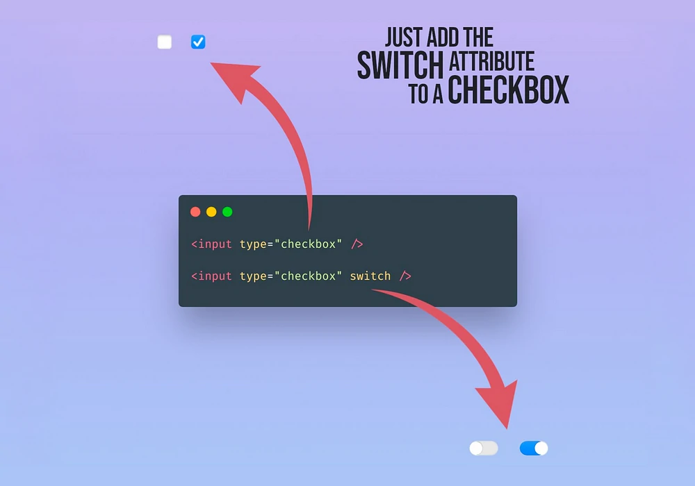
Safari's implementation is as straightforward as it can be. Just add the switch attribute to a regular checkbox, and you'll be done!
<!-- this will render a checkbox -->
<input type="checkbox" />

<!-- this will render a toggle switch -->
<input type="checkbox" switch />
It's really that simple. There is no need for additional CSS, JS, or anything complicated, and the browser will take care of the rest, including out-of-the-box interactions and styles.

The default visualization resembles the toggle switch of iOS, but as part of the feature, Safari includes two pseudo-elements ::track and ::thumb that make it easy to update the look and feel of the control. @yisibl added a few examples of how they work (you'll need Safari Technology Preview 185 or above to see them).
Thoughts on this syntax
Having a switch attribute in the checkbox makes it easy, but it also may be misleading as it looks like it equates toggle switches to checkboxes. While this may seem logical to many, it is unfair to the switch control, which becomes a "sub-control" tightly coupled to the checkbox.
They are not the same component: they have different values (checked/unchecked vs. on/off), one of them has an indeterminate state (checkbox, although it's not technically a state), and one is supposed to have an action associated on change (switch).
So why couple them? Just because they look the same or behave in a "similar way"? That's wrong. Following that logic, we shouldn't have inputs of the type number, date, password, email, search... because we already have the text input to handle all of them.
<!-- We don't do this -->
<input type="text" number />
<input type="text" date />
<input type="text" password />

<!-- So why do this? -->
<input type="checkbox" switch />

<!-- Wouldn't this make more sense? -->
<input type="switch" />
In my opinion, a toggle switch should be its own type of input. And not a "sub-type" or "sub-control" dependent on the checkbox.
Pros and cons
As with every technology —especially a new one—, Safari's toggle switch has good and bad things. Here are some pros and cons of this component.
Pros
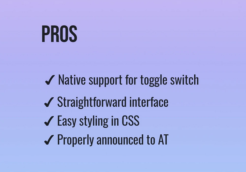
- Provides native support for the control: no need for hacky or complex solutions that require too much code and may be error-prone.
-
Straightforward interface: easy to implement (add an attribute!) and easy-to-follow new pseudo-elements (
::trackand::thumb). -
Easy styling in CSS: with the introduction of two pseudo-elements (
::trackand::thumb), changing the styles of the components would become simple. - Accessibility out of the box: the control is announced correctly by the Voice Over screen reader without needing extra ARIA labels or roles. Adrian Roselli ran tests and shared the results over time.

Cons
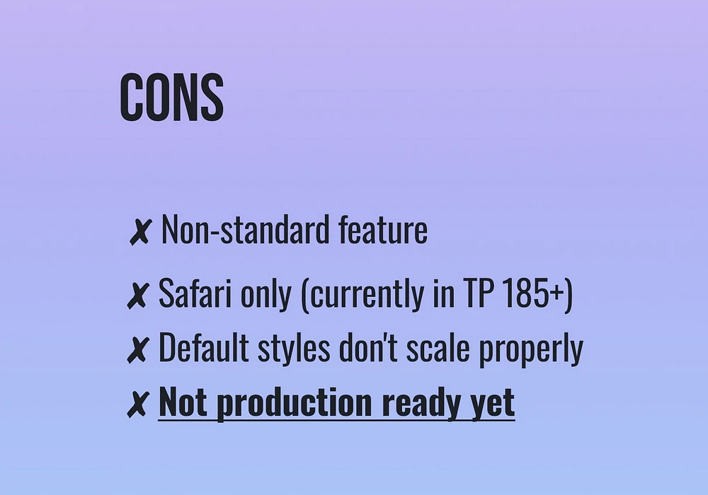
- Non-standard feature: this is a Safari proposal and hasn't been adopted by other browsers or taken into the standard.
- Safari-only feature: as it is a new suggestion by Safari, it will work only on Safari and only in the Technology Preview version of the browser (from version 185).
- Default styles are sketchy: the toggle looks like the regular iOS toggle, but it presents some issues when scaling and applying zoom.
Considering those cons, it is safe to say that this is not a production-ready feature. At least not yet. It could be an excellent case for progressive enhancement approaches (maybe the reason why they made it an attribute instead of a full type: falling back into a checkbox if not supported), but waiting to see how the component moves forward is better. It is still too early.

Final thoughts
Toggle switches are a great addition to a browser, and the Safari team did nicely adding it to the Technology Preview version. Still, the implementation feels a bit rushed —maybe Safari is trying to earn brownie points with developers while shaking the "The New IE Browser" label?
One of the things that is more counterintuitive is the used syntax. Having a switch attribute in the checkbox makes it easy, but it also unnecessarily associates both controls and doesn't follow the same notation that other form controls follow. I wouldn't be surprised if this is one thing that changes when —not if— this proposal moves forward. So beware of support and likely changes in the future.
As I said, this is a great addition to the form controls. I hope it triggers a deeper conversation about its addition to the standard. I look forward to what it becomes and the possibility of using it on any browser.