In the world of email marketing, opens and clicks are everything, which means email marketers are always testing ways to improve these metrics. We'll tweak subject lines, calls-to-action, images, headers, layout, link positioning, copy, length, tone, content ... the list goes on and on.
Through all of this testing, there's one hard truth we've discovered: Aside from proper list segmentation, nothing boosts opens and clicks as well as an old school, plain-text email.
While the plain-text emails we created had some formatting capabilities (hyperlinks, tracking pixels, etc.), they were as close to plain-text as we could while maintaining the ability to track opens and clicks for testing purposes.
With that said, here's how we came to that conclusion.
Beyond Deliverability
The (relatively) old debate of plain-text vs. HTML is mostly centered around email deliverability. We won't be covering all of the deliverability best practices in this article, but it is important to have some context around that metric.
Having an HTML email does not hurt your deliverability as long as you have two things: a properly coded HTML email and a plain-text version.
1) The HTML email needs to be properly coded.
If there are broken tags in your HTML, the email provider and users can mark it as spam. That'll hurt deliverability -- not just for that email, but also for any emails coming from that particular email address in the future.
2) The email should also contain a plain-text version.
Most email marketing tools will let you easily create plain-text versions within their email editor, so take those five extra minutes to create and optimize the plain-text version of your email. Otherwise, email providers such as Gmail or Outlook might think your email is dodgy -- they expect legitimate companies to follow this basic best practice.
If your emails follow the deliverability guidelines above, your HTML and plain-text should have the same deliverability metrics.
So if you're following the best practices above, which type of email actually performs better once it's in someone's inbox?
People Say They Prefer HTML Emails
In a 2014 survey, we asked over a thousand professionals whether they preferred HTML-based or text-based emails, and whether they preferred emails that consisted of mostly text or mostly images. Nearly 2/3 of the respondents said they preferred HTML and image-based emails.
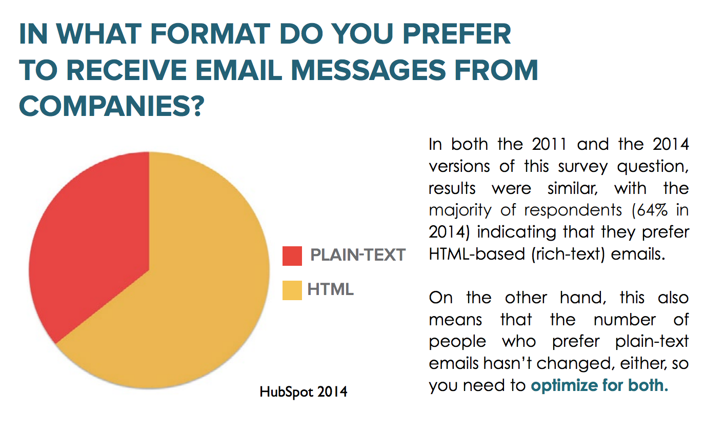
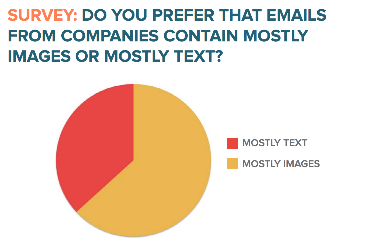
Great, we thought. If people wanted visuals, we'd give them visuals!
So we decided to experiment with varying degrees of HTML-richness -- plain HTML templates, snazzy and sleek HTML templates, beautiful headers, different sized and positioned images, various call-to-action buttons, and even GIFs -- to see which would have the best result.
... But They Actually Prefer Plain-Text
In every single A/B test, the simpler-designed email won. The emails with fewer HTML elements won with statistical significance.
Ouch.
Every other marketing channel is moving towards incorporating visuals and seemingly getting positive results. Why were emails performing worse when we attempted to make them more visual appealing?
HTML emails reduce open rates.
One thing that we noticed was that our HTML and plain-text emails were both receiving the same deliverability rate. So if they were getting delivered at the same rate, how were HTML emails underperforming?
To understand the full scope of what happened, we decided to A/B test our email sends. We tested various segments of our database in multiple regions to get a better picture of HTML vs. plain-text emails.
The results confirmed what we assumed: HTML emails decreased open rates. What was interesting, however, was that not only were HTML emails receiving lower open rates than their plain-text counterparts, the more HTML-rich an email was, the lower its open rate.
Here are some of the A/B test results we found:

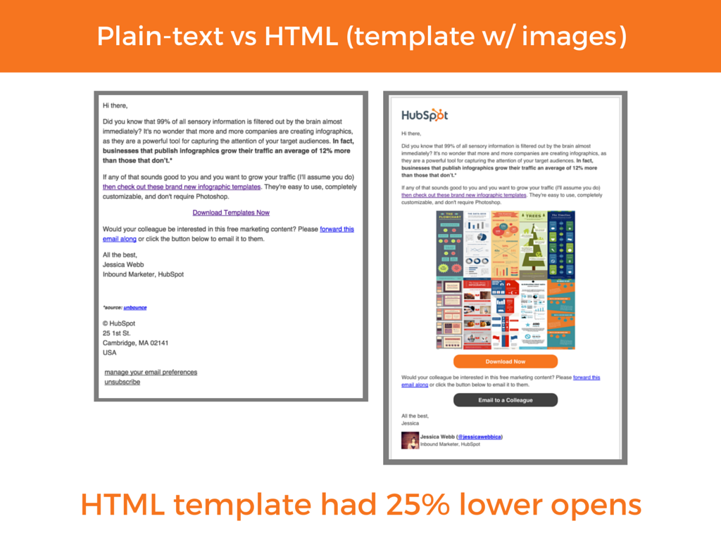
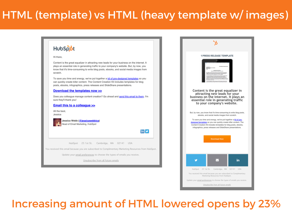
While these (and at least 10 more) tests vary in the percentage opens were lowered, the conclusion we came to was that simpler HTML emails had better open rates than HTML-rich emails, and that plain-text emails performed best of all.
Why?
We figured it had to do with the concept of deliverability. Just because something says it's been delivered doesn't mean it's actually in a noticeable place of someone's inbox.
Email services are increasingly filtering emails (especially commercial ones) to provide a better experience for the user. An example of this is Gmail's promotions tab. It automatically filters what it deems "commercial" emails out of the main inbox unless the user changes the settings.
So the simple explanation is that image tags and HTML-rich templates seem to be getting flagged by email providers as commercial email, which means they get filtered out of a recipient's main inbox. (And thus, people can't open it.)
HTML emails reduce clickthrough rates.
But open rates are just one part of the picture. Even if open rates decreased with HTML emails, most marketers assumed HTML emails would convert better because they appear well designed.
For example, shouldn't an email with an image of the ebook being promoted do better than an email with no visualization of the offer? Wouldn't just a plain email be boring, and not help explain the offer? Aren't humans wired to be attracted to beautiful design?
Unfortunately, this principle doesn't apply to email.
And the reason is simple: Email, unlike other marketing channels, is perceived as a 1-to-1 interaction.
Think about how you email colleagues and friends: Do you usually add images or use well-designed templates? Probably not, and neither does your audience. They're used to using email to communicate in a personal way, so emails from companies that look more personal will resonate more.
To better understand the impact of plain-text vs. HTML emails, we looked at the effect on the click rate (clicks/delivered) which is influenced by open rates, and clickthrough rates (clicks/opens) which isolate clicks from the variable of opens.
For the click rate, we dove into data from over half a billion marketing emails sent from HubSpot customers. These customers vary in type of business, and have different segments, list sizes, and list compositions.
What we found was that even a single image reduced the click rate:
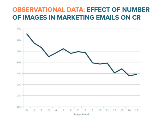
This data above is of course correlated to open rates -- but what other factors might be contributing to the decline in click rates? In the data above, it's clear that after the HTML threshold is crossed, click rates continue to decrease, which means it's not just the open rate affecting the click rates
To see if the clickthrough rate (clicks/opened) were affected, we looked to our A/B tests once again. For the emails in the section above as well as in the others we have tested, the plainer variation won with statistical significance.
- For the plain-text vs. .GIF image test, the .GIF version had a 2.3% lower clickthrough rate. This, combined with the lower open rate, meant the plain-text version got 42% more clicks.
- For the plain-text vs. HTML template with images test, the HTML email version had a 21% lower clickthrough rate, and combined with the open rate the email had 51% fewer clicks.
- For the simple HTML template vs. HTML-heavy template, the simpler email had a 5.3% higher clickthrough rate, and combined with the higher open rate, resulted in getting 30% more clicks.
It would seem that better design or even images did not improve the clickthrough rate -- in fact, HTML consistently had a lower clickthrough rate. When combined with the lower open rates, this can turn into a double-whammy for email conversions.
What This Means for Email Marketers
Although people say they prefer HTML-based and image-based emails, in reality, simpler emails perform best -- and plain-text emails perform best of all.
In most instances, lower opens and clicks are due to several factors:
- Filters set up by email providers that divert commercial emails from users' main inboxes.
- Email client limitations. For example, Gmail will not automatically show images from unknown senders.
- User preference for digestible formatting. Plain text might be perceived as less of a time commitment to read, or perhaps people really don't care for design in email.
Ultimately, in email, less is more.
This can be a tough pill for marketers to swallow (myself included) because we're naturally driven to be creative. But data repeatedly shows plain-text email wins, so it's up to us to decide whether or not we want to make the switch.
Like with all cases, there may be exceptions. For example, ecommerce companies may have completely different results because users expect only HTML-rich emails with visuals of products. So before you make any final decisions, it's important to test your own emails.
It's not all bad though. Being limited to plain-text forces marketers to get creative with the basics -- subject line, copy, positioning, link placement -- to achieve the desired result. Sometimes "old-school," well-written copy is all you need to get the job done.