What makes the difference between a good digital product and a great digital product? Two letters: UX. User Experience Design. But there’s a fundamental problem with that.

The term “User Experience” was brought on the map by Don Norman, author of “The Design of Everyday Things”. The idea is to look past the visuals and functions, and towards the feelings and thoughts that a user has when using the product. Improving the user experience should make using a product more joyful, more convenient. It should lead users to stick to a product and feel a sense of progression once they are using it. But it also poses a big issue:
User experience design has led us to use a certain vocabulary: Instead of seeing human beings with goals and attitudes, we see users. We use words like subscribers, subs, visitors, spenders, whales or even just “traffic” or “installs” to refer to them. We assign a role to them. UX design dehumanizes people.
This isolated world view is not only narrowing our view on the people who interact with our product, but it also limits the opportunities we can see - designing for the whole human, not the user, will give you a completely new perspective on your product and your business model. How do you create Human Experiences, instead of User Experiences?
The key point of UX design is to look at users – from the perspective of the product, or the company that is making it. How can we serve our users better? How can we improve the experience of our users? How do the users feel?
The issue with that: we only care about them while they are a user of our product. And this limits our view on the person who is using our product. What’s going on with them when they aren’t using our product?
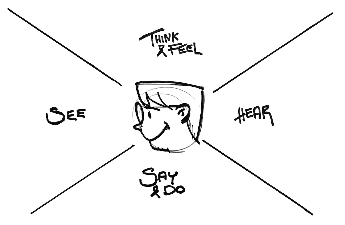
Try to change the perspective: Instead of looking at a user, a persona, an audience member – look at your product. Look at your product from the perspective of the human who is using your product. Ask yourself:
Switching sides is a great hack to get a better understanding of how your users tick, even when they are not using your product. It will help you to empathize with them and get a better understanding of the human beyond the user.
When UX designers favor one feature over another one, they want to know the impact they’re creating. Does the red button attract more users to click it? Will people get the slider feature? Can this modal window help drive more 5-star reviews?
A common way to measure this is Key Performance Indicators, short KPIs. Typical KPIs are figures like the number of installs, daily active users, retention rates – how many users will come back the next day, in 3 days, in 14 days? KPIs are a powerful tool to get an idea over general user behavior and the impact that design changes can have. Some designers are even judged by the influence their design has on these numbers – and that is a trap.

The great misunderstanding of KPIs is that they are not actually success metrics – as performance indicators, they show you the way to go to reach a business goal. Yet they get treated like a business goal. “This modal will bring us more reviews!” – “If we send people daily notifications, our retention will be higher” – “A permanent notification badge will result in higher click rates!” That is all true, but none of that should be your goal. See it like that: When you start a road trip, you’re not driving to the sign on the highway that says “Montauk – 50 miles” – you’re going for the beach.
Designing to optimize KPIs is like getting in the car to see how close you can get to that sign on the road. What your design should be about is the hard business goal: Selling things, getting people to donate or sign up for something – and eventually, make people happy on the way. A KPI can help you see how your trip is going, but it should never be the goal.
What makes us humans special is the awareness of life itself, and the quest for the meaning of life. We either have a plan of what we want to achieve in our life or we are still looking for it. We are constantly striving to become a better version of ourselves. We have, and we need – purpose.
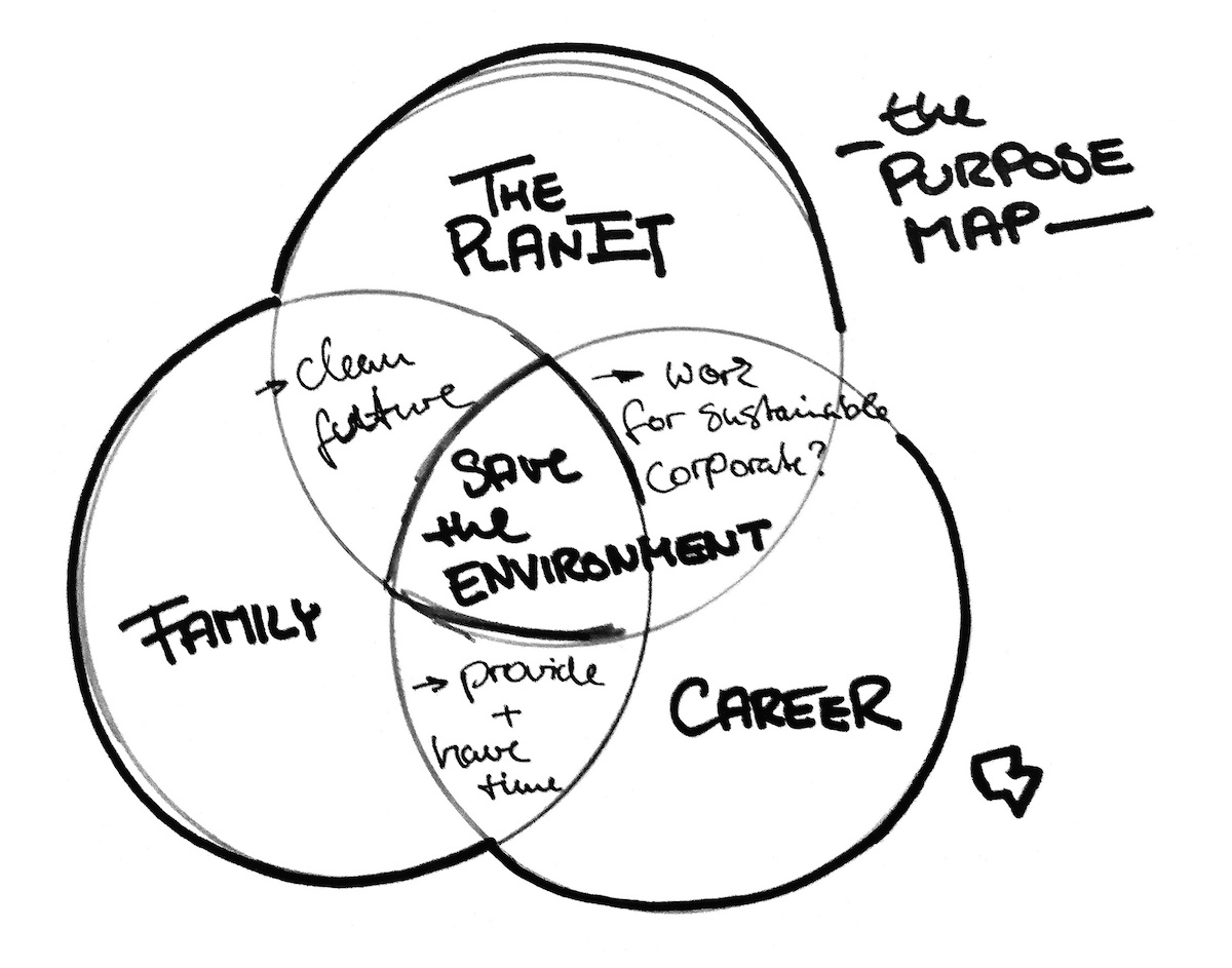
Ask yourself: What is my user’s purpose, where are they going in life? What is their plan, what is their goal? Maybe they want to become a doctor and help the weak and the poor all over the world. Maybe they want to create a business and change the world with it? Maybe they want to become a better parent and be able to provide their kids with a good future.
What is your user’s purpose? More importantly: How can your product support it? Can you help them on the journey?
Sometimes, it’s very obvious – a service like Kinderheldin can help you become a more confident parent, preventive healthcare like Forward helps you reach your health plans. Sometimes it is less obvious: Say your user is a biology student who wants to fight global warming, how can a productivity app like Trello help them achieve this? How can a mobility app do this?
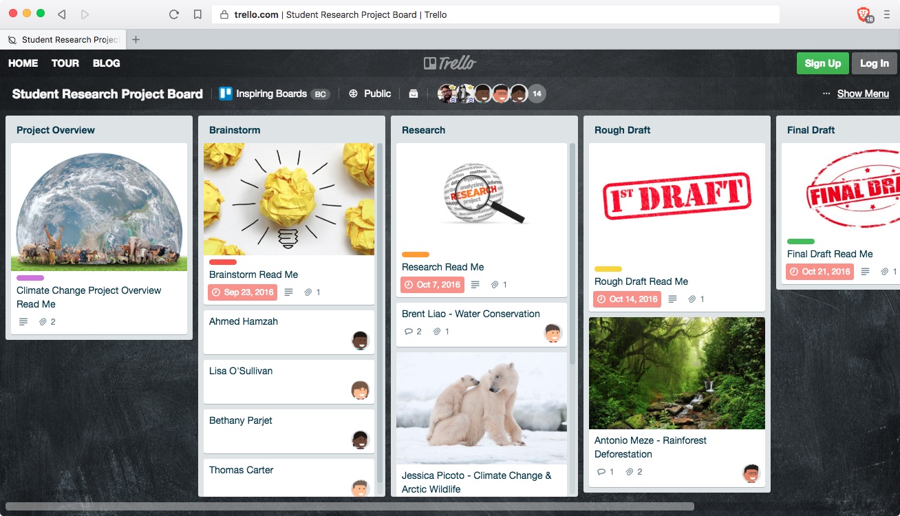
A good way is to look at potential touch points between your product’s features and values and your audience’s purpose. But there’s a better, and more scary way: Look beyond your product. What else do people use to reach their goals? What better ways are there? How does your current feature set stand in their way? How can they combine your product with others to enable purpose? How can you enable purpose?
Designing for the whole human, not the user can be scary. There are some tools to help you like Empathy Maps or Purpose Mapping. You could book a workshop on Human Experience Design with me. The first step though is to admit that a user is much more than just that. Or to put it in the words of Don Norman: “If we are designing for people, why not call them that: people, a person, or perhaps humans”.