Source originale du contenu
It applied to Ludwig Mies van der Rohe when he was designing buildings in the mid 1900’s, and it remains true in product design today. Though I don’t profess to know much about architecture, another likely commonality with product design is that it’s those same details that are the easiest to forget. But it’s those little things, the tiny minutia of detail, that ultimately make beautiful products, and beautiful houses.
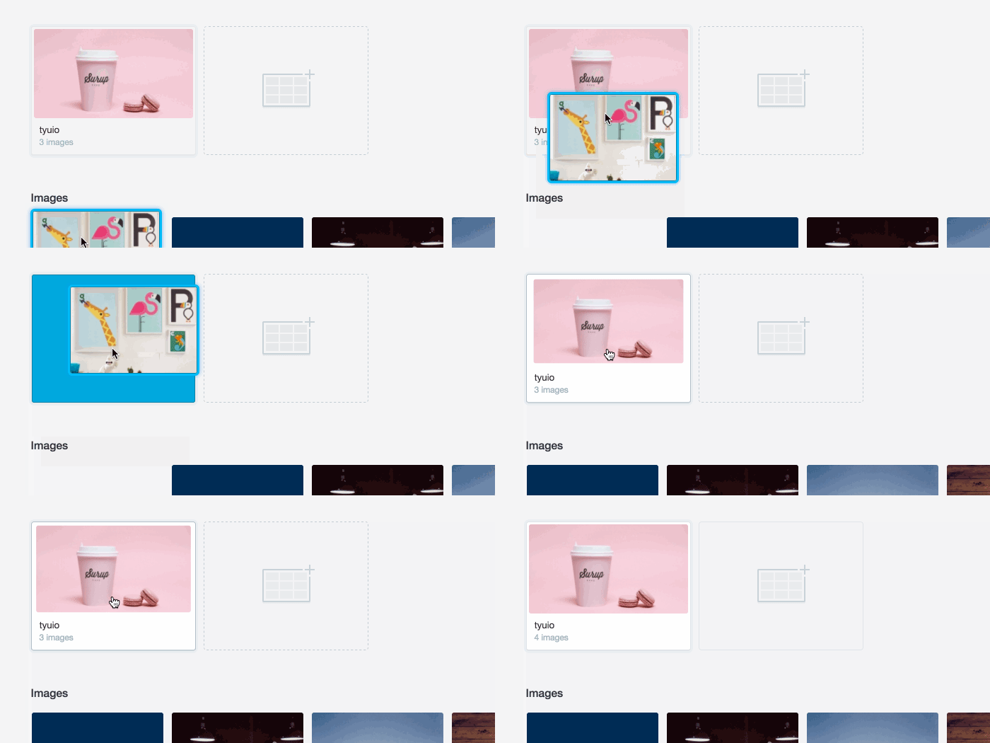
Unfortunately, when I refer to the “details” in product design, I’m not talking about obvious design things; like colours, drop-shadows or placement. Instead I’m referring to something harder to define; experience and subconscious patterns that help the user feel more at-ease with an interaction. That detail might come in the form of a change in cursor, a “down” style for a button, or a helpful animation.
Whatever form that detail takes, I’ll bet that it wasn’t designed in Photoshop, or included in even the most detailed spec document. It’s the details that fall outside of titles like UX, or UI. It’s interaction detail that can only be found after using a product for real, then dedicating solid design and engineering time to building.


